无需媒体查询的响应式布局
How often do you use media queries when building web layouts? I’ve spent too much time on them!
First you spent quite a lot of time trying to make the layout exactly like in the design. But then you need to resize your browser to all possible screen resolutions to make sure your page still looks good on all of them. And I mean to resize not only by width, but by height too - especially, if you have full height sections.
Eventually, your CSS become full of lines like these:
@media screen and (max-width: 1199px) { /*styles here*/ }
@media screen and (max-width: 1023px) { /*more styles here*/ }
@media screen and (max-width: 767px) { /*another styles here*/ }
And that’s annoying! Won’t it be much easier if you can include responsiveness kind of like automatically? Of course, you still need to provide the rules for the responsiveness, but without need to write them for dozens of screen resolutions.
Units system
The first thing you need to understand about responsive design is that you have to forget about pixels.
I know it might be hard to switch from one unit to another, but using pixels is the voice from the past.
The biggest problem with using pixels as a size unit is that you don’t get in count the user's device from which it views your website.
The default root font size for modern browsers is 16px. That means 1rem = 16px. But that doesn't mean users cannot change that value in browser settings to whatever they want.
So imagine the user's default browser font size is 24px. But you setted up the font size of the body tag to 16px.
Here’s what user expects to see:

Root font size equals 24px
And this is what user actually sees:

Root font size equals 16px
It especially affects people with vision problems, thus your page won’t be very accessible for them.
Of course, they can always zoom your page, but in this case it will affect other opened websites, which may not be supposed to be zoomed in.
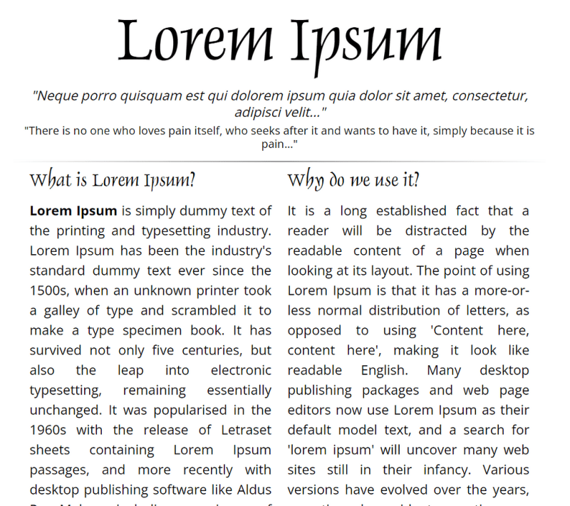
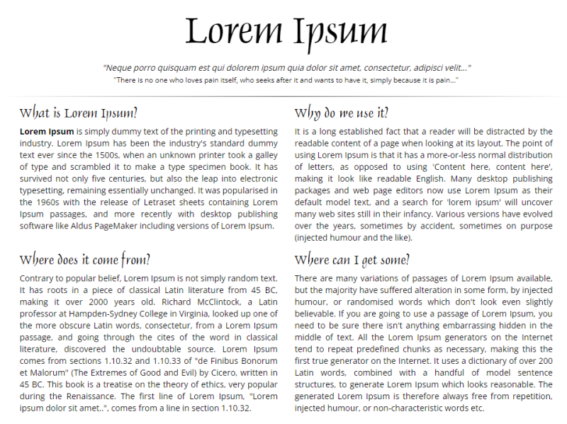
BTW, the Lorem Ipsum site is a very “good” bad example of how non UX-friendly a page can look if you’re using pixels for fonts, margins, paddings etc.
If you're not familiar with the relative units like rem and vw, you should check this article on the MDN, where you can deep dive into CSS units and values: https://developer.mozilla.org/en-US/docs/Learn/CSS/Building_blocks/Values_and_units
Setup variables
To make it easier to build the layout, let's set up global variables first. Luckily, in CSS we have that opportunity. Since custom variables are subject to the cascade and inherit their value from their parent, we will define them on the :root pseudo-class, thus they can be applied to the whole HTML document.
:root {
  --primary-color: green;
  --primary-font: Helvetica, sans-serif;
  --text-font-size: clamp(1rem, 2.08vw, 1.5rem);
}
Looks pretty simple - we define a variable name, which must begin with a double hyphen (--). Then provide a variable value, which can be any valid CSS value.
Then we can use those variables for any element or even pseudo-class in the document using the var() function:
color: var(--primary-color);
For example, we can use our --primary-color variable for all the headings on the page like this:
h1, h2, h3, h4, h5, h6 {
  color: var(--primary-color);
}
Since the primary colour will use quite a lot of different elements on the page, it’s very handy to use the variable instead of writing each time the colour itself.
The last variable --text-font-size: clamp(1rem, 2.08vw, 1.5rem) might look odd: what’s the clamp and what’s it doing on the font size variable?
Dynamic font scaling
The clamp() CSS function clamps a middle value within a range of values between a defined minimum bound and a maximum bound.
You need to provide a minimum value (which is 1rem from the example above), a preferred value (2.08vw) and the maximum allowed value (1.5rem).
The most tricky part here is to set the preferred value. It should be in some viewport relative units (like vw or vh). Thus when a user resizes its browser or changes the device’s orientation the font size will scale proportionally.
I’ve made this formula for calculating the preferred value:
value = AMValue * remInPx / (containerWidth / 100)
Here comes an explanation, no panic:
AMValue - arithmetic mean, between the minimum and maximum allowed values in rem. In our example it equals (1rem 1.5rem) / 2 = 1.25rem
remInPx - default size of 1rem in pixels, depending on your design, usually it equals to 16px
containerWidth - the maximum width of your content container block (in pixels). We need to divide that value to 100 to get the 1% of the width. In the example it equals 960px.
So if you replace the arguments in that equation with real numbers you will get:
value = 1.25 \* 16 / (960 / 100) = 2.08
Let’s check how it will scale:
I know it’s not a perfect solution. Besides, we attach again to pixels, when calculating the preferred value. It’s just one of many possible options to make our fonts scale between viewports sizes.
You can use other CSS functions like min() or max(), or create a custom method to calculate the preferred value in the clamp() function.
I wrote an article about dynamic font size scaling, only for pixel units. It’s a bit outdated, but still you might find it helpful:
Dynamic font-size using only CSS3
Ok, enough of the fonts, let’s go further to the layout!
Layout with equal column width
Let’s start with some simple layout with 6 equal columns.
With media queries you need to write a bunch of extra CSS code to handle how they should wrap on different screen sizes. Like this:
/* by default we have 6 columns */
.column {
  float: left;
  width: calc(100% / 6);
}
/* decrease to 4 columns on the 1200px breakpoint */
@media screen and (max-width: 1200px) {
  .column {
    width: calc(100% / 4);
  }
}
/* decrease to 3 columns on the 1024px breakpoint */
@media screen and (max-width: 1024px) {
  .column {
    width: calc(100% / 3);
  }
}
/* finally, decrease to 2 columns for the viewport width less than or equal to 768px */
@media screen and (max-width: 768px) {
  .column {
    width: calc(100% / 2);
  }
}
Woah! That’s a lot of code, I must say! Wouldn't it be better to just make it scale automatically?
And here’s how, thanks to the CSS grid layout:
.row {
  display: grid;
  grid-template-columns: repeat( auto-fit, minmax(10em, 1fr) );
}
All we need to do is to set the parent block of our columns to be displayed as a grid. And then, create a template for our columns, using grid-template-columns property.
This is called RAM technique (stands for Repeat, Auto, Minmax) in CSS, you can read about it in more details here:
RAM Technique in CSS
In that property we use the CSS repeat() function.
The first argument is set to auto-fit, which means it FITS the CURRENTLY AVAILABLE columns into the space by expanding them so that they take up any available space. There’s another value for that argument: auto-fill. To understand the difference between them check this pen:
Also, I highly recommend to read this article from CSS tricks about auto sizing columns in CSS grid: https://css-tricks.com/auto-sizing-columns-css-grid-auto-fill-vs-auto-fit/
The second argument is using another function minmax(), which defines the size of each column. In our example each column should not be less than 10em and should be stretched to the remaining space.
Looks fine, but we have a problem - the number of columns can be bigger than 6!
To make a limit of columns, we need some custom formula again. But hey, it’s still in CSS! And it’s not that scary, basically, you just need to provide a gap for the grid, a minimal column width and the max number of columns.
Here’ the code:
.grid-container {

  /** * User input values. */
  --grid-layout-gap: 1em;
  --grid-column-count: 4;
  --grid-item--min-width: 15em;

  /** * Calculated values. */
  --gap-count: calc(var(--grid-column-count) - 1);
  --total-gap-width: calc(var(--gap-count) * var(--grid-layout-gap));
  --grid-item--max-width: calc((100% - var(--total-gap-width)) / var(--grid-column-count));

  display: grid;
  grid-template-columns: repeat(auto-fill, minmax(max(var(--grid-item--min-width), var(--grid-item--max-width)), 1fr));
  grid-gap: var(--grid-layout-gap);

}
And here’s what we achieve with that:
As you can see, we can use the relative values for the columns min width and gap, which makes this code like the perfect solution. Until they build the native CSS property for that, of course ?
Important notice! If you don't need a gap between columns, you need to set it to 0px or 0em, not just 0 (pure number). I mean you have to provide the units, otherwise the code won’t work.
I’ve found that solution on CSS tricks, so in case you want to dive deeper to how that formula works, here’s the original article about it: https://css-tricks.com/an-auto-filling-css-grid-with-max-columns/
Layout with different column width
The solution above works perfectly for the grids with equal width of the columns. But how to handle layouts with unequal columns? The most common example is a content area with a sidebar, so let’s work with this one.
Here’s a simple markup of the content area along with sidebar:
For the .content section let’s use the flex box layout:
.content {
  display: flex;
  flex-wrap: wrap;
  justify-content: space-between;
  gap: 1rem;
}
The flex-wrap property here is important and should be set as wrap in order to force the columns (sidebar and content area) stack under each other.
For the sidebar and content columns we need to set flex properties like grow and basis:
/* Sidebar */
.content > aside {
  border: 1px solid var( - primary-color);
  padding: var( - primary-padding);
  flex-grow: 1;
  flex-basis: 15em;
}

/* Content */
.content > article {
  border: 1px solid var( - primary-color);
  padding: var( - primary-padding);
  flex-grow: 3;
  flex-basis: 25em;
}
The flex-basis property sets the initial size of the flex item. Basically, it’s a minimum width which the flex item should have.
The flex-grow property sets the flex grow factor — similar to the proportion of the flex item compared to the other flex items. It’s a very rough and approximate explanation, to understand better the flex-grow property I highly recommend to read this article from CSS tricks: https://css-tricks.com/flex-grow-is-weird/
So if we set the flex-grow: 1 for the sidebar and flex-grow: 3 for the content area, that means the content area will take approximately three times more space than the sidebar.
I also added the grid section from the previous example to demonstrate that it works inside the flex layout as well.
Here’s what we have in the final result:
Stackable columns
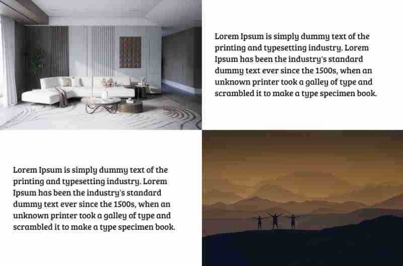
It’s pretty common, when you have a grid layout where text comes next to image on one row and then in reverse order on the next row:

But when the columns become stacked you want them to be in a specific order, where text comes always before image, but they don’t:

To achieve that we need to detect somehow when the columns become stacked.
Unfortunately, it’s impossible (yet) to do that with pure CSS. So we need to add some JS code to detect that:
/**
* Detect when elements become wrapped
*
* @param {NodeList} items - list of elements to check
* @returns {array} Array of items that were wrapped
*/
const detectWrap = (items) => {
  let wrappedItems = [];
  let prevItem = {};
  let currItem = {};

  for (let i = 0; i  {
  const items = wrapper.querySelectorAll(":scope > *");

  // remove ".wrapped" classes to detect which items was actually wrapped
  cover.classList.remove("wrapped");

  // only after that detect wrap items
  let wrappedItems = detectWrap(items); // get wrapped items

  // if there are any elements that were wrapped - add a special class to menu
  if (wrappedItems.length > 0) {
    cover.classList.add("wrapped");
  }

};
The function addWrapClasses() accepts two arguments.
The first one is wrapper — it’s a parent element of the items which we should check whether they are wrapped (stacked) or not.
The second argument cover is an element to which we apply a special CSS class .wrapped. Using this class you can change your layout when the columns become stacked.
If you want to apply the .wrapped class directly to the wrapper element you can pass the same element as the second argument.
For better understanding my “wonderful” explanation please see the pen below, hope it will become more clear for you:
You can also use it to detect when the header menu should be collapsed into the burger. You can read about that case in my article here:
An Easy Way to Make an Auto Responsive Menu
Combining all together
Here’s a pen with all the techniques I mentioned in this article combined:
Final thoughts
I’ve used the techniques from this article in my recent project and it worked very well. The web pages look fine on every screen with no need to optimise them manually on multiple breakpoints.
Of course I will be lying if I tell you I didn’t use media queries at all. It all depends on the design and how flexible you can be with modifying page layout. Sometimes it’s much faster and simpler just to add a couple of breakpoints and then fix CSS for them. But I think eventually CSS media queries will be replaced by CSS functions like clamp() which allow developers to create responsive layouts automatically.
If you find this article helpful — don’t hesitate to like, subscribe and leave your thoughts in the comments ?
Read more posts on my Medium blog
Thanks for reading!
Stay safe and peace to you!
-
 PHP SimpleXML解析带命名空间冒号的XML方法在php 很少,请使用该限制很大,很少有很高。例如:这种技术可确保可以通过遍历XML树和使用儿童()方法()方法的XML树和切换名称空间来访问名称空间内的元素。编程 发布于2025-07-03
 -
 您如何在Laravel Blade模板中定义变量?在Laravel Blade模板中使用Elegance 在blade模板中如何分配变量对于存储以后使用的数据至关重要。在使用“ {{}}”分配变量的同时,它可能并不总是最优雅的解决方案。幸运的是,Blade通过@php Directive提供了更优雅的方法: $ old_section =“...编程 发布于2025-07-03
 -
 Python中嵌套函数与闭包的区别是什么嵌套函数与python 在python中的嵌套函数不被考虑闭合,因为它们不符合以下要求:不访问局部范围scliables to incling scliables在封装范围外执行范围的局部范围。 make_printer(msg): DEF打印机(): 打印(味精) ...编程 发布于2025-07-03
 -
 PHP未来:适应与创新PHP的未来将通过适应新技术趋势和引入创新特性来实现:1)适应云计算、容器化和微服务架构,支持Docker和Kubernetes;2)引入JIT编译器和枚举类型,提升性能和数据处理效率;3)持续优化性能和推广最佳实践。 引言在编程世界中,PHP一直是网页开发的中流砥柱。作为一个从1994年就开始发展...编程 发布于2025-07-03
 -
 如何限制动态大小的父元素中元素的滚动范围?在交互式接口中实现垂直滚动元素的CSS高度限制问题:考虑一个布局,其中我们具有与用户垂直滚动一起移动的可滚动地图div,同时与固定的固定sidebar保持一致。但是,地图的滚动无限期扩展,超过了视口的高度,阻止用户访问页面页脚。$("#map").css({ marginT...编程 发布于2025-07-03
 -
 如何从Google API中检索最新的jQuery库?从Google APIS 问题中提供的jQuery URL是版本1.2.6。对于检索最新版本,以前有一种使用特定版本编号的替代方法,它是使用以下语法:获取最新版本:未压缩)While these legacy URLs still remain in use, it is recommended ...编程 发布于2025-07-03
 -
 为什么HTML无法打印页码及解决方案无法在html页面上打印页码? @page规则在@Media内部和外部都无济于事。 HTML:Customization:@page { margin: 10%; @top-center { font-family: sans-serif; font-weight: bo...编程 发布于2025-07-03
 -
 C++20 Consteval函数中模板参数能否依赖于函数参数?[ consteval函数和模板参数依赖于函数参数在C 17中,模板参数不能依赖一个函数参数,因为编译器仍然需要对非contexexpr futcoriations contim at contexpr function进行评估。 compile time。 C 20引入恒定函数,必须在编译时进行...编程 发布于2025-07-03
 -
 `console.log`显示修改后对象值异常的原因foo = [{id:1},{id:2},{id:3},{id:4},{id:id:5},],]; console.log('foo1',foo,foo.length); foo.splice(2,1); console.log('foo2', foo, foo....编程 发布于2025-07-03
 -
 在Python中如何创建动态变量?在Python 中,动态创建变量的功能可以是一种强大的工具,尤其是在使用复杂的数据结构或算法时,Dynamic Variable Creation的动态变量创建。 Python提供了几种创造性的方法来实现这一目标。利用dictionaries 一种有效的方法是利用字典。字典允许您动态创建密钥并分...编程 发布于2025-07-03
 -
 为什么PHP的DateTime :: Modify('+1个月')会产生意外的结果?使用php dateTime修改月份:发现预期的行为在使用PHP的DateTime类时,添加或减去几个月可能并不总是会产生预期的结果。正如文档所警告的那样,“当心”这些操作的“不像看起来那样直观。 ; $ date->修改('1个月'); //前进1个月 echo $ date->...编程 发布于2025-07-03
 -
 解决MySQL插入Emoji时出现的\\"字符串值错误\\"异常Resolving Incorrect String Value Exception When Inserting EmojiWhen attempting to insert a string containing emoji characters into a MySQL database us...编程 发布于2025-07-03
 -
 如何使用Regex在PHP中有效地提取括号内的文本php:在括号内提取文本在处理括号内的文本时,找到最有效的解决方案是必不可少的。一种方法是利用PHP的字符串操作函数,如下所示: 作为替代 $ text ='忽略除此之外的一切(text)'; preg_match('#((。 &&& [Regex使用模式来搜索特...编程 发布于2025-07-03
学习中文
- 1 走路用中文怎么说?走路中文发音,走路中文学习
- 2 坐飞机用中文怎么说?坐飞机中文发音,坐飞机中文学习
- 3 坐火车用中文怎么说?坐火车中文发音,坐火车中文学习
- 4 坐车用中文怎么说?坐车中文发音,坐车中文学习
- 5 开车用中文怎么说?开车中文发音,开车中文学习
- 6 游泳用中文怎么说?游泳中文发音,游泳中文学习
- 7 骑自行车用中文怎么说?骑自行车中文发音,骑自行车中文学习
- 8 你好用中文怎么说?你好中文发音,你好中文学习
- 9 谢谢用中文怎么说?谢谢中文发音,谢谢中文学习
- 10 How to say goodbye in Chinese? 再见Chinese pronunciation, 再见Chinese learning


