
MUI TextField:构建变体、颜色和样式
 浏览:705
The mui textfield is a fundamental component in Material-UI, designed to capture user inputs efficiently and stylishly. This guide explores its build variants, extensive customization through colors and styles, and practical use cases to elevate your application's UI/UX.

Introduction to MUI TextField
The mui textfield provides a highly adaptable interface component for user inputs in web applications, supporting a range of styles, configurations, and user interactions. Whether you are collecting simple text inputs, passwords, or more complex multiline entries, mui textfield offers the flexibility to meet these needs with robust customization options.
Basic TextField
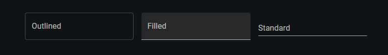
Material-UI offers three distinct build variants for the basic mui textfield each tailored for different UI preferences and user experiences:
- Standard: Offers a minimalist approach with an underline that becomes prominent on focus. Ideal for clean, modern designs where the interface is not cluttered.
- Filled: This variant introduces a light background fill and an underline that only appears when the field is active, adding a subtle touch of depth and emphasis.
- Outlined: Features a full border around the text field, which enhances visibility on varied backgrounds and provides a clear demarcation for interactive elements.
Implementation with Code:
import * as React from 'react';
import Box from '@mui/material/Box';
import TextField from '@mui/material/TextField';
// BasicTextFields Component: Demonstrates different TextField variants.
export default function BasicTextFields() {
return (
// Container component for form elements with specified margins and width
:not(style)': { m: 1, width: '25ch' } }} // Apply margin and width to each TextField
noValidate // Disables browser validation
autoComplete="off" // Disables autocomplete feature
>
{/* Outlined TextField: Uses a border to define the input area */}
);
}
Form Props
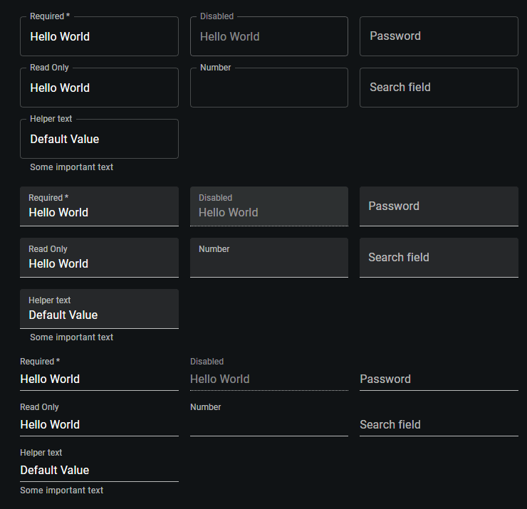
The mui textfield is equipped to handle a variety of standard form attributes that enhance functionality and user interaction. These attributes include options like required, disabled, and type, which are essential for guiding user inputs and maintaining form integrity. Additionally, the helperText prop is particularly useful for providing context about a field’s input, explaining its utility or offering guidance on the expected format.
Following are the key Form Props:
- required: Marks the field as necessary, prompting users to fill it out before submitting a form. This is crucial for ensuring that all essential information is gathered.
- disabled: Temporarily disables the input field, making it non-interactive. This is useful in scenarios where certain conditions need to be met before user input can be accepted.
- type: Defines the type of data expected in the text field, such as text, password, or number. This helps in structuring the form data correctly and ensures that the user input matches the required format.
- helperText: Provides additional details or instructions associated with the input field. This can be used to clarify the purpose of the data or to guide users on how to fill out the form correctly.
Implementation with Code:
import * as React from 'react';
import Box from '@mui/material/Box';
import TextField from '@mui/material/TextField';
// FormPropsTextFields Component: Showcases TextField with various props and states.
export default function FormPropsTextFields() {
return (
// Container for the form elements with specified margins and width
{/* Section for Outlined TextFields with various configurations */}
);
}
Multiline Text Fields
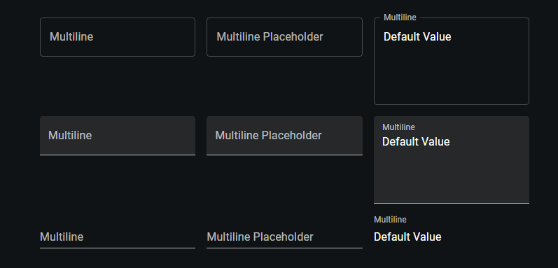
The multiline prop in the mui textfield is a powerful feature that transforms the standard text field into a TextareaAutosize element, making it ideal for inputs that require longer text entries such as comments, descriptions, or feedback forms. This feature is especially useful in forms where users need to provide detailed information that exceeds a single line of text.
For scenarios where you need more control over the size of the text field, you can use the minRows and maxRows props to set minimum and maximum boundaries for its height. This is particularly useful when you want to maintain a certain layout aesthetic or when dealing with form inputs that are expected to be within specific length constraints.
Implementation with Code:
import * as React from 'react';
import Box from '@mui/material/Box';
import TextField from '@mui/material/TextField';
// MULTILINE TEXT FIELDS COMPONENT: Demonstrates various multiline TextField configurations.
export default function MultilineTextFields() {
return (
// Container for the multiline TextField elements with specified margins and width
{/* OUTLINED TEXTFIELDS GROUP */}
);
}
Select
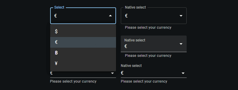
The select prop in mui textfield transforms the standard text field into a dropdown menu by integrating the Select component internally. This modification allows for seamless selection among predefined options, making it particularly useful in forms where users must choose from a set list.
Implementation with Code:
import * as React from 'react';
import Box from '@mui/material/Box';
import TextField from '@mui/material/TextField';
import MenuItem from '@mui/material/MenuItem';
// Currency options for the select dropdown.
const currencies = [
{ value: 'USD', label: '$' },
{ value: 'EUR', label: '€' },
{ value: 'BTC', label: '฿' },
{ value: 'JPY', label: '¥' },
];
// SELECT TEXT FIELDS COMPONENT: Demonstrates TextField with select dropdowns.
export default function SelectTextFields() {
return (
// Container for the select TextField elements with specified margins and width
{/* OUTLINED SELECT TEXTFIELDS GROUP */}
{currencies.map((option) => (
))}
{currencies.map((option) => (
))}
{/* FILLED SELECT TEXTFIELDS GROUP */}
{currencies.map((option) => (
))}
{currencies.map((option) => (
))}
{/* STANDARD SELECT TEXTFIELDS GROUP */}
{currencies.map((option) => (
))}
{currencies.map((option) => (
))}
);
}
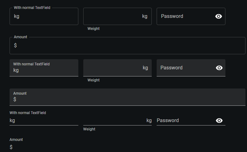
Input Adornments
Input Adornments in Material-UI's mui textfield offer a flexible way to incorporate additional elements like prefixes, suffixes, or interactive icons directly within the text field.
Implementation with Code:
import * as React from 'react';
import Box from '@mui/material/Box';
import IconButton from '@mui/material/IconButton';
import Input from '@mui/material/Input';
import FilledInput from '@mui/material/FilledInput';
import OutlinedInput from '@mui/material/OutlinedInput';
import InputLabel from '@mui/material/InputLabel';
import InputAdornment from '@mui/material/InputAdornment';
import FormHelperText from '@mui/material/FormHelperText';
import FormControl from '@mui/material/FormControl';
import TextField from '@mui/material/TextField';
import Visibility from '@mui/icons-material/Visibility';
import VisibilityOff from '@mui/icons-material/VisibilityOff';
// INPUT ADORNMENTS COMPONENT: Demonstrates various ways to use Input Adornments with TextField and FormControl.
export default function InputAdornments() {
const [showPassword, setShowPassword] = React.useState(false);
const handleClickShowPassword = () => setShowPassword((show) => !show);
const handleMouseDownPassword = (event) => event.preventDefault();
const handleMouseUpPassword = (event) => event.preventDefault();
return (
{/* OUTLINED VARIANT GROUP */}
kg,
}}
/>
kg}
aria-describedby="outlined-weight-helper-text"
/>
Weight
Password
{showPassword ?
}
label="Password"
/>
Amount
$}
label="Amount"
/>
{/* FILLED VARIANT GROUP */}
kg,
}}
variant="filled"
/>
kg}
aria-describedby="filled-weight-helper-text"
/>
Weight
Password
{showPassword ?
}
/>
Amount
$}
/>
{/* STANDARD VARIANT GROUP */}
kg,
}}
variant="standard"
/>
kg}
aria-describedby="standard-weight-helper-text"
/>
Weight
{showPassword ?
}
/>
Amount
$}
/>
)
};
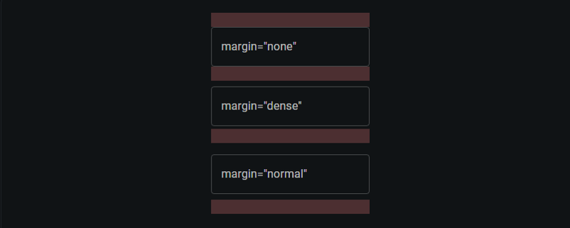
Margin
The margin prop in the mui textfield component is a practical attribute that allows you to control the vertical spacing of the text field within a form. This can be crucial for achieving the desired layout and ensuring that the form is visually appealing.
The margin prop accepts three values: none, dense, and normal. Each of these settings adjusts the amount of space around the text field, affecting how compact or spread out the form elements appear.
- none (default): Applies no additional margin to the TextField. This setting is useful when you want to handle spacing through other means, such as using grid systems or custom CSS.
- dense: Reduces the amount of vertical space around the text field. This is ideal for forms where space is limited or when many elements need to be displayed without overwhelming the user.
- normal: Increases the vertical spacing for better readability and separation between fields. This setting is often used in forms where clarity and ease of use are prioritized.
Implementation with Code:
import * as React from 'react';
import Box from '@mui/material/Box';
import TextField from '@mui/material/TextField';
// RedBar Component: Displays a red horizontal bar to visually separate elements.
function RedBar() {
return (
// Styling applied using a function to access the theme for conditional styles
({
height: 20, // Fixed height for the bar
backgroundColor: 'rgba(255, 0, 0, 0.1)', // Light red background color
...theme.applyStyles('dark', { // Conditional style application for dark themes
backgroundColor: 'rgb(255 132 132 / 25%)',
}),
})}
/>
);
}
// LayoutTextFields Component: Demonstrates TextField components with different margin settings.
export default function LayoutTextFields() {
return (
);
}
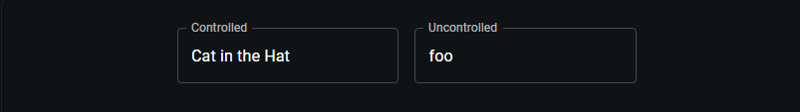
Controlled vs. Uncontrolled Components
In React, components like mui textfield can be either controlled or uncontrolled, which refers to how their state is managed.
- A controlled TextField is managed by state and props within a parent component, offering precise value handling and updates.
- Conversely, an uncontrolled TextField maintains its own internal state, initialized with defaultValue, simplifying setup but offering less direct control over its state.
Implementation with Code:
import * as React from 'react';
import Box from '@mui/material/Box';
import TextField from '@mui/material/TextField';


// StateTextFields Component: Demonstrates the use of controlled and uncontrolled TextField components.
export default function StateTextFields() {
  // State hook for controlling the TextField value
  const [name, setName] = React.useState('Cat in the Hat');


  return (
    // Container for the form elements with specific margin and width styles
     :not(style)': { m: 1, width: '25ch' } }} // Apply margin and width to each TextField
      noValidate // Disables browser validation
      autoComplete="off" // Turns off auto-completion
    >
      {/* CONTROLLED TEXTFIELD */}
       {
          setName(event.target.value); // Update state based on input
        }}
      />
      {/* UNCONTROLLED TEXTFIELD */}


  );
}
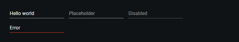
Inputs
Material-UI's Input component provides a streamlined way to handle user inputs in forms. It supports various states such as default values, placeholders, disabled inputs, and error handling.
Implementation with Code:
import * as React from 'react';
import Box from '@mui/material/Box';
import Input from '@mui/material/Input';
// Accessibility label configuration for inputs.
const ariaLabel = { 'aria-label': 'description' };
// Inputs Component: Demonstrates various configurations of MUI Input components.
export default function Inputs() {
return (
// Form container that applies margin to each input and disables browser validation and autocomplete.
:not(style)': { m: 1 } }} // Margin applied to all direct children except
);
}
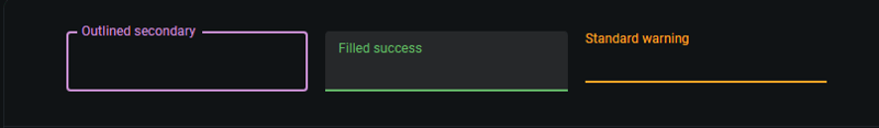
Color
The color prop changes the highlight color of the text field when focused.
Implementation with Code:
import * as React from 'react';
import Box from '@mui/material/Box';
import TextField from '@mui/material/TextField';
// ColorTextFields Component: Demonstrates TextField components styled with various color schemes.
export default function ColorTextFields() {
return (
// Form container applying margin and width to each TextField component
:not(style)': { m: 1, width: '25ch' } }} // Specifies margin and width for direct children
noValidate // Disables HTML5 validation
autoComplete="off" // Disables browser auto-completion
>
{/* OUTLINED TEXTFIELD WITH SECONDARY COLOR */}
);
}
Conclusion
Throughout this guide, we've explored the diverse capabilities of the MUI TextField component, covering its variants, styles, colors, and additional functionalities like select options and input adornments.
- Variants and Styles: We discussed how different TextField variants like standard, filled, and outlined can be utilized to meet specific design needs, enhancing the form's usability and appearance.
- Functionality Enhancements: By leveraging props such as select and input adornments, TextField can be transformed to accommodate more complex user interactions, such as selecting from dropdowns or adding icons for improved functionality.
- Form Management: The distinction between controlled and uncontrolled components was highlighted, emphasizing their roles in managing form state and interactions in React applications.
- Basic Inputs: The simplicity and flexibility of the MUI Input component were showcased, demonstrating how it can handle various input states to streamline user form interactions.
The versatility of MUI components allows developers to build comprehensive, responsive, and accessible user interfaces. For further customization and deeper understanding, refer to the official Material-UI documentation.
-
 如何使用FormData()处理多个文件上传?)处理多个文件输入时,通常需要处理多个文件上传时,通常是必要的。 The fd.append("fileToUpload[]", files[x]); method can be used for this purpose, allowing you to send multi...编程 发布于2025-04-20
 -
如何使用不同数量列的联合数据库表?合并列数不同的表 当尝试合并列数不同的数据库表时,可能会遇到挑战。一种直接的方法是在列数较少的表中,为缺失的列追加空值。 例如,考虑两个表,表 A 和表 B,其中表 A 的列数多于表 B。为了合并这些表,同时处理表 B 中缺失的列,请按照以下步骤操作: 确定表 B 中缺失的列,并将它们添加到表的末...编程 发布于2025-04-20
-
Go语言垃圾回收如何处理切片内存?在Go Slices中的垃圾收集:详细的分析在GO中,Slice是一个动态数组,引用了基础阵列。使用切片时,了解垃圾收集行为至关重要,以避免潜在的内存泄漏。考虑使用slice使用slice的以下实现:字符串{ R:=(*Q)[0] *q =(*q)[1:len(*q)] 返回...编程 发布于2025-04-20
-
如何干净地删除匿名JavaScript事件处理程序?删除匿名事件侦听器将匿名事件侦听器添加到元素中会提供灵活性和简单性,但是当要删除它们时,可以构成挑战,而无需替换元素本身就可以替换一个问题。 element? element.addeventlistener(event,function(){/在这里工作/},false); 要解决此问题,请考虑...编程 发布于2025-04-20
-
如何从PHP中的数组中提取随机元素?从阵列中的随机选择,可以轻松从数组中获取随机项目。考虑以下数组:; 从此数组中检索一个随机项目,利用array_rand( array_rand()函数从数组返回一个随机键。通过将$项目数组索引使用此键,我们可以从数组中访问一个随机元素。这种方法为选择随机项目提供了一种直接且可靠的方法。编程 发布于2025-04-20
-
在所有浏览器中实现左对齐文本的斜线方法] 在倾斜行上的文本对齐背景在倾斜行上实现左对齐的文本可能会构成挑战,在nectera时尤其是挑战。兼容性(返回IE9)。通过引入一系列平方元素并计算其尺寸,我们可以创建一个有效的解决方案: .loop(@i) when (@i > 0){ .loop((@i - 1...编程 发布于2025-04-20
-
在UTF8 MySQL表中正确将Latin1字符转换为UTF8的方法在UTF8表中将latin1字符转换为utf8 ,您遇到了一个问题,其中含义的字符(例如,“jáuòiñe”)在utf8 table tabled tablesset中被extect(例如,“致电。为了解决此问题,您正在尝试使用“ mb_convert_encoding”和“ iconv”转换受...编程 发布于2025-04-20
-
您如何在Laravel Blade模板中定义变量?在Laravel Blade模板中使用Elegance 在blade模板中如何分配变量对于存储以后使用的数据至关重要。在使用“ {{}}”分配变量的同时,它可能并不总是最优雅的解决方案。幸运的是,Blade通过@php Directive提供了更优雅的方法: $ old_section =“...编程 发布于2025-04-20
-
为什么我会收到MySQL错误#1089:错误的前缀密钥?mySQL错误#1089:错误的前缀键错误descript [#1089-不正确的前缀键在尝试在表中创建一个prefix键时会出现。前缀键旨在索引字符串列的特定前缀长度长度,可以更快地搜索这些前缀。了解prefix keys `这将在整个Movie_ID列上创建标准主键。主密钥对于唯一识别...编程 发布于2025-04-20
-
在Java中使用for-to-loop和迭代器进行收集遍历之间是否存在性能差异?For Each Loop vs. Iterator: Efficiency in Collection TraversalIntroductionWhen traversing a collection in Java, the choice arises between using a for-...编程 发布于2025-04-20
-
在细胞编辑后,如何维护自定义的JTable细胞渲染?在JTable中维护jtable单元格渲染后,在JTable中,在JTable中实现自定义单元格渲染和编辑功能可以增强用户体验。但是,至关重要的是要确保即使在编辑操作后也保留所需的格式。在设置用于格式化“价格”列的“价格”列,用户遇到的数字格式丢失的“价格”列的“价格”之后,问题在设置自定义单元格...编程 发布于2025-04-20
-
为什么尽管有效代码,为什么在PHP中捕获输入?在php ;?>" method="post">The intention is to capture the input from the text box and display it when the submit button is clicked.但是,输出...编程 发布于2025-04-20
-
在JavaScript中如何并发运行异步操作并正确处理错误?同意操作execution 在执行asynchronous操作时,相关的代码段落会遇到一个问题,当执行asynchronous操作:此实现在启动下一个操作之前依次等待每个操作的完成。要启用并发执行,需要进行修改的方法。 第一个解决方案试图通过获得每个操作的承诺来解决此问题,然后单独等待它们: co...编程 发布于2025-04-20
-
图片在Chrome中为何仍有边框?`border: none;`无效解决方案在chrome 在使用Chrome and IE9中的图像时遇到的一个频繁的问题是围绕图像的持续薄薄边框,尽管指定了图像,尽管指定了;和“边境:无;”在CSS中。要解决此问题,请考虑以下方法: Chrome具有忽略“ border:none; none;”的已知错误,风格。要解决此问题,请使用以下...编程 发布于2025-04-20
-
为什么不````''{margin:0; }`始终删除CSS中的最高边距?在CSS 问题:不正确的代码: 全球范围将所有余量重置为零,如提供的代码所建议的,可能会导致意外的副作用。解决特定的保证金问题是更建议的。 例如,在提供的示例中,将以下代码添加到CSS中,将解决余量问题: body H1 { 保证金顶:-40px; } 此方法更精确,避免了由全局保证金重置引...编程 发布于2025-04-20


学习中文
- 1 走路用中文怎么说?走路中文发音,走路中文学习
- 2 坐飞机用中文怎么说?坐飞机中文发音,坐飞机中文学习
- 3 坐火车用中文怎么说?坐火车中文发音,坐火车中文学习
- 4 坐车用中文怎么说?坐车中文发音,坐车中文学习
- 5 开车用中文怎么说?开车中文发音,开车中文学习
- 6 游泳用中文怎么说?游泳中文发音,游泳中文学习
- 7 骑自行车用中文怎么说?骑自行车中文发音,骑自行车中文学习
- 8 你好用中文怎么说?你好中文发音,你好中文学习
- 9 谢谢用中文怎么说?谢谢中文发音,谢谢中文学习
- 10 How to say goodbye in Chinese? 再见Chinese pronunciation, 再见Chinese learning


