
如何使用 css 制作链接的项目符号点
发布于2024-07-30
 浏览:363
这是基本思想
您在 ul 或 li 标签下创建三个 li 列表
- item 1
- item 2
- item 3
你使 li 标签位置:相对;并给予一些左侧填充
li {
  height: 40px;
  padding-left: 20px;
  display: flex;
  align-items: center;
  position: relative;
}
你使用 li::before css 属性并设置左边框。
li::before {
  content: '';
  position: absolute;
  left: -16px;
  border-left: 2px solid black;
  height: 100%;
  width: 1px;
}
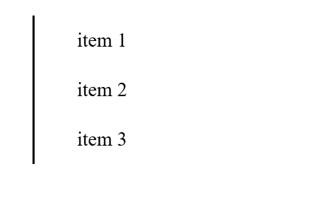
现在你使用 li::after css 属性并在它周围画三个圆圈
li::after {
  content: '';
  display: inline-block;
  height: 10px;
  width: 10px;
  border-radius: 50%;
  background-color: blue;
  margin-left: -80px;
}
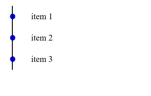
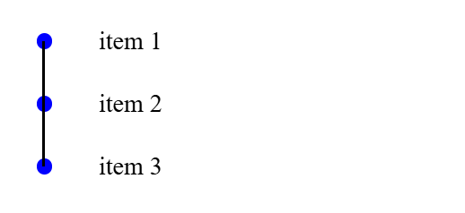
现在终于从第一个和最后一个列表中裁剪该行
li:first-child:before {
  top: 20px;
}

li:last-child:before {
  top: -20px;
}
结果:
完整代码:
html:
- item 1
- item 2
- item 3
css:
li {
  height: 40px;
  padding-left: 20px;
  display: flex;
  align-items: center;
  position: relative;
}

li::before {
  content: '';
  position: absolute;
  left: -16px;
  border-left: 2px solid black;
  height: 100%;
  width: 1px;
}

li::after {
  content: '';
  display: inline-block;
  height: 10px;
  width: 10px;
  border-radius: 50%;
  background-color: blue;
  margin-left: -80px;
}


li:first-child:before {
  top: 20px;
}

li:last-child:before {
  top: -20px;
}
版本声明
本文转载于:https://dev.to/slimpython/how-to-make-linked-bullet-point-with-css-22c4?1如有侵犯,请联系[email protected]删除
最新教程
更多>
-
 对象拟合:IE和Edge中的封面失败,如何修复?To resolve this issue, we employ a clever CSS solution that solves the problem:position: absolute;top: 50%;left: 50%;transform: translate(-50%, -50%)...编程 发布于2025-04-09
 -
如何使用组在MySQL中旋转数据?在关系数据库中使用mySQL组使用mySQL组进行查询结果,在关系数据库中使用MySQL组,转移数据的数据是指重新排列的行和列的重排以增强数据可视化。在这里,我们面对一个共同的挑战:使用组的组将数据从基于行的基于列的转换为基于列。 Let's consider the following ...编程 发布于2025-04-09
-
为什么尽管有效代码,为什么在PHP中捕获输入?在php ;?>" method="post">The intention is to capture the input from the text box and display it when the submit button is clicked.但是,输出...编程 发布于2025-04-09
-
如何使用替换指令在GO MOD中解析模块路径差异?在使用GO MOD时,在GO MOD 中克服模块路径差异时,可能会遇到冲突,其中3个Party Package将另一个PAXPANCE带有导入式套件之间的另一个软件包,并在导入式套件之间导入另一个软件包。如回声消息所证明的那样: go.etcd.io/bbolt [&&&&&&&&&&&&&&&&...编程 发布于2025-04-09
-
如何在其容器中为DIV创建平滑的左右CSS动画?通用CSS动画,用于左右运动 ,我们将探索创建一个通用的CSS动画,以向左和右移动DIV,从而到达其容器的边缘。该动画可以应用于具有绝对定位的任何div,无论其未知长度如何。问题:使用左直接导致瞬时消失 更加流畅的解决方案:混合转换和左 [并实现平稳的,线性的运动,我们介绍了线性的转换。这...编程 发布于2025-04-09
-
如何从Google API中检索最新的jQuery库?从Google APIS 问题中提供的jQuery URL是版本1.2.6。对于检索最新版本,以前有一种使用特定版本编号的替代方法,它是使用以下语法:获取最新版本:未压缩)While these legacy URLs still remain in use, it is recommended ...编程 发布于2025-04-09
-
如何配置Pytesseract以使用数字输出的单位数字识别?Pytesseract OCR具有单位数字识别和仅数字约束 在pytesseract的上下文中,在配置tesseract以识别单位数字和限制单个数字和限制输出对数字可能会提出质疑。 To address this issue, we delve into the specifics of Te...编程 发布于2025-04-09
-
如何解决由于Android的内容安全策略而拒绝加载脚本... \”错误?Unveiling the Mystery: Content Security Policy Directive ErrorsEncountering the enigmatic error "Refused to load the script..." when deployi...编程 发布于2025-04-09
-
如何将来自三个MySQL表的数据组合到新表中?mysql:从三个表和列的新表创建新表 答案:为了实现这一目标,您可以利用一个3-way Join。 选择p。*,d.content作为年龄 来自人为p的人 加入d.person_id = p.id上的d的详细信息 加入T.Id = d.detail_id的分类法 其中t.taxonomy =...编程 发布于2025-04-09
-
您可以使用CSS在Chrome和Firefox中染色控制台输出吗?在javascript console 中显示颜色是可以使用chrome的控制台显示彩色文本,例如红色的redors,for for for for错误消息?回答是的,可以使用CSS将颜色添加到Chrome和Firefox中的控制台显示的消息(版本31或更高版本)中。要实现这一目标,请使用以下模...编程 发布于2025-04-09
-
How to Efficiently Retrieve the Last Row for Each Unique Identifier in PostgreSQL?postgresql:为每个唯一标识符提取最后一行,在Postgresql中,您可能需要遇到与在数据库中的每个不同标识相关的信息中提取信息的情况。考虑以下数据:[ 1 2014-02-01 kjkj 在数据集中的每个唯一ID中检索最后一行的信息,您可以在操作员上使用Postgres的有效效率: ...编程 发布于2025-04-09
-
如何在php中使用卷发发送原始帖子请求?如何使用php 创建请求来发送原始帖子请求,开始使用curl_init()开始初始化curl session。然后,配置以下选项: curlopt_url:请求 [要发送的原始数据指定内容类型,为原始的帖子请求指定身体的内容类型很重要。在这种情况下,它是文本/平原。要执行此操作,请使用包含以下标头...编程 发布于2025-04-09
-
如何在Java的全屏独家模式下处理用户输入?Handling User Input in Full Screen Exclusive Mode in JavaIntroductionWhen running a Java application in full screen exclusive mode, the usual event ha...编程 发布于2025-04-09
-
为什么我在Silverlight Linq查询中获得“无法找到查询模式的实现”错误?查询模式实现缺失:解决“无法找到”错误在银光应用程序中,尝试使用LINQ建立错误的数据库连接的尝试,无法找到以查询模式的实现。”当省略LINQ名称空间或查询类型缺少IEnumerable 实现时,通常会发生此错误。 解决问题来验证该类型的质量是至关重要的。在此特定实例中,tblpersoon可能需...编程 发布于2025-04-09


学习中文
- 1 走路用中文怎么说?走路中文发音,走路中文学习
- 2 坐飞机用中文怎么说?坐飞机中文发音,坐飞机中文学习
- 3 坐火车用中文怎么说?坐火车中文发音,坐火车中文学习
- 4 坐车用中文怎么说?坐车中文发音,坐车中文学习
- 5 开车用中文怎么说?开车中文发音,开车中文学习
- 6 游泳用中文怎么说?游泳中文发音,游泳中文学习
- 7 骑自行车用中文怎么说?骑自行车中文发音,骑自行车中文学习
- 8 你好用中文怎么说?你好中文发音,你好中文学习
- 9 谢谢用中文怎么说?谢谢中文发音,谢谢中文学习
- 10 How to say goodbye in Chinese? 再见Chinese pronunciation, 再见Chinese learning


