设计系统入门模板 - 您需要的所有技术
There are several ways how Design System can be founded — down-top, top-down, external, originated from design or development needs and probably some others. One thing is certain — it’s important to start things small, while keeping an eye on the future setup, which is crucial for sustainable growth.
The very foundation you build today must support current needs while being agile and thought through to suffice gradual evolution of requirements within a project or organization. This article focuses on the technical backbone, essential for creating a Design System that can satisfy expanding ambitions.
The ? Design System Starter Template (DSS) is built on the core components that establish a strong technical foundation for scalable and maintainable Design System. These components ensure that design and development are consistent, flexible, and efficient.
⭐️ https://github.com/XOP/design-system-starter
In the following sections we’ll overview primary and secondary modules of the DSS template, as well as its services and tooling. In addition we’ll explore their cost-effectiveness in the early stages of Design System and their potential in more mature stages.
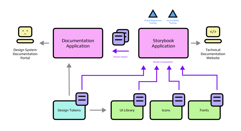
The Core Components
UI Library: The Heart of the Design System
The DSS UI library serves as the central pillar of DSS Template, built with react-aria to ensure accessibility-first, headless UI components. While React is the selected framework for the template, DSS is meant to be easily adapted to other frameworks like Vue or Solid. This adaptability allows teams to choose the technologies that best align with their project needs without being locked into a specific stack
For styling DSS UI relies on vanilla-extract, which provides a robust scalable zero-runtime CSS base. Yet again, it’s a flexible choice, allowing for alternative approaches like CSS modules, Panda CSS, Tailwind etc.
For stability, UI components rely on the testing library, focusing on functionality in the first place. Specific testing scenarios might not be relevant in case of themed (headless) components, but essential in other scenarios.
Resulting component structure looks rather straightforward:
Switch/
  index.ts
  Switch.css.ts       - styles created with vanilla-extract
  Switch.spec.tsx     - tests using testing-library
  Switch.stories.tsx  - documentation with Storybook stories
  Switch.tsx          - component based on react-aria
It’s worth mentioning that even though DSS UI is not following a multi-package approach, it still allows for tree-shaking, leveraging respective rollup options in Vite config:
// named import
import { Button } from '@ds-starter/ui';

// default import
import Button from '@ds-starter/ui/components/Button/Button';
A critical aspect of the UI library is the early incorporation of Design Tokens. Tokens are foundational to maintaining consistent styling across Design Systems, allowing even projects that do not utilize the full UI library to benefit from a cohesive design language. With the proper semantic tokens in place, colors can be easily changed without the need for massive refactoring. Also, with the modular approach we don’t really care how Design Tokens are built, but rather what is being output.
Design Tokens: The Backbone of Consistency
Design Tokens are integral to the consistency and flexibility of the Design System. They provide a standardized approach to theming and styling across all modules and applications, ensuring that every element of the UI remains cohesive.
DSS color tokens are generated using ? Unicornix, a tool that allows to create accessible and customizable color palettes, providing for easy start with light and dark modes. Typography and some other tokens are created with ? Design Tokens Generator. Altogether this provides a solid foundation for further scaling without encountering major roadblocks.
DSS Tokens are available in both CSS and JavaScript formats, to reflect and support different project needs, from simple websites to complex web applications. Theming can be done in several ways, and here we fully rely on CSS custom properties.
Here is an excerpt from the generated CSS.
It’s easy to note that theme can be swapped completely by changing a single data attribute:
:root[data-theme="light"], [data-theme="light"] {
  --awsm-color-content-strong: rgb(24, 26, 27);
  --awsm-color-content-regular: rgb(45, 47, 49);
  --awsm-color-background-regular: rgb(255, 255, 255);
  --awsm-color-background-subtle: rgb(236, 237, 237);
}

:root[data-theme="dark"], [data-theme="dark"] {
  --awsm-color-content-strong: rgb(255, 255, 255);
  --awsm-color-content-regular: rgb(229, 230, 231);
  --awsm-color-background-regular: rgb(0, 0, 0);
  --awsm-color-background-subtle: rgb(9, 10, 11);
}
JS tokens can be consumed as CSS refs, containing the references to values, rather than the color strings. This approach is great for semantic variables and theming without sacrificing performance:
export const tokens = {
  content: {
    strong: "var(--awsm-color-content-strong)",
    regular: "var(--awsm-color-content-regular)",
  },
  background: {
    regular: "var(--awsm-color-background-regular)",
    subtle: "var(--awsm-color-background-subtle)",
  }
}
Icons and Fonts: Modular Visual Language
The Icons and Fonts modules add depth to the visual language. Icons are managed through an efficient process that generates components from SVG files using SVGR and tsup. This ensures that icons are consistent and can be flexibly integrated across the system.
Similar to UI components, icons can be also imported individually:
// named import
import { IconX } from '@ds-starter/icons';

// default import
import IconX from '@ds-starter/icons/lib/IconX';

// Source (SVG) import
import IconXSrc from '@ds-starter/icons/svg/x.svg';
The Fonts package offers a convenient solution for managing typography within the Design System. It supports both base64-encoded fonts for quick setups and Google Fonts integration for more robust implementations, giving teams the flexibility to choose the best approach for their project’s needs while maintaining consistent typography across all digital products.
It’s worth noting that while base64 encoding is efficient, it’s not effective for production setup. Yet in the early stages it can be a common denominator for consistent typography. Of course going further this should be replaced with the more appropriate fonts-loading strategy.
Now, the question arises — should you setup Icons and Fonts packages from the start? The answer naturally depends, however in most typical scenarios it will be a “no”. More agile environment in the early stages is crucial and less dependencies is the key. Yet, keeping in mind the upcoming structure and incorporating that in the early setup is a good idea, shaving off a couple of dozen “story points” in the future refactorings.
Documentation — Storybook and Beyond
Storybook: A Multi-Purpose Development Tool
Storybook is an important tool for UI development, serving primarily as a development environment and a documentation portal on early stages of Design System. It allows to visualize and interact with UI components in various states and configurations, resolving issues early in the development process.
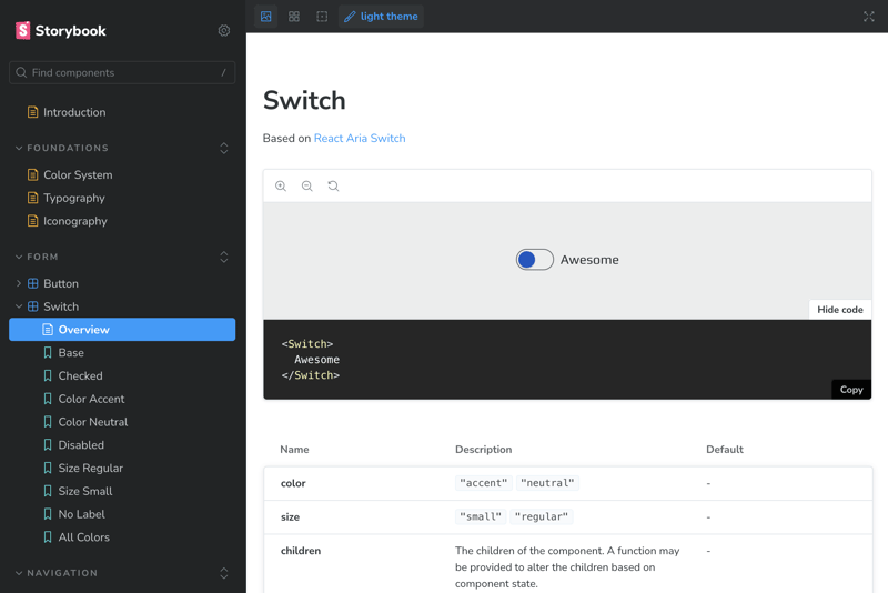
Storybook in DSS is a standalone app that does not itself host any stories — they all are collected across the packages and composed in one central hub. This way DSS Storybook can document color palettes, typography, iconography etc. along with the UI components from different sources after a simple setup.
? Note that there is no storybook composition per se,
yet it’s also possible as one does not deny the other.
Explore the deployed demo here: https://ds-starter-storybook.vercel.app/
Beyond its direct functionality, DSS Storybook is additionally equipped with Visual Regression Testing (VRT) and Accessibility Testing using Playwright. Such automation is essential for large design systems, where manual testing could quickly grow ineffective and time-consuming. By integrating these tests into the development workflow (early), DSS ensures that the Design System can evolve fast without fear of regressions.
While being an irreplaceable tool for early-stage documentation, consolidating component documentation and visual examples into a single platform, Storybook is not actually a documentation website. With time, more sophisticated, content-oriented and customizable solution is demanded, especially for the Design System consumers far apart from technology.
Documentation Website: Design System Knowledgebase
As the Design System matures, the need for more detailed and accessible documentation becomes paramount. The DSS Documentation Website (DSS Docs) addresses this need by providing a dedicated application for organizing and presenting information about the Design System.
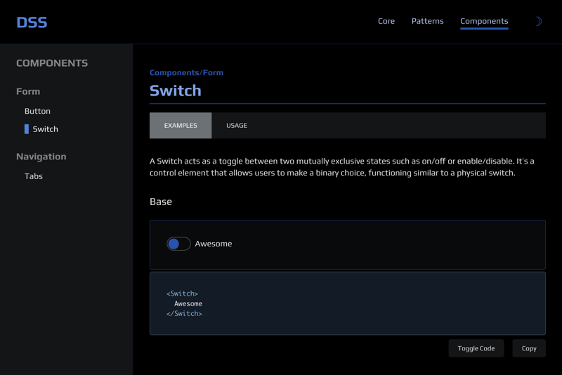
Explore the deployed demo here: https://ds-starter-docs.vercel.app/
DSS Docs is designed to be minimalistic yet highly functional and customizable. It includes several modules that can be tweaked and modified to meet the project purpose. Powered by Astro and enhanced with nanostores state manager, DSS Docs implies two main types of content: Articles and Component Documentation.
Articles offer in-depth insights into Design System concepts, provide guidelines, patterns and describe foundational layers in detail. To add a new Article is as easy as simply to place a Markdown file into the respective folder.
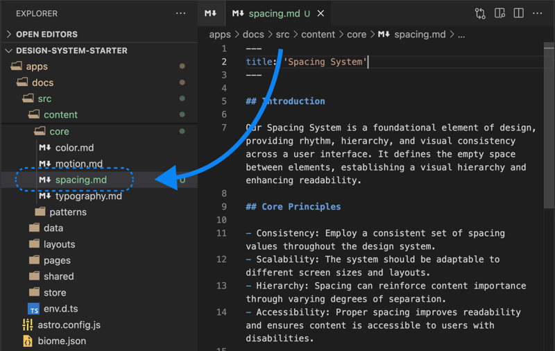
Component Documentation includes interactive examples dynamically loaded from the Storybook stories. This integration solves a couple of issues — it ensures consistency across the “Dev” and “Prod” documentation and avoids redundancy in content creation.
? As a bonus — component examples can be edited in the UI library and will be automatically picked up by Docs running in dev mode. Not a Storybook replacement, but can be useful for cosmetic updates.
New Component Documentation can be added with a MDX file, following a particular schema. Apart from the main description, extra sections can be added following the “Usage” pages example.
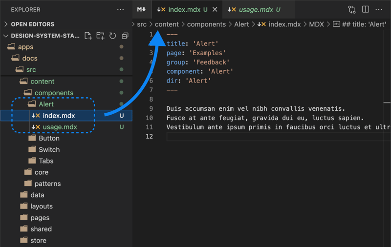
Expandable structure of DSS Docs allows for easy updates and tweaks, making it an essential tool for teams looking to step up from Storybook without significant effort and creating redundancy. The Documentation app is themed with DSS Tokens to ensure a consistent look and feel of the main product.
Automation and Workflow Best Practices
Scripts and Github Actions Automation
DSS leverages a series of scripts to handle essential tasks like testing, linting, formatting, and dependency management. Turborepo offers great help for running scripts effectively, especially when every module adheres to a unified standard.
What’s more, everything that we run locally, including Visual Regression Testing — can be done on CI, thanks to Github Actions. Apart from the thorough quality checks, Github Actions will take care of apps deployment too (powered by Vercel). Naturally, all scripts are configurable and optional.
Changelog and Release Management
DSS uses Changesets to automate the processes of changelog generation and packages releases, ensuring every change is tracked and properly versioned. Needless to say, both processes are supported by Github Actions as well.
Here are some examples of published NPM packages:
@ds-starter/fonts
@ds-starter/icons
@ds-starter/tokens
@ds-starter/ui
Component Generator
To further enhance productivity, DSS includes a Turbo-powered Generator that simplifies the process of scaffolding new UI components. Apart from saving time, this allows to greatly reduce the human-error-copy-paste factor.
# Run a generator
$ pnpm run gen:ui
After replying to a series of prompts, you will get the following:
New component scaffolded in the DSS UI package, containing all respective files
Same component added to the DSS Docs application, with the correct MDX frontmatter data
Like almost everything in DSS, generator template can and most probably need to be tweaked to the project needs. This is a completely arbitrary operation, however using generator can be very beneficial for contributors, onboarding of team members and scenarios like codebase migration.
Flexible Technology Stack
Main Design Principle
Design System technological stack is an arbitrary matter, however it’s for sure not random. It’s a natural effect of multiple contributing factors, including, but not limited to:
product scope and project peculiarities
initial size and future ambitions
teams expertise and proficiency
contributors and consumers proficiency
client requirements and technical stack
overall codebase age and historical reasons
existing technical debt
cross-platform and cross-browser support
maintainability requirements
existing or upcoming deadlines
industry trends and market volatility
organization structural changes
and more…
? Would you be interested in a dedicated article on this? Let me know!
⭐️ Also, you are past 2000 words, reading champion!
The aim of the DSS template is not to comply with every single scenario, but to suggest the industry average best practices that can be further tailored to the desired experience. Understandable, Template won’t fit a lot of systems, however presented patterns and snippets can be explored, re-used, improved and hopefully inspire new creations.
Selected, Recommended, Opinionated
Throughout the article we observed multiple technologies being used in order to compose the DSS Template and provide a holistic and functional developer experience. Actually, there’re more under the hood, welcome to explore the comprehensive documentation.
Those technologies can be basically grouped into “Selected”, “Recommended” and “Opinionated” categories, so that each next one is more biased than the previous.
Consider examples:
- React is Selected for being the most popular solution for UI libraries, it’s perfect for demonstration of UI library scaffolding.
- React-Aria is Recommended, because it’s the headless UI solution that prioritizes accessibility; we don’t need to invent the wheel with typical functional patterns and get lots of accessibility concerns sorted out of the box.
- Using Biome for linting and formatting is an Opinionated choice (I appreciate the turn-key configuration and blazing performance) and can be replaced with ESLint and i.e. Prettier.
Of all other technological choices I would like to (additionally) highlight the Opinionated ones:
- Vanilla-extract as the CSS solution is great for scalable projects that prioritize performance and server-side rendering compatibility. While it has a somewhat higher entry threshold, it provides a very friendly CSS-in-JS experience without CSS-in-JS downsides.
- Nanostores is the go-to solution when it comes to minimalistic and effective global state management in the apps. It shines in the island-like architecture and Astro projects in particular. DSS Docs feature nanostores for basic operations like toggling theme or source code, but it’s capable of managing much more complex tasks.
Finally, Typescript is the technology that stands out being in all three groups simultaneously. It has been around for a while to become industry standard, it is generally recommended for complex projects like Design System and I would also use it further for similar reasons.
Closing Thoughts
Building any product requires a solid foundation, a clear roadmap, careful preparations, and timely revisions at every milestone. As requirements evolve over time, your technology should be resilient enough to adapt effectively to new settings.
With Design Systems, it’s all of that, plus the element of perpetual motion. Can you think of a universal development approach that can handle project unpredictability and versatility beyond the good ol’ Markup and Style? Maybe later, but for now, this is just the way of things.
The ? Design System Starter Template can help you in establishing a strong technological core and may even become a great starting point, providing a modular and flexible solution for your next Design System challenge. However, for the most part, it’s the groundwork for insights and sparks of inspiration. This has happened to me several times during the development of DSS to the extent of pivoting on tools, which is why I think it’s useful. I’m definitely looking forward to and inviting you to the next encounters.
-
 Pandas 什么时候创建视图而不是副本?Pandas 视图与副本生成规则Pandas 在决定 DataFrame 上的切片操作是否产生视图或结果时采用特定规则复制。通过了解这些规则,您可以优化数据操作并避免意外行为。从始终生成副本的操作开始:所有操作,除了那些专门设计用于修改的操作就地 DataFrame,创建副本。只有某些操作支持 in...编程 发布于2024-11-06
 -
 使用代理服务器解锁地理限制网站利用代理服务器绕过区域封锁是一种常用且有效的方法。代理服务器作为中介,可以隐藏用户的真实IP地址,使用户的请求看起来像是来自代理服务器的地理位置,从而绕过区域封锁。 使用代理服务器绕过区域封锁的关键步骤: 选择合适的代理服务器:根据目标区域的网络环境和遮挡情况,选择覆盖该区域的...编程 发布于2024-11-06
 -
 如何为三角形中的线性渐变锯齿线创建平滑边缘?为线性渐变锯齿线创建平滑边缘为了设计具有由两个三角形形成的尖底的响应式图像,开发人员在三角形线上遇到了意外的锯齿状边缘。为了解决这个问题,我们探索了产生更平滑渐变过渡的策略。虽然硬停止线性渐变图像中的颜色通常会导致锯齿状边缘,但调整停止点和起始点可以缓解此问题。不要突然从一种颜色变为另一种颜色,而是...编程 发布于2024-11-06
 -
 Java 中“static”的魔力:一为所有,一切为一!老实说,当我们第一次遇到 static 关键字时,我们都会想:“这是什么魔法?” ?但别担心,我会用一种简单、深入、甚至有点有趣的方式来分解它! 想象一下你正在参加一个聚会?你和你所有的朋友都戴着帽子。但每个人都必须分享一顶帽子。这基本上就是 Java 中 static 关键字的作用!您不必为每个朋...编程 发布于2024-11-06
 -
 如何在 Laravel Eloquent ORM 中对表进行别名以增强灵活性和可读性?Laravel 的 Eloquent 查询中的别名表:超越 DB::table在 Laravel 的 Eloquent ORM 中,您可以使用干净的、面向对象的方法与数据库进行交互。然而,有时您可能会遇到需要更大灵活性的查询,例如别名表。挑战考虑使用 Laravel 的查询生成器进行查询:$user...编程 发布于2024-11-06
 -
 如何使用 document.write 功能动态包含脚本?动态包含具有document.write功能的脚本问题:如何将带有变量src属性的脚本标签动态添加到网页中,特别是如果 src 包含 document.write 函数?背景:通常,在 HTML 头中添加具有特定 src 属性的脚本标记可以无缝工作。但是,当src属性中包含document.writ...编程 发布于2024-11-06
 -
 为什么我在 Python 中收到“Bad magic number”导入错误?Bad Magic Number:了解导入错误使用 Python 时,遇到“Bad magic number”ImportError 可能会令人沮丧。此错误表示 pyc 文件(Python 脚本的编译版本)已损坏,这会导致与 Python 解释器不兼容。理解幻数在 UNIX 中-type 系统中,文...编程 发布于2024-11-06
 -
 如何测试 Go 中未导出的函数?从非测试 Go 文件中调用测试函数在 Go 中,不应从代码本身调用测试函数。相反,单元测试应该使用 go test 命令执行。黑白盒测试Go 支持两种类型的单元测试:黑盒和白盒.黑盒测试测试从包外部导出的函数,模拟外部包如何与其交互。白盒测试从包本身内部测试未导出的函数。Example考虑一个名为...编程 发布于2024-11-06
 -
 如何优化 Matplotlib 绘图性能以提高速度和效率?提高 Matplotlib 绘图性能使用 Matplotlib 绘图有时会很慢,尤其是在处理复杂或动画图形时。了解这种缓慢背后的原因可以帮助您优化代码以获得更快的性能。瓶颈和 BlittingMatplotlib 绘图过程的主要瓶颈在于它对所有内容的重绘每次调用Fig.canvas.draw()。然...编程 发布于2024-11-06
 -
 面试工具包:数组 - 滑动窗口。一切都与模式有关! 一旦你学会了这些模式,一切都开始变得更容易了!如果你像我一样,你可能不喜欢技术面试,我不怪你——面试可能很艰难。 数组问题是面试中最常见的问题。这些问题通常涉及使用自然数组: const arr = [1, 2, 3, 4, 5]; 还有字符串问题,本质上是字符...编程 发布于2024-11-06
 -
 字符串常量池:为什么即使文字存在,“new”也会创建一个新的字符串对象?字符串常量池:深入检查Java 中的字符串常量池被池化以优化内存使用并提高性能。这意味着当遇到字符串文字时,编译器会检查字符串常量池中是否存在具有相同值的现有字符串对象。如果找到,引用将定向到现有对象,避免创建新对象。但是,当使用“new”运算符创建新的 String 对象时,会出现混乱,因为这似乎...编程 发布于2024-11-06
 -
 如何在 PHP 中使用 array_push() 处理多维数组?使用 PHP 的 array_push 添加元素到多维数组使用多维数组可能会令人困惑,特别是在尝试添加新元素时。当任务是将存储在 $newdata 中的循环中的数据附加到给定 $md_array 内的子数组“recipe_type”和“cuisine”时,就会出现此问题。要实现此目的,您可以利用ar...编程 发布于2024-11-06
 -
 Python 第 00 天今天,我开始了我的个人挑战,#100DaysOfCode。为了这个挑战,我选择学习Python,因为我的目标是成为一名数据分析师。 第 2 章: 变量和字符串 我用来学习 Python 的材料是 Eric Matthes 写的一本名为《Python Crash Course》的书。它对学习非常有帮...编程 发布于2024-11-06
 -
 PDO、准备好的语句或 MySQLi:哪一个最适合您的 PHP 项目?揭秘 PDO、Prepared statements 和 MySQLi在 PHP 数据库交互领域,初学者经常会遇到从遗留 mysql_ 过渡的建议* 函数适用于更现代的选项,如 PDO、准备好的语句或 MySQLi。虽然访问和操作数据库的基本目标仍然存在,但每种技术都提供了独特的优势和细微差别。PD...编程 发布于2024-11-06
 -
 WordPress 主题开发:终极文件夹结构指南WordPress 是构建网站时的灵活框架。您可以构建任何类型的网站,例如 CMS、电子商务、单一登陆页面等。这里我将讨论 WordPress 项目的结构,以便您可以制作自定义主题。当您为自己或客户制作网站时,流行的主题(例如 divi、Astra、Neve、oceanwp 等)是一些不错的选择。但...编程 发布于2024-11-06
学习中文
- 1 走路用中文怎么说?走路中文发音,走路中文学习
- 2 坐飞机用中文怎么说?坐飞机中文发音,坐飞机中文学习
- 3 坐火车用中文怎么说?坐火车中文发音,坐火车中文学习
- 4 坐车用中文怎么说?坐车中文发音,坐车中文学习
- 5 开车用中文怎么说?开车中文发音,开车中文学习
- 6 游泳用中文怎么说?游泳中文发音,游泳中文学习
- 7 骑自行车用中文怎么说?骑自行车中文发音,骑自行车中文学习
- 8 你好用中文怎么说?你好中文发音,你好中文学习
- 9 谢谢用中文怎么说?谢谢中文发音,谢谢中文学习
- 10 How to say goodbye in Chinese? 再见Chinese pronunciation, 再见Chinese learning


 npmjs.com


