
使用 CSS @starting-style 动画对话框和弹出框元素
 浏览:745
Written by Rahul Chhodde✏️
Native dialog and popover elements have their own well-defined roles in modern-day frontend web development. Dialog elements are known to communicate with the user and collect their inputs, while popovers are more apt in providing low-priority secondary info to the user.
In a previous article about dialogs vs.popovers, we discussed that both these elements have their dedicated JavaScript APIs that allow us to make the most out of these two elements.
When it comes to adding animations and interactivity to these elements, JavaScript libraries are preferred over CSS. Such elements typically require minimal animations, and using huge animation libraries merely to add a few simple effects can significantly increase the unnecessary load on your app.
To remedy that, this article will help you code animation effects into dialogs and popovers using pure CSS techniques. We'll cover CSS keyframes and the newly introduced @starting-style at-rule, both of which can be used to create subtle animations with improved performance.
The problem with animating overlay elements
Dialogs and popovers are overlay elements, which means they operate on the topmost layer rendered by the browser. As discussed previously, these elements also rely on dedicated APIs to manage their display and/or modality.
Let’s look at the challenges we face when animating dialogs and popovers using traditional CSS transition techniques.
Dependence on the display property
CSS in general doesn’t allow you to transition a discrete property like display from one value to the other. This means that the standard opacity zero to 100 percent approach for creating transitions won't work either, as the display property does not permit delays between value switches for transitions to complete.
If you inspect the computed display property of the dialog and popover elements, you’ll notice how the browser intelligently manages it without any additional effort on our part, except for using the methods provided by APIs of the respective elements: 
Note: The computed display for popover element in DevTools doesn’t update automatically for some reason. You have to select a different node and then reselect the popover node to see the updated value.
As displayed above, the on-screen visibility of the dialog and popover elements is handled by the browser internally using the CSS display property.
The following demo illustrates how the dependency of the dialog and popover elements on the display property makes the standard CSS transition approaches ineffective for them:
See the Pen Opacity/Visibility transitions doesn't work with dialogs and popovers by Rahul (@_rahul) on CodePen.
Before concentrating on opacity and transformations to create transitions, we should consider the display property first, which governs how the associated elements are displayed on the screen.
Lack of initial styles before rendering
Another problem with overlay elements is the lack of initial styles, which is crucial to ensure proper transition for elements that are dynamically added to the DOM or have their visibility controlled dynamically with the display property.
Let’s say our element should fade in while it renders on the web page. In this case, we need to set the element’s initial opacity to zero, and then transition it to 100 percent once it completely renders on the page. The only initial state we usually have available to us is the present state of the elements, which if provided an opacity of zero, would make the element disappear on screen.
To turn this into a functional effect, we can use JavaScript to add programmatic delays, class switching, or CSS keyframe animations to emulate a transition-like effect.
In the upcoming sections, we will explore ways to address the display property’s inability to support transitions and the lack of initial element styles before rendering.
Transitioning discrete CSS properties
As discussed above, dialog and popover elements rely on the display property for their visibility on the screen, making them nearly impossible to animate using CSS transitions.
The display property is of discrete nature, which means it changes abruptly between values. For example, it might change from block to none without considering the delay defined in the transition-duration. This is because there are no logical intermediate states between such values, as we see with properties accepting additive values like opacity, width, height, and others.
To make discrete properties compatible with CSS transitions, a new transition property called transition-behavior has been introduced that allows you to make transitions behave in a certain way, especially for discrete elements that don’t have additive values in numeric form, pixels, or percentages.
Instead of transitioning smoothly between values, the allow-discrete behavior postpones the change from one discrete value to another until the specified transition-duration has elapsed:
.dynamic-display {
  transition: opacity 0.5s, translate ..., display 0.5s allow-discrete;
  ...
}
In the above snippet, the allow-discrete behavior ensures the display values will wait for half a second, as specified by the transition-duration, instead of switching abruptly.
This delay in switching discrete values allows transitions for other properties with additive values enough time to complete their job:
See the Pen allow-discrete transition-behavior in action by Rahul (@_rahul) on CodePen.
With the allow-discrete transition behavior, we now understand how the exit transitions can be added to elements whose rendering or display is managed dynamically. However, the entry transition will not function in the absence of pre-render styles. The next few sections will explore a couple of techniques for adding entry transitions.
Animating dialogs and popovers with CSS keyframes
So far we have learned how to incorporate exit transitions to dynamically added and managed elements, and now we will apply the same technique to dialogs and popovers.
Let’s start by declaring both the entry and exit animations and examine how CSS keyframes can be effective in adding somewhat of an entry point for transitions to any element, regardless of its display.
Adding entry animation with CSS keyframes
Using CSS keyframes to mimic the starting styles for elements is simple. We'll start with adding entry and exit animations for both the elements as well as the backdrop for the dialog element.
Let's add some CSS keyframes to create a subtle fade-in and fade-out animation for the elements. Note that we need to define the keyframes for the elements and their respective backdrop (pseudo-element) separately:
/* Keyframes for dialog and popover elements */
@keyframes fadeIn {
  from { opacity: 0 }
  to { opacity: 1 }
}
@keyframes fadeOut {
  from { opacity: 1 }
  to { opacity: 0 }
}

/* Keyframes for the backdrop pseudo-element */
@keyframes backdropFadeIn {
  from { background: hsl(0 0% 0% / 0%) }
  to { background: hsl(0 0% 0% / 50%) }
}
@keyframes backdropFadeOut {
  from { background: hsl(0 0% 0% / 50%) }
  to { background: hsl(0 0% 0% / 0%) }
}
We can now use the above animation keyframes in different parts of our elements. We can also target the open state of our dialogs and popovers with the [open] attribute and the :popover-open pseudo-class as shown in the following code snippet:
.my-dialog {
  animation: fadeOut 0.5s forwards;
  &::backdrop {
    animation: backdropFadeOut 0.5s forwards;
  }
  &[open] {
    animation: fadeIn 0.5s forwards;
    &::backdrop {
      animation: backdropFadeIn 0.5s forwards;
    }
  }
}

.my-popover {
  animation: fadeOut 0.5s forwards;
  &:popover-open {
    animation: fadeIn 0.5s forwards;
  }
}
If we combine the above code snippets and use them in a dialog and a popover element, the outcome will resemble the demonstration shared below. This technique is great for entry animation, but it completely skips the exit animation part:
See the Pen HTML5 Dialog and popover entry animation w/ CSS keyframes by Rahul (@_rahul) on CodePen.
If you have an eye for micro-interactions, you'll notice that the fading-in entry animation works well when opening the dialog box, but upon closing or cancelling it, the fading-out exit animation doesn’t seem to work. Let’s learn why in the next section.
Adding exit animations to the dialogs and popovers
The reason why the exit animation isn’t working in the above demo is the abrupt change in the computed display of the elements due to the popover and dialog APIs. We previously discussed how the transition-behavior property helps us manage discrete CSS properties alongside transitions. Let's try using the transition-behavior property in this scenario to see if it resolves the issue.
See the Pen HTML5 Dialog and popover entry & exit animations w/ CSS keyframes by Rahul (@_rahul) on CodePen.
Fortunately, adding the allow-discrete behavior to the display and overlay properties has resolved the exit animation issue. Both the entry and exit animations are now working correctly.
In production, this approach ends up in a much bigger code with two to three vendor-specific variations for each block of animation declaration. The effects we implemented here are not too complex and could have been achieved using CSS transitions if it weren't for the dialog and popover elements.
CSS keyframes are best intended to create keyframe animations, but they do not offer pre-render optimization even though they may seem to. However, with the newly introduced @starting-style at-rule, we can achieve transition-based effects without using CSS keyframe animations.
What is @starting-style at-rule in CSS?
Earlier we discussed how DOM-dependent elements require a starting point for initial styles to transition from, and that’s exactly what the new @starting-style CSS at-rule delivers.
The @starting-style at-rule is a CSS Transition Level 2 feature used to declare starting values for properties on a transitioning element, starting from its first style update.
The following syntax allows you to specify a starting point for the styles of a given element from which the transition will pick up and operate. The properties included within the selectors of this at-rule should be the ones that will be involved in the associated transitions:
@starting-style {
  .selector {
    opacity: 0;
    ...
  }
}
Try re-rendering the element dynamically in the below demo by pressing the trigger button, and see how straightforward it is to create an entry point for the transitions with @starting-style before the associated elements are rendered:
See the Pen HTML5 Dialog and popover entry & exit animations w/ CSS keyframes by Rahul (@_rahul) on CodePen.
The @starting-style feature is expected to gain solid support across major web browsers, and currently, it is well-supported on Chromium and Webkit-based browsers. See the latest support here.
Dialog and popover transitions using @starting-style
Following the pattern above, we can add subtle animations to dialog and popover elements using the allow-discrete transition behavior and @starting-style.
Before moving ahead, let’s first ensure that we use the allow-discrete behavior for the transition of display and overlay properties. This can be done explicitly by defining the transition-behavior property inside the selectors, or you can combine it in the transition property alongside other transitions as shown below:
.my-dialog,
.my-popover {
  transition: opacity 0.5s, translate 0.5s,
              overlay 0.5s allow-discrete,
              display 0.5s allow-discrete;
  &::backdrop {
    transition: background 0.5s,
                overlay 0.5s allow-discrete,
                display 0.5s allow-discrete;
  }
}
To handle the initial styles for the open state, we should add a @starting-style block and add the properties that are responsible for our transition effect. You don't need to include the display and overlay properties here, as those are already managed by the dialog and popover APIs behind the scenes:
@starting-style {
  .my-dialog[open],
  .my-popover:popover-open {
    opacity: 0;
    transform: translateY(-1em);
  }

  .my-dialog[open]::backdrop {
    background-color: hsl(0 0 0 / 0%);
  }
}
With dialogs and popovers, we have the API advantage to ourselves, which means we can use certain attributes and pseudo-classes like dialog[open] and :popover-open to target the open states:
.my-dialog[open],
.my-popover:popover-open {
  opacity: 1;
  transform: translateY(0);
}

.my-dialog[open]::backdrop {
  background-color: hsl(0 0 0 / 10%);
}
Lastly, you can give the original elements styles that correspond to a closing transition, which is basically the closing state. In other words, keep the dialog element faded out and slid up by default:
.my-dialog,
.my-popover {
  opacity: 0;
  translate: 0 -1em;
}

.my-dialog {
  &::backdrop {
    background-color: transparent;
  }
}
The following demo reflects the outcomes of applying allow-discrete behavior to transitions, defining initial styles with @starting-style, and styling for both open and closed states. Now both the entry and exit animations work smoothly with our dialog and popover elements, and we used less code compared to CSS keyframes:
See the Pen HTML5 Dialog and popover entry & exit animations w/ @starting-style by Rahul (@_rahul) on CodePen.
If you want to remember this sequence of states we covered when constructing the above example, refer to the below graphic which visually illustrates the changes and communication between states: 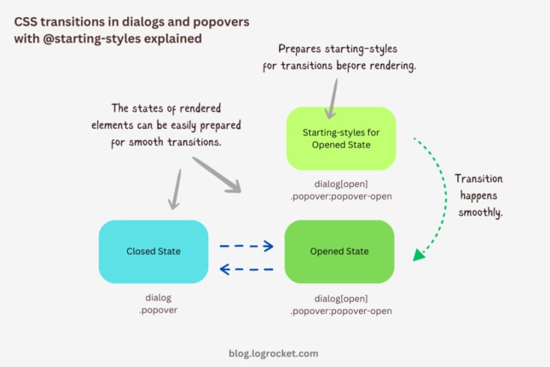
Advanced dialog animations with @starting-style
Let’s take it one step further by implementing different animations for dialog elements. The baseline remains the same: only the properties related to transformations and transitions will change.
Rotating-in-out dialogs
The idea behind creating a stylish rotating dialog box involves playing with the opacity and a couple of CSS transformation properties:
.my-dialog {
  transition: opacity 0.5s, translate 0.5s, rotate 0.5s,
              overlay 0.5s allow-discrete,
              display 0.5s allow-discrete;
}
The starting styles for the open state of the dialog include the following:
- Zero percent opacity to make it initially transparent
- A translation of -50 percent along the x-axis to shift the dialog from the center to the left
- A translation of -100 percent along the y-axis to move the dialog outside the visible viewport
- A rotation of -180 degrees to prepare it for positive rotation when opened
Here’s the code:
@starting-style {
  .my-dialog[open] {
    opacity: 0;
    translate: -50% -100%;
    rotate: -180deg;
  }
}
The closed state resembles the starting styles but with altered translations and rotations to reflect an opposite movement when exiting the dialog element:
.my-dialog {
  /* Previous styles */
  opacity: 0;
  translate: 50% 100%;
  rotate: 180deg;
}
The dialog element in the open state has 100 percent opacity, no translation on either axis, and no rotation, effectively positioning it at the center of the screen:
.my-dialog[open] {
  opacity: 1;
  translate: 0 0;
  rotate: 0deg;
}
The final output looks something like below:
See the Pen HTML5 Dialog and popover rotating animation by Rahul (@_rahul) on CodePen.
Bouncing in-out dialogs
To create a bouncing effect without using CSS keyframe animations, we can utilize a Bezier curve as the transition-timing function for the transformation and opacity transitions of our dialog. We’ll use the scale transformation for this effect.
Feel free to experiment with different x1, y1, x2, and y2 values for the Bezier curve, and implement them in your animation projects:
.my-dialog {
  transition: opacity 0.4s cubic-bezier(0.4, 1.6, 0.4, 0.8),
              scale 0.4s cubic-bezier(0.4, 1.6, 0.4, 0.8),
              overlay 0.4s allow-discrete,
              display 0.4s allow-discrete;
}
Now we can easily determine the starting styles and the open and closed states. The initial styles for the open and closed states will be the same — the dialog box will be scaled down to zero and completely transparent.
In the open state, the dialog box will have 100 percent opacity and be scaled to one. The rest of the transition effects will be handled by the Bezier curve-powered transitions:
@starting-style {
  .my-dialog[open] {
    opacity: 0;
    scale: 0;
  }
}

.my-dialog {
  opacity: 0;
  scale: 0;

  &[open] {
    opacity: 1;
    scale: 1;
  }
}
Here’s how this looks in action:
See the Pen HTML5 Dialog and popover bouncing animation by Rahul (@_rahul) on CodePen.
Sliding and bouncing dialogs
We will use the same Bezier curve in this animation to keep things simple, but the effect will be different compared to the previous one. The idea is to translate the dialogue along the y-axis instead of scaling it, as we did with the last effect:
.my-dialog {
  transition:
    opacity 0.5s cubic-bezier(0.4, 1.6, 0.4, 0.8),
    translate 0.5s cubic-bezier(0.4, 1.6, 0.4, 0.8),
    overlay 0.5s allow-discrete,
    display 0.5s allow-discrete;
}
The idea is to keep the dialog way up the viewport on the y-axis initially. Then, we will transform the dialog to zero when it is opened and finally translate it down the axis:
@starting-style {
  .my-dialog[open] {
    opacity: 0;
    translate: 0 -200%;
  }
}

.my-dialog {
  opacity: 0;
  translate: 0 200%;

  &[open] {
    opacity: 1;
    translate: 0 0;
  }
}
Instead of applying a 100 percent positive or negative translation, I doubled it to create the impression of urgency in the dialog box. See it in action below:
See the Pen HTML5 Dialog and popover slide-up-down bouncing animation by Rahul (@_rahul) on CodePen.
Subtle popover animations with @starting-style
The above effects suit the dialog elements well, but they won’t look great with the popover elements. This section is dedicated to some nice popover animation effects, which make the popover look like popovers and nothing more.
Rising-sinking popover
This effect resembles the popover effect we created initially. In that example, the popover appeared from the top and slide-fading down the y-axis, which isn’t what you’d expect from a popup in the bottom-right corner of the viewport.
Let’s rectify that by adding the same translation on the y-axis for the starting styles and the close state. Everything else remains unchanged:
See the Pen Rising up and down popover animation by Rahul (@_rahul) on CodePen.
Growing and shrinking popover
The process of creating a growing and shrinking effect is simple and involves the use of scale transformation with a twist.
By setting the transformation origin to the absolute bottom-right, we can ensure that the popover expands from the right, aligning with its current position at the bottom-right.
See the Pen Growing and shrinking popover animation by Rahul (@_rahul) on CodePen.
The toast popover
This technique is commonly used to create animations for notification toasts. To achieve this effect, you simply need to translate the popover element 100 percent to the right, putting it out of the viewport. Then, in the open state, you can translate it back to zero to complete the effect.
See the Pen Slide in out from right popover animation by Rahul (@_rahul) on CodePen.
Conclusion
We learned about incorporating CSS transition-based animations in dialog and popover elements using pure CSS. We discussed the complexities and issues of traditional transitioning with overlay elements, and then we addressed these problems one by one using CSS keyframes and, more importantly, the @starting-style at-rule, which is specially developed for transitions.
However, the @starting-style feature is fairly new and not yet available globally. Consequently, using CSS keyframes and the Web Animation API is an option that makes sense in production and provides more granular control over adding animation effects.
Having said that, I recommend the @starting-style approach once it gets adopted widely to keep things simple and lightweight with CSS transition applications.
Is your frontend hogging your users' CPU?
As web frontends get increasingly complex, resource-greedy features demand more and more from the browser. If you’re interested in monitoring and tracking client-side CPU usage, memory usage, and more for all of your users in production, try LogRocket.
LogRocket is like a DVR for web and mobile apps, recording everything that happens in your web app, mobile app, or website. Instead of guessing why problems happen, you can aggregate and report on key frontend performance metrics, replay user sessions along with application state, log network requests, and automatically surface all errors.
Modernize how you debug web and mobile apps — start monitoring for free.
-
 \“(1)vs.(;;):编译器优化是否消除了性能差异?\”使用(1)而不是(;;)会导致无限循环的性能差异? 现代编译器,(1)和(;;)之间没有性能差异。 是如何实现这些循环的技术分析在编译器中: perl: S-> 7 8 unstack v-> 4 -e语法ok 在GCC中,两者都循环到相同的汇编代码中,如下所示:。 globl t_时 t_时...编程 发布于2025-02-07
 -
如何克服PHP的功能重新定义限制?克服PHP的函数重新定义限制在PHP中,多次定义一个相同名称的函数是一个no-no。尝试这样做,如提供的代码段所示,将导致可怕的“不能重新列出”错误。 // error:“ coss redeclare foo()” 但是,php工具腰带中有一个隐藏的宝石:runkit扩展。它使您能够灵活地...编程 发布于2025-02-07
-
如何修复\“常规错误:2006 MySQL Server在插入数据时已经消失\”?插入记录时如何解决“一般错误:2006 MySQL 服务器已消失”介绍:将数据插入 MySQL 数据库有时会导致错误“一般错误:2006 MySQL 服务器已消失”。当与服务器的连接丢失时会出现此错误,通常是由于 MySQL 配置中的两个变量之一所致。解决方案:解决此错误的关键是调整wait_tim...编程 发布于2025-02-07
-
版本5.6.5之前,使用current_timestamp与时间戳列的current_timestamp与时间戳列有什么限制?在默认值中使用current_timestamp或mysql版本中的current_timestamp或在5.6.5 这种限制源于遗产实现的关注,这些限制需要为Current_timestamp功能提供特定的实现。消息和相关问题 `Productid` int(10)unsigned not ...编程 发布于2025-02-07
-
在保持其内容完整时,如何删除DIV元素?在保留其元素 display:cottents; display:cottents; cottents;在这种情况下是理想的选择。它导致元素的孩子出现为父母的直接子女,无视元素本身。当使用CSS网格或其他应该忽略包装元素的布局技术时,这是有价值的。 。容器{ 显示:Flex; } 。一 {...编程 发布于2025-02-07
-
可以在纯CS中将多个粘性元素彼此堆叠在一起吗?</main> <section> ,但无法使其正常工作,如您所见。任何洞察力都将不胜感激! display:grid; { position:sticky; top:1em; z-index:1 1 ; { { { pos...编程 发布于2025-02-07
-
我可以在CSS中使用SVG作为伪元素吗?使用svgs用作pseudo-element content css content properts允许在使用元素之前或之后使用元素插入各种类型的内容伪元素,例如::之前和::之后。但是,对可以包括哪些内容有限制。可以将svgs用作pseudo-element Content?,现在可以使用s...编程 发布于2025-02-07
-
如何限制动态大小的父元素中元素的滚动范围?在交互式界面中实现垂直滚动元素的CSS高度限制 考虑一个布局,其中我们具有与可滚动的映射div一起移动的subollable map div用户的垂直滚动,同时保持其与固定侧边栏的对齐方式。但是,地图的滚动无限期扩展,超过了视口的高度,阻止用户访问页面页脚。 可以限制地图的滚动,我们可以利用CSS...编程 发布于2025-02-07
-
如何在整个HTML文档中设计特定元素类型的第一个实例?[2单独使用CSS,整个HTML文档可能是一个挑战。 the:第一型伪级仅限于与其父元素中类型的第一个元素匹配。 以下CSS将使用添加的类样式的第一个段落: }编程 发布于2025-02-07
-
如何使用PHP将斑点(图像)正确插入MySQL?在尝试将image存储在mysql数据库中时,您可能会遇到一个可能会遇到问题。本指南将提供成功存储您的图像数据的解决方案。 easudy values('$ this-> image_id','file_get_contents($ tmp_image)...编程 发布于2025-02-07
-
如何使用char_length()在mySQL中按字符串长度对数据进行排序?[2使用内置的char_length()function。 char_length()和length() 此查询将从指定的表中检索所有行,并基于上升顺序对它们进行排序指定列的字符长度。带有更长字符串的行将出现在结果的底部。编程 发布于2025-02-07
-
如何使用替换指令在GO MOD中解析模块路径差异?克服go mod中的模块路径差异 coreos/bbolt:github.com/coreos/ [email受保护]:解析go.mod:模块将其路径声明为:go.etcd.io/bbolt `要解决此问题,您可以在go.mod文件中使用替换指令。只需在go.mod的末尾添加以下行:[&& &...编程 发布于2025-02-07
-
如何在Java字符串中有效替换多个子字符串?利用正则表达式示例示例usage 接下来,您可以使用匹配器查找令牌的所有出现,并用相应的值替换它们: 一旦汇总正则表达式,搜索输入字符串通常非常快, 。此外,正则表达式还可以灵活地处理复杂的搜索模式,例如涉及括号和量词的模式。编程 发布于2025-02-07
-
为什么使用固定定位时,为什么具有100%网格板柱的网格超越身体?网格超过身体,用100%grid-template-columns 问题:考虑以下CSS和HTML: position:fixed; grid-template-columns:40%60%; grid-gap:5px; 背景:#eee; 当位置未固定时,网格将正确显示。但是,当...编程 发布于2025-02-07


学习中文
- 1 走路用中文怎么说?走路中文发音,走路中文学习
- 2 坐飞机用中文怎么说?坐飞机中文发音,坐飞机中文学习
- 3 坐火车用中文怎么说?坐火车中文发音,坐火车中文学习
- 4 坐车用中文怎么说?坐车中文发音,坐车中文学习
- 5 开车用中文怎么说?开车中文发音,开车中文学习
- 6 游泳用中文怎么说?游泳中文发音,游泳中文学习
- 7 骑自行车用中文怎么说?骑自行车中文发音,骑自行车中文学习
- 8 你好用中文怎么说?你好中文发音,你好中文学习
- 9 谢谢用中文怎么说?谢谢中文发音,谢谢中文学习
- 10 How to say goodbye in Chinese? 再见Chinese pronunciation, 再见Chinese learning


