
CSS로 연결된 글머리 기호를 만드는 방법
2024-07-30에 게시됨
 검색:481
기본 아이디어는 다음과 같습니다.
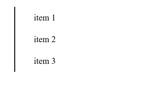
ul 또는 li 태그 아래에 세 개의 li 목록을 만듭니다.
- item 1
- item 2
- item 3
li 태그 위치를 상대적으로 설정합니다. 그리고 왼쪽 패딩을 줍니다
li {
  height: 40px;
  padding-left: 20px;
  display: flex;
  align-items: center;
  position: relative;
}
li::before CSS 속성을 사용하고 주위에 왼쪽 테두리를 만듭니다.
li::before {
  content: '';
  position: absolute;
  left: -16px;
  border-left: 2px solid black;
  height: 100%;
  width: 1px;
}
이제 li::after CSS 속성을 사용하고 그 주위에 세 개의 원을 만듭니다.
li::after {
  content: '';
  display: inline-block;
  height: 10px;
  width: 10px;
  border-radius: 50%;
  background-color: blue;
  margin-left: -80px;
}
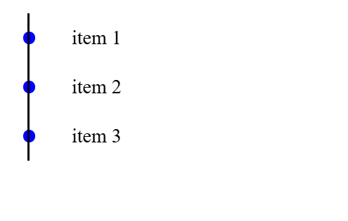
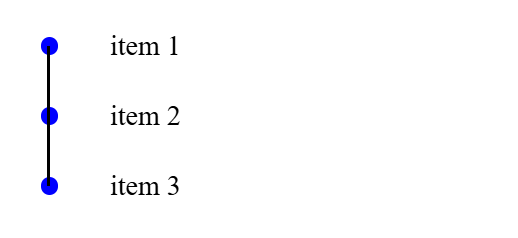
이제 마지막으로 첫 번째 목록과 마지막 목록에서 줄을 자릅니다.
li:first-child:before {
  top: 20px;
}

li:last-child:before {
  top: -20px;
}
및 결과:
전체 코드:
html:
- item 1
- item 2
- item 3
css:
li {
  height: 40px;
  padding-left: 20px;
  display: flex;
  align-items: center;
  position: relative;
}

li::before {
  content: '';
  position: absolute;
  left: -16px;
  border-left: 2px solid black;
  height: 100%;
  width: 1px;
}

li::after {
  content: '';
  display: inline-block;
  height: 10px;
  width: 10px;
  border-radius: 50%;
  background-color: blue;
  margin-left: -80px;
}


li:first-child:before {
  top: 20px;
}

li:last-child:before {
  top: -20px;
}
릴리스 선언문
이 글은 https://dev.to/slimpython/how-to-make-linked-bullet-point-with-css-22c4?1에서 복제됩니다. 침해 내용이 있는 경우, [email protected]으로 연락하여 삭제하시기 바랍니다. 그것
최신 튜토리얼
더>
-
 Point-In-Polygon 감지에 더 효율적인 방법 : Ray Tracing 또는 Matplotlib \ 's Path.contains_points?Ray Tracing MethodThe ray tracing method intersects a horizontal ray from the point under examination with the polygon's sides. 교차로의 수를 계산하고 지점이 패...프로그램 작성 2025-04-01에 게시되었습니다
 -
유효한 코드에도 불구하고 PHP의 입력을 캡처하는 사후 요청이없는 이유는 무엇입니까?post request 오작동 주소 php action='' action = "프로그램 작성 2025-04-01에 게시되었습니다
-
자바 스크립트 객체의 키를 알파벳순으로 정렬하는 방법은 무엇입니까?object.keys (...) . .sort () . 정렬 된 속성을 보유 할 새 개체를 만듭니다. 정렬 된 키 어레이를 반복하고 리소셔 함수를 사용하여 원래 객체에서 새 객체에 해당 값과 함께 각 키를 추가합니다. 다음 코드는 프로세...프로그램 작성 2025-04-01에 게시되었습니다
-
선형 구배 배경에 줄무늬가있는 이유는 무엇이며 어떻게 고칠 수 있습니까?수직 지향적 구배의 경우, 신체 요소의 마진은 HTML 요소로 전파되어 8px 키가 큰 영역을 초래합니다. 그 후, 선형 등급은이 전체 높이에 걸쳐 확장되어 반복 패턴을 생성합니다. 솔루션 : 이 문제를 해결하기 위해 신체 요소에 충분한 높이가 있는지...프로그램 작성 2025-04-01에 게시되었습니다
-
열의 열이 다른 데이터베이스 테이블을 어떻게 통합하려면 어떻게해야합니까?다른 열이있는 결합 테이블 ] 는 데이터베이스 테이블을 다른 열로 병합하려고 할 때 도전에 직면 할 수 있습니다. 간단한 방법은 열이 적은 테이블의 누락 된 열에 null 값을 추가하는 것입니다. 예를 들어, 표 B보다 더 많은 열이있는 두 개의 테이블을...프로그램 작성 2025-04-01에 게시되었습니다
-
Homebrew에서 GO를 설정하면 명령 줄 실행 문제가 발생하는 이유는 무엇입니까?발생하는 문제를 해결하려면 다음을 수행하십시오. 1. 필요한 디렉토리 만들기 mkdir $ home/go mkdir -p $ home/go/src/github.com/user 2. 환경 변수 구성프로그램 작성 2025-04-01에 게시되었습니다
-
Java는 여러 반환 유형을 허용합니까 : 일반적인 방법을 자세히 살펴보십시오.public 목록 getResult (문자열 s); 여기서 foo는 사용자 정의 클래스입니다. 이 방법 선언은 두 가지 반환 유형을 자랑하는 것처럼 보입니다. 목록과 E. 그러나 이것이 사실인가? 일반 방법 : 미스터리 메소드는 단일...프로그램 작성 2025-04-01에 게시되었습니다
-
regex를 사용하여 PHP에서 괄호 안에서 텍스트를 추출하는 방법$ fullstring = "이 (텍스트)을 제외한 모든 것을 무시하는 것"; $ start = strpos ( ', $ fullstring); $ fullString); $ shortstring = substr ($ fulls...프로그램 작성 2025-04-01에 게시되었습니다
-
MySQL 오류 #1089 : 잘못된 접두사 키를 얻는 이유는 무엇입니까?오류 설명 [#1089- 잘못된 접두사 키 "는 테이블에서 열에 프리픽스 키를 만들려고 시도 할 때 나타날 수 있습니다. 접두사 키는 특정 접두사 길이의 문자열 열 길이를 색인화하도록 설계되었으며, 접두사를 더 빠르게 검색 할 수 있습니...프로그램 작성 2025-04-01에 게시되었습니다
-
McRypt에서 OpenSSL로 암호화를 마이그레이션하고 OpenSSL을 사용하여 McRypt 암호화 데이터를 해제 할 수 있습니까?질문 : McRypt에서 OpenSSL로 내 암호화 라이브러리를 업그레이드 할 수 있습니까? 그렇다면 어떻게? 대답 : 대답 : 예, McRypt에서 암호화 라이브러리를 OpenSSL로 업그레이드 할 수 있습니다. OpenSSL을 사용하여 McRyp...프로그램 작성 2025-04-01에 게시되었습니다
-
익명의 JavaScript 이벤트 처리기를 깨끗하게 제거하는 방법은 무엇입니까?익명 이벤트 리스너를 제거하는 데 익명의 이벤트 리스너 추가 요소를 추가하면 유연성과 단순성을 제공하지만 유연성과 단순성을 제공하지만, 그것들을 제거 할 시간이되면, 요소 자체를 교체하지 않고 도전 할 수 있습니다. 요소? element.addevent...프로그램 작성 2025-04-01에 게시되었습니다
-
PHP \의 기능 재정의 제한을 극복하는 방법은 무엇입니까?return $ a * $ b; } 그러나 PHP 도구 벨트에는 숨겨진 보석이 있습니다. runkit_function_rename () runkit_function_rename ( 'this', 'that'); run...프로그램 작성 2025-04-01에 게시되었습니다
-
SQLALCHEMY 필터 조항에서 'Flake8'플래킹 부울 비교가 된 이유는 무엇입니까?데이터베이스 테이블의 부울 필드 (Obsoleted)는 비 초소형 테스트 사례의 수를 결정하는 데 사용됩니다. 이 코드는 필터 절에서 테스트 케이스를 사용합니다. casenum = session.query (testcase) .filter (testcas...프로그램 작성 2025-04-01에 게시되었습니다
-
버전 5.6.5 이전에 MySQL의 Timestamp 열을 사용하여 current_timestamp를 사용하는 데 제한 사항은 무엇입니까?5.6.5 이전에 mysql 버전의 기본적으로 또는 업데이트 클로즈가있는 타임 스탬프 열의 제한 사항 5.6.5 5.6.5 이전에 mySQL 버전에서 Timestamp Holumn에 전적으로 기본적으로 한 제한 사항이 있었는데, 이는 제한적으로 전혀 ...프로그램 작성 2025-04-01에 게시되었습니다
-
PYTZ가 처음에 예상치 못한 시간대 오프셋을 표시하는 이유는 무엇입니까?import pytz pytz.timezone ( 'Asia/Hong_kong') std> discrepancy source 역사 전반에 걸쳐 변동합니다. PYTZ가 제공하는 기본 시간대 이름 및 오프...프로그램 작성 2025-04-01에 게시되었습니다


중국어 공부
- 1 "걷다"를 중국어로 어떻게 말하나요? 走路 중국어 발음, 走路 중국어 학습
- 2 "비행기를 타다"를 중국어로 어떻게 말하나요? 坐飞机 중국어 발음, 坐飞机 중국어 학습
- 3 "기차를 타다"를 중국어로 어떻게 말하나요? 坐火车 중국어 발음, 坐火车 중국어 학습
- 4 "버스를 타다"를 중국어로 어떻게 말하나요? 坐车 중국어 발음, 坐车 중국어 학습
- 5 운전을 중국어로 어떻게 말하나요? 开车 중국어 발음, 开车 중국어 학습
- 6 수영을 중국어로 뭐라고 하나요? 游泳 중국어 발음, 游泳 중국어 학습
- 7 자전거를 타다 중국어로 뭐라고 하나요? 骑自行车 중국어 발음, 骑自行车 중국어 학습
- 8 중국어로 안녕하세요를 어떻게 말해요? 你好중국어 발음, 你好중국어 학습
- 9 감사합니다를 중국어로 어떻게 말하나요? 谢谢중국어 발음, 谢谢중국어 학습
- 10 How to say goodbye in Chinese? 再见Chinese pronunciation, 再见Chinese learning


