I made a webcomic using HTML/CSS + AI…
When gen-AI started to emerge I was learning HTML/CSS. I saw all this and said: wait a minute, I could use CSS to make a comic with some AI tool. Overall I wasn't wrong, except that I predicted it would take me a couple of weeks and it turned out to take me 4 months. However, the result is pretty decent, I'm proud of the work and I learned A LOT doing it. So, let me tell you why and a taste of the how I did so:
1-FREE TOOLS: except if you choose to use a paid AI generator -that i recommend- all the rest you'll need is for free.
In my case, i used VS code and nothing but HTML & CSS. No need for more. All the fonts, assets and tools can be found for free.
Don't multiply things without necessity. These are two SUPER POWERFUL tools. Master it, and would be enough for a while to do it.

2-AUTOMATION: when you make a comic using html and css, you're coding a comic essentially. Then, you can harness the power of automation.
Speech bubbles, typos, layout...everything can be done at scale with a click, or a couple lines of code. I don't know if using web technologies for this purpose is going to grow, I suspect is a very idiosyncratic thing of my part. However, the results are spectacular.
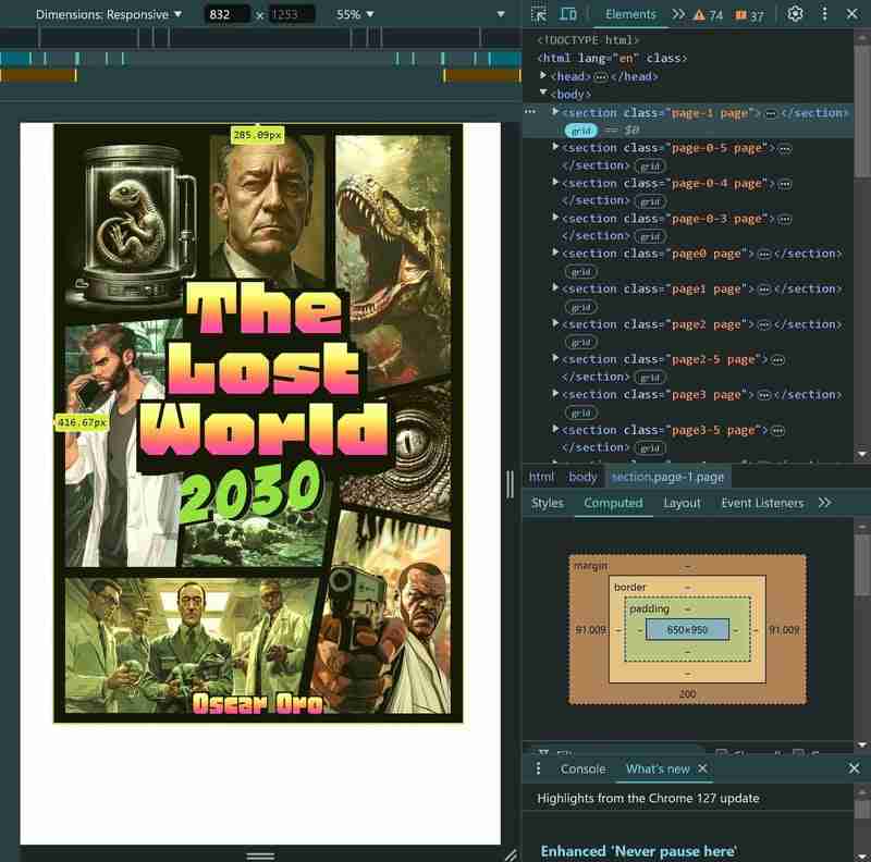
The next is a view of the cover of my comic in VS code. With DevTools you can control almost anything. It like if were made for this.

3-TRANSLATION: this is a big one. Because even if you use one of these no-code platforms to make your comic, you're losing this power of automation.
As far as I know (correct me if I am wrong), in all these platforms you create essentially some exportable file —PDF, JPG, DOC...— therefore, if the moment comes that you want to translate your comic into another languages you'll have to repeat the process over and over. My comic is about 264 pages, and believe me, even the seemingly simple task of copy/paste all the text in other language start to be INSURMOUNTABLE beyond... 20 pages? Not to say if you create hundreds.
If you use web technologies to make your comic, then you can leverage the power of your browser to make automatic translations with just a simple click. Almost magic.
My advice here is twofold. First, for translations, the best browser by far is chrome because has embedded the google translator and supports almost any language you can image (there are crazy ones...). Second, even if is automatic, you want to check every single page for quality control. This is because there are languages much more verbose than others, and this can vary dramatically the length of the speech bubbles and force sizes and positions you didn't set that destroy the style of the page.
An example of a page of the comic translated into traditional chinese:

A great attribute to know is the translate, that allows you to set to YES or NO. Let's say you don't want to translate certain words or sentences. You can set to NO and the browser won't perform the translation.
4- ONLINE PUBLICATION: What if you don't want to submit to the middle man and publish your comic online, say, in your personal web?
That's a great option. One of the experiences I get by doing this and publishing my comic is that platforms act like gate keepers —reasonable and even predictable— but NOT NECESSARY. And this is one of the beauties of the web, a decentralized medium, you can make your own web/platform and publish there your comic without having to pass the filters others impose in you —and believe me, there are a lot of filters, even in platforms that seem to be ideology-free like amazon.
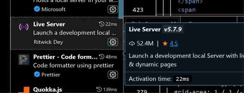
I used the Live Server extension in VS code to visualize the process on a local server.

5-PRACTICE HTML/CSS: this was on the top of my goals in doing this.
I wanted to practice html and css, specially get the hang on CSS GRID, and it was really an effective idea. Making the comic using these web languages gave the excuse to use if not everything, a great deal of what these languages can offer. In CSS i used variables, properties, layout, text styling... the amount what i learned is enormous and all the best part is that if was a fun process because i was doing this project that i like.
CSS GRID deserves an special mention. Since the beginning of CSS as a language, to style the HTML in order to make complex layouts was a real pain: positioning, margin tricks, layout tables... NO MORE. Making this comic is really a proof of the power of CSS Grid and what you can do with it.
When I started learning, I quickly realized that this tool is as if it were made for making comics. The level of precision, low-control that gives you is amazing and if feels natural and suited. It has a steep learning curve at the beginning, but after you get the hang on this, in the long run is really worth it. I would say is the central piece for doing a web-based comic in the simplest manner and is a great skill investment.
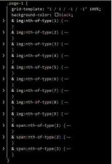
Here it is how it looks the CSS code of the comic's cover. I am selecting the .page-1 class and giving a position using the grid-template shorthand. I set the background of the page to black and the style all the images i have uploaded on the HTML file.

It was a really great and fun adventure (even when it took me more time than expected). Now I am a bit tired of front-end. Want to continue with back-end and make a cool full-stack project.
Check out the comic here
-
 How does Android send POST data to PHP server?Sending POST Data in AndroidIntroductionThis article addresses the need to send POST data to a PHP script and display the result in an Android applica...Programming Posted on 2025-03-25
 -
 Why Doesn't `body { margin: 0; }` Always Remove Top Margin in CSS?Addressing Body Margin Removal in CSSFor novice web developers, removing the margin of the body element can be a confusing task. Often, the code provi...Programming Posted on 2025-03-25
 -
 Python Read CSV File UnicodeDecodeError Ultimate SolutionUnicode Decode Error in CSV File ReadingWhen attempting to read a CSV file into Python using the built-in csv module, you may encounter an error stati...Programming Posted on 2025-03-25
 -
 How to Fix \"mysql_config not found\" Error When Installing MySQL-python on Ubuntu/Linux?MySQL-python Installation Error: "mysql_config not found"Attempting to install MySQL-python on Ubuntu/Linux Box may encounter an error messa...Programming Posted on 2025-03-25
 -
 How to Simplify JSON Parsing in PHP for Multi-Dimensional Arrays?Parsing JSON with PHPTrying to parse JSON data in PHP can be challenging, especially when dealing with multi-dimensional arrays. To simplify the proce...Programming Posted on 2025-03-25
 -
 Why Am I Getting a \"Class \'ZipArchive\' Not Found\" Error After Installing Archive_Zip on My Linux Server?Class 'ZipArchive' Not Found Error While Installing Archive_Zip on Linux ServerSymptom:When attempting to run a script that utilizes the ZipAr...Programming Posted on 2025-03-25
 -
 How Can I Efficiently Read a Large File in Reverse Order Using Python?Reading a File in Reverse Order in PythonIf you're working with a large file and need to read its contents from the last line to the first, Python...Programming Posted on 2025-03-25
 -
 How to Correctly Display the Current Date and Time in "dd/MM/yyyy HH:mm:ss.SS" Format in Java?How to Display Current Date and Time in "dd/MM/yyyy HH:mm:ss.SS" FormatIn the provided Java code, the issue with displaying the date and tim...Programming Posted on 2025-03-25
 -
 How Can I UNION Database Tables with Different Numbers of Columns?Combined tables with different columns] Can encounter challenges when trying to merge database tables with different columns. A straightforward way i...Programming Posted on 2025-03-25
 -
 Why Isn\'t My CSS Background Image Appearing?Troubleshoot: CSS Background Image Not AppearingYou've encountered an issue where your background image fails to load despite following tutorial i...Programming Posted on 2025-03-25
 -
 How Can I Maintain Custom JTable Cell Rendering After Cell Editing?Maintaining JTable Cell Rendering After Cell EditIn a JTable, implementing custom cell rendering and editing capabilities can enhance the user experie...Programming Posted on 2025-03-25
 -
 Can You Use CSS to Color Console Output in Chrome and Firefox?Displaying Colors in JavaScript ConsoleIs it possible to use Chrome's console to display colored text, such as red for errors, orange for warnings...Programming Posted on 2025-03-25
 -
 How to Send a Raw POST Request with cURL in PHP?How to Send a Raw POST Request Using cURL in PHPIn PHP, cURL is a popular library for sending HTTP requests. This article will demonstrate how to use ...Programming Posted on 2025-03-25
 -
 How to Parse JSON Arrays in Go Using the `json` Package?Parsing JSON Arrays in Go with the JSON PackageProblem: How can you parse a JSON string representing an array in Go using the json package?Code Exampl...Programming Posted on 2025-03-25
 -
 How Can I Synchronously Iterate and Print Values from Two Equal-Sized Arrays in PHP?Synchronously Iterating and Printing Values from Two Arrays of the Same SizeWhen creating a selectbox using two arrays of equal size, one containing c...Programming Posted on 2025-03-25
Study Chinese
- 1 How do you say "walk" in Chinese? 走路 Chinese pronunciation, 走路 Chinese learning
- 2 How do you say "take a plane" in Chinese? 坐飞机 Chinese pronunciation, 坐飞机 Chinese learning
- 3 How do you say "take a train" in Chinese? 坐火车 Chinese pronunciation, 坐火车 Chinese learning
- 4 How do you say "take a bus" in Chinese? 坐车 Chinese pronunciation, 坐车 Chinese learning
- 5 How to say drive in Chinese? 开车 Chinese pronunciation, 开车 Chinese learning
- 6 How do you say swimming in Chinese? 游泳 Chinese pronunciation, 游泳 Chinese learning
- 7 How do you say ride a bicycle in Chinese? 骑自行车 Chinese pronunciation, 骑自行车 Chinese learning
- 8 How do you say hello in Chinese? 你好Chinese pronunciation, 你好Chinese learning
- 9 How do you say thank you in Chinese? 谢谢Chinese pronunciation, 谢谢Chinese learning
- 10 How to say goodbye in Chinese? 再见Chinese pronunciation, 再见Chinese learning


