 Front page > Programming > From Typewriters to Pixels: A Journey with CMYK, RGB, and Building a Color Visualizer
From Typewriters to Pixels: A Journey with CMYK, RGB, and Building a Color Visualizer
When I was a kid, I published a fanzine about comics. This was long before I had a computer—it was created using a typewriter, paper, and scissors!
The fanzine was initially in black and white, photocopied at my school. Over time, as it gained more success, I was able to afford offset printing with color covers!
However, managing those colors was quite challenging. Each cover had to be printed four times, once for each color: cyan, magenta, yellow, and key (black) — abbreviated as CMYK.
This meant I had to provide four separate sheets, each printed in black ink, but corresponding to a specific color.
Here’s one of the issues I published:

All the yellow you see in the image above was hand-painted by me using black ink on the “yellow” sheet. For the skin tones, I used something called “raster dots.” These were sheets you could buy with black dots of varying densities. You would cut out the dots and apply them — in this case, to the “red” sheet.
I worked on a light table — a glass-topped drawing table with built-in lighting — so I could see through the various sheets while aligning them correctly.
It was very time-consuming, but it sparked a lifelong interest in understanding colors — and the huge difference between print- and screen colors!
While CMYK is limited to four colors, it’s still relatively easy to grasp. We’ve all used colored pencils on paper and have an intuitive sense of how colors mix. CMYK is a subtractive color model. You start with a white sheet of paper, and as you add more ink, you’re actually subtracting light. Combining all colors moves you toward black. If you don’t apply any ink, the paper stays white because it reflects all light.
When I got my first computer, I had to understand RGB, which is very different from CMYK. RGB is an additive color model used for digital screens. Here, you’re mixing light itself — adding more light makes the colors brighter and moves you toward white. Turn off all the RGB lights (R=0, G=0, B=0), and the screen goes black because there’s no light emitted.
As a graphic designer back then, you had to calibrate your screen because the colors you saw on the screen and those you saw in print were often very different!
Visualizing RGB
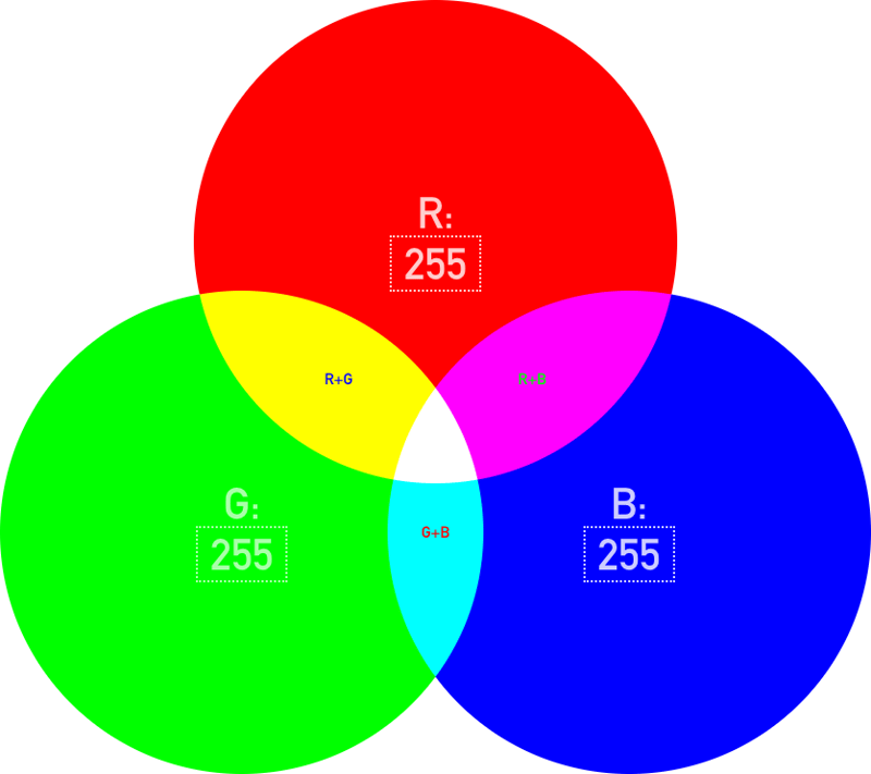
RGB represents three light sources: red, green, and blue. When a light is off, its value is 0; when it’s fully on, its value is 255. When these lights overlap, they create different colors.
To better understand how RGB works, let’s build a small tool:

HTML
Styles
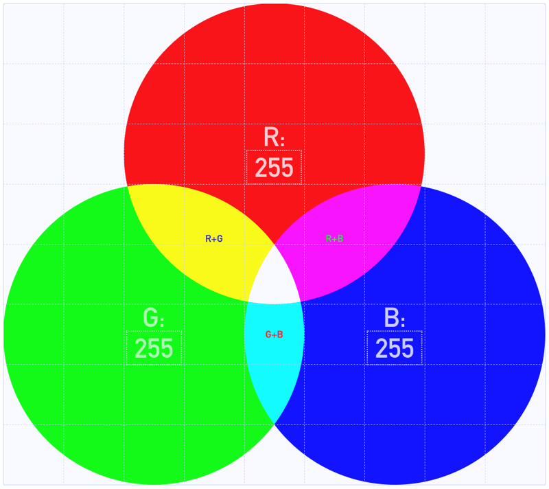
First, let’s create a 9x8 grid:
.rgb {
  all: unset;
  aspect-ratio: 9 / 8;
  container-type: inline-size;
  display: grid;
  font-size: 1.75cqi;
  grid-template-columns: repeat(9, 1fr);
  grid-template-rows: repeat(8, 1fr);
  width: 100%;
}
It’s an unusual size, but that's because our R, G and B circles are 5x5 and overlap:
.r, .g, .b {
  aspect-ratio: 1 / 1;
  border-radius: 50%;
  display: grid;
  font-size: 5cqi;
  mix-blend-mode: difference;
}
The CSS for .r, .g and .b is:
.r {
  background-color: rgb(var(--r), 0, 0);
  grid-area: 1 / 3 / 6 / 8;
}

.g {
  background-color: rgb(0, var(--g), 0);
  grid-area: 4 / 1 / 9 / 6;
}

.b {
  background-color: rgb(0, 0, var(--b));
  grid-area: 4 / 5 / 9 / 10;
}
I’ve used grid-area a lot lately. It lets you place a grid item at a very specific location:
row-start / col-start / row-end / col-end
It’s easier to visualize this if you enable Dev Tools’ grid visualizer:

Did you notice the three CSS Custom Properties, --r, --g and --b? We’ll update these in a small JS snippet:
const rgb = document.querySelector('.rgb');
rgb.addEventListener('input', e => {
  const N = e.target;
  document.body.style.setProperty(`--${N.name}`, N.value);
})
And that’s basically it. I’ve added some
mix-blend-mode: difference
Read about it here — it’s great fun to loop through all the modes.
Demo
Here’s a Codepen. Click and edit the numbers below R, G and B, and notice how the page background and the overlapping parts of all three circles change.
-
 How to efficiently insert data into multiple MySQL tables in one transaction?MySQL Insert into Multiple TablesAttempting to insert data into multiple tables with a single MySQL query may yield unexpected results. While it may s...Programming Posted on 2025-04-27
 -
 Why Does Microsoft Visual C++ Fail to Correctly Implement Two-Phase Template Instantiation?The Mystery of "Broken" Two-Phase Template Instantiation in Microsoft Visual C Problem Statement:Users commonly express concerns that Micro...Programming Posted on 2025-04-27
 -
 Python metaclass working principle and class creation and customizationWhat are Metaclasses in Python?Metaclasses are responsible for creating class objects in Python. Just as classes create instances, metaclasses create ...Programming Posted on 2025-04-27
 -
 How Can I Efficiently Read a Large File in Reverse Order Using Python?Reading a File in Reverse Order in PythonIf you're working with a large file and need to read its contents from the last line to the first, Python...Programming Posted on 2025-04-27
 -
 Why Isn\'t My CSS Background Image Appearing?Troubleshoot: CSS Background Image Not AppearingYou've encountered an issue where your background image fails to load despite following tutorial i...Programming Posted on 2025-04-27
 -
 How to deal with sliced memory in Go language garbage collection?Garbage Collection in Go Slices: A Detailed AnalysisIn Go, a slice is a dynamic array that references an underlying array. When working with slices, i...Programming Posted on 2025-04-27
 -
 Reasons why Python does not report errors to the slicing of the hyperscope substringSubstring Slicing with Index Out of Range: Duality and Empty SequencesIn Python, accessing elements of a sequence using the slicing operator, such as ...Programming Posted on 2025-04-27
 -
 How to Handle User Input in Java's Full-Screen Exclusive Mode?Handling User Input in Full Screen Exclusive Mode in JavaIntroductionWhen running a Java application in full screen exclusive mode, the usual event ha...Programming Posted on 2025-04-27
 -
 Why do Lambda expressions require "final" or "valid final" variables in Java?Lambda Expressions Require "Final" or "Effectively Final" VariablesThe error message "Variable used in lambda expression shou...Programming Posted on 2025-04-27
 -
 How to dynamically access global variables in JavaScript?Accessing Global Variables Dynamically by Name in JavaScriptGetting access to global variables during runtime can be a common requirement. Typically, ...Programming Posted on 2025-04-27
 -
 Can You Use CSS to Color Console Output in Chrome and Firefox?Displaying Colors in JavaScript ConsoleIs it possible to use Chrome's console to display colored text, such as red for errors, orange for warnings...Programming Posted on 2025-04-27
 -
 How to solve the error "Cannot guess file type, use application/octet-stream..." in AppEngine?AppEngine Static File MIME Type OverrideIn AppEngine, static file handlers can occasionally override the correct MIME type, resulting in the error mes...Programming Posted on 2025-04-27
 -
 How to get the actual rendered font in JavaScript when the CSS font attribute is undefined?Accessing Actual Rendered Font when Undefined in CSSWhen accessing the font properties of an element, the JavaScript object.style.fontFamily and objec...Programming Posted on 2025-04-27
 -
 How Can I Execute Multiple SQL Statements in a Single Query Using Node-MySQL?Multi-Statement Query Support in Node-MySQLIn Node.js, the question arises when executing multiple SQL statements in a single query using the node-mys...Programming Posted on 2025-04-27
 -
 Guide to Solve CORS Issues in Spring Security 4.1 and aboveSpring Security CORS Filter: Troubleshooting Common IssuesWhen integrating Spring Security into an existing project, you may encounter CORS-related er...Programming Posted on 2025-04-27
Study Chinese
- 1 How do you say "walk" in Chinese? 走路 Chinese pronunciation, 走路 Chinese learning
- 2 How do you say "take a plane" in Chinese? 坐飞机 Chinese pronunciation, 坐飞机 Chinese learning
- 3 How do you say "take a train" in Chinese? 坐火车 Chinese pronunciation, 坐火车 Chinese learning
- 4 How do you say "take a bus" in Chinese? 坐车 Chinese pronunciation, 坐车 Chinese learning
- 5 How to say drive in Chinese? 开车 Chinese pronunciation, 开车 Chinese learning
- 6 How do you say swimming in Chinese? 游泳 Chinese pronunciation, 游泳 Chinese learning
- 7 How do you say ride a bicycle in Chinese? 骑自行车 Chinese pronunciation, 骑自行车 Chinese learning
- 8 How do you say hello in Chinese? 你好Chinese pronunciation, 你好Chinese learning
- 9 How do you say thank you in Chinese? 谢谢Chinese pronunciation, 谢谢Chinese learning
- 10 How to say goodbye in Chinese? 再见Chinese pronunciation, 再见Chinese learning


