Simple Image Comparison in CSS
Simple trick for Image Comparison in CSS

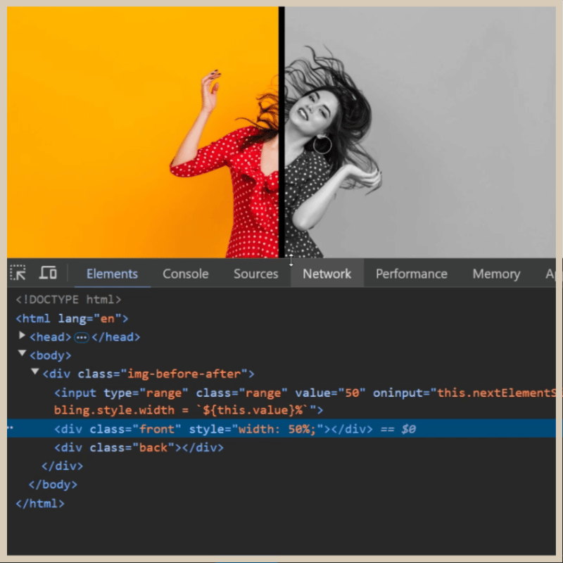
Lets create input range slider and and two divs below it with class names .front, .back inside parent div with class name '.img-before-after'. Assign inline style width:50% to .front div
Create CSS for img-before-after, input-range, input-slider-thumb, front, back
body {
    background: #d6d6d6;
}

.img-before-after {
    position: relative;
    width: 900px;
    height: 600px;
}

input[type="range"] {
    background: transparent;
    width: 100%;
    height: 100%;
    margin: 0;
    outline: none;
    position: absolute;
    z-index: 2;
    -webkit-appearance: none;
}

input[type="range"]::-webkit-slider-thumb {
    width: 10px;
    height: 600px;
    cursor: pointer;
    -webkit-appearance: none;
    background: black;
}
Add background image for both .front and .back divs.
.front, .back {
    position: absolute;
    width: 100%;
    height: 600px;
    background: url("https://shorturl.at/kbKhz") no-repeat;
    background-size: cover;
    z-index: 1;
}
Lets send .back div behind .front div with z-index and make it grayscale.
.back {
    filter: grayscale(1);
    z-index: 0;
}
We need to increase/decrease the width of '.front' div dynamically when we drag the input slider. We have to append the input range value to width of '.front' div.
oninput="this.nextElementSibling.style.width = `${this.value}%`"
Output:

Below you can watch how the width is increasing and decreasing in dev tools when we drag the slider range.

You can try with different variations in CSS like blur, invert etc like below.
blur
.back {
    filter: blur(5px);
    z-index: 0;
}

invert
.back {
    filter: invert(1);
    z-index: 0;
}

Final Output: with grayscale

Thank you for watching...
-
 How to Correctly Display the Current Date and Time in "dd/MM/yyyy HH:mm:ss.SS" Format in Java?How to Display Current Date and Time in "dd/MM/yyyy HH:mm:ss.SS" FormatIn the provided Java code, the issue with displaying the date and tim...Programming Posted on 2025-04-09
 -
 How Can I Handle UTF-8 Filenames in PHP's Filesystem Functions?Handling UTF-8 Filenames in PHP's Filesystem FunctionsWhen creating folders containing UTF-8 characters using PHP's mkdir function, you may en...Programming Posted on 2025-04-09
 -
 How to Handle User Input in Java's Full-Screen Exclusive Mode?Handling User Input in Full Screen Exclusive Mode in JavaIntroductionWhen running a Java application in full screen exclusive mode, the usual event ha...Programming Posted on 2025-04-09
 -
 Why Doesn't `body { margin: 0; }` Always Remove Top Margin in CSS?Addressing Body Margin Removal in CSSFor novice web developers, removing the margin of the body element can be a confusing task. Often, the code provi...Programming Posted on 2025-04-09
 -
 How to Redirect Multiple User Types (Students, Teachers, and Admins) to Their Respective Activities in a Firebase App?Red: How to Redirect Multiple User Types to Respective ActivitiesUnderstanding the ProblemIn a Firebase-based voting app with three distinct user type...Programming Posted on 2025-04-09
 -
 Why Does Microsoft Visual C++ Fail to Correctly Implement Two-Phase Template Instantiation?The Mystery of "Broken" Two-Phase Template Instantiation in Microsoft Visual C Problem Statement:Users commonly express concerns that Micro...Programming Posted on 2025-04-09
 -
 How to Resolve the \"Invalid Use of Group Function\" Error in MySQL When Finding Max Count?How to Retrieve the Maximum Count Using MySQLIn MySQL, you may encounter an issue while attempting to find the maximum count of values grouped by a sp...Programming Posted on 2025-04-09
 -
 How to upload files with additional parameters using java.net.URLConnection and multipart/form-data encoding?Uploading Files with HTTP RequestsTo upload files to an HTTP server while also submitting additional parameters, java.net.URLConnection and multipart/...Programming Posted on 2025-04-09
 -
 How to Capture and Stream stdout in Real Time for Chatbot Command Execution?Capturing stdout in Real Time from Command ExecutionIn the realm of developing chatbots capable of executing commands, a common requirement is the abi...Programming Posted on 2025-04-09
 -
 Why Doesn\'t Firefox Display Images Using the CSS `content` Property?Displaying Images with Content URL in FirefoxAn issue has been encountered where certain browsers, specifically Firefox, fail to display images when r...Programming Posted on 2025-04-09
 -
 How to Create a Smooth Left-Right CSS Animation for a Div Within Its Container?Generic CSS Animation for Left-Right MovementIn this article, we'll explore creating a generic CSS animation to move a div left and right, reachin...Programming Posted on 2025-04-09
 -
 Which Method for Declaring Multiple Variables in JavaScript is More Maintainable?Declaring Multiple Variables in JavaScript: Exploring Two MethodsIn JavaScript, developers often encounter the need to declare multiple variables. Two...Programming Posted on 2025-04-09
 -
 How Can I Efficiently Create Dictionaries Using Python Comprehension?Python Dictionary ComprehensionIn Python, dictionary comprehensions offer a concise way to generate new dictionaries. While they are similar to list c...Programming Posted on 2025-04-09
 -
 Can You Use CSS to Color Console Output in Chrome and Firefox?Displaying Colors in JavaScript ConsoleIs it possible to use Chrome's console to display colored text, such as red for errors, orange for warnings...Programming Posted on 2025-04-09
 -
 How does Android send POST data to PHP server?Sending POST Data in AndroidIntroductionThis article addresses the need to send POST data to a PHP script and display the result in an Android applica...Programming Posted on 2025-04-09
Study Chinese
- 1 How do you say "walk" in Chinese? 走路 Chinese pronunciation, 走路 Chinese learning
- 2 How do you say "take a plane" in Chinese? 坐飞机 Chinese pronunciation, 坐飞机 Chinese learning
- 3 How do you say "take a train" in Chinese? 坐火车 Chinese pronunciation, 坐火车 Chinese learning
- 4 How do you say "take a bus" in Chinese? 坐车 Chinese pronunciation, 坐车 Chinese learning
- 5 How to say drive in Chinese? 开车 Chinese pronunciation, 开车 Chinese learning
- 6 How do you say swimming in Chinese? 游泳 Chinese pronunciation, 游泳 Chinese learning
- 7 How do you say ride a bicycle in Chinese? 骑自行车 Chinese pronunciation, 骑自行车 Chinese learning
- 8 How do you say hello in Chinese? 你好Chinese pronunciation, 你好Chinese learning
- 9 How do you say thank you in Chinese? 谢谢Chinese pronunciation, 谢谢Chinese learning
- 10 How to say goodbye in Chinese? 再见Chinese pronunciation, 再见Chinese learning


