Sharing UI Components: Copy VS Install
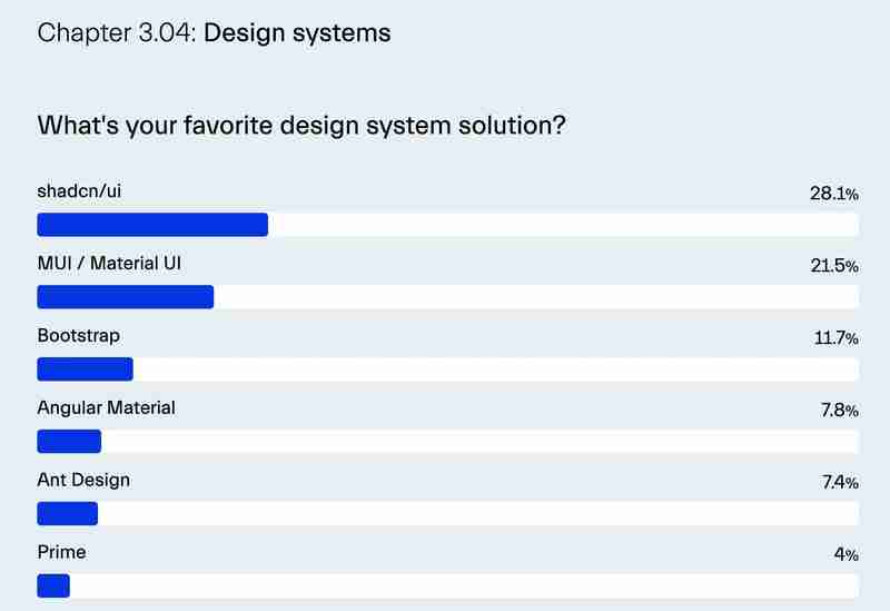
In recent years, there's been a noticeable shift in how developers approach UI libraries, moving away from installing entire component libraries via npm packages and toward directly copy-pasting the code into their codebase.
This trend has been largely popularized by Shadcn/UI, a library that provides developers with ready-made, customizable components that can be copied directly into a project for maximum flexibility.
Why Copying Wins for Complex Components
The copy-paste approach shines, particularly for complex UI elements such as authentication pages, detailed dashboards, or intricate data visualizations. These components require fine-tuned customization that’s difficult to achieve through immutable npm packages.
Instead of overwhelming the library’s API with endless configuration options, this approach allows developers to leverage the composable and declarative nature of modern frontend frameworks, enabling greater control over every part of the component.
Instead of long and complex CSS selectors, you can directly apply styles to elements in a component. Instead of injecting components using a complex dependency injection logic, you simply place or rearrange components however you choose.

An interactive shadcnui chart on Bit Platform
This approach has gained even greater significance with the introduction of AI coding assistants. Instead of generating components from scratch through AI with long, complex prompts — or engaging in a lengthy conversation with the assistant — you can begin with a pre-built composition close to what you need.
By embedding the code into your project, you give the AI assistant a specific, tangible context. From there, you can ask it to make incremental adjustments, such as tweaking styles, adding accessibility features, or changing the layout.
Bit Components: Packages that you can directly edit
Bit has introduced a new entity to the world of web development: The Bit Component. In short, a Bit component can be thought of as a super-package. You can share it, install it, copy it, and even collaborate on it independently of any particular project setup.
For simplicity, we can divide UI components into two groups: design system components and block components. In the design system, basic components like Card are fundamental building blocks. Meanwhile, block components, such as a MediaCard, are composed of design system elements but offer more advanced functionality.
Choice 1: Composing with Design System Components
When creating a new component, the first option is to compose from your design system. For instance, to build a custom card, you may need to combine components like Card, Button, and Typography.
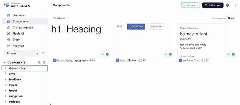
MUI-based components shared on the Bit Platform
These components can be installed in your project through npm, pnpm, yarn, or Bit’s installation:
npm i @bitdesign/material-ui.surfaces.card bitdesign.material-ui/inputs/button @bitdesign/material-ui.data-display.typography
Choice 2: Utilizing Block Components
When opting for a pre-built block component, you have several flexible choices beyond simple installation.
The easiest route is to install the component package directly and use its API. This approach works well if the component fits your needs out of the box or requires only minor tweaks.
For scenarios where you need to make extensive changes, Bit’s fork command allows you to copy the component’s full code into your project. This includes source files, dependencies, and configurations (including the component’s dev tools).

https://bit.cloud/learnbit-react/material-ui-blocks/content/media-card
For example, to copy the MediaCard component and its configuration, we’ll run bit fork and pass its component ID (not package name) as an argument:
bit fork learnbit-react.material-ui-blocks/content/media-card
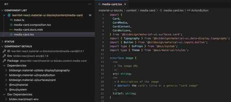
It’s worth noting that Bit also provides the bit import command, which allows you to create changes to the component and release a new version. This option requires that you have the proper permissions to modify the component (unlike the bit fork command, which does not affect the original component).
Ejecting dependencies’ source files
When forking components with dependencies, Bit auto-installs them for convenience. However, if you need direct access to the source code of a dependency, you can also fork those dependencies.
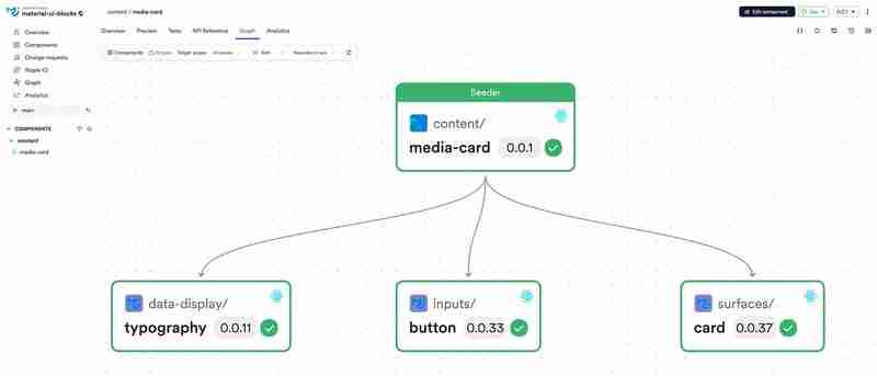
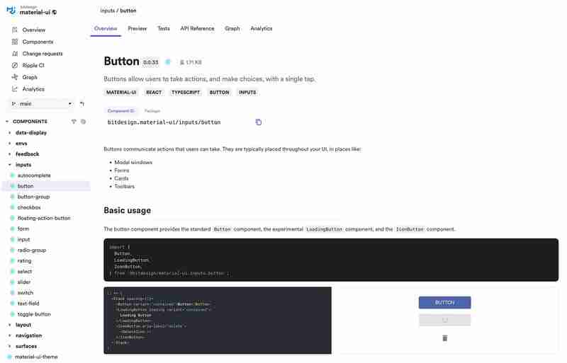
For instance, if you want to copy the Button component, you can fork it as well from your team’s collection on Bit Platform:
bit fork bitdesign.material-ui/inputs/button
-
 How do I combine two associative arrays in PHP while preserving unique IDs and handling duplicate names?Combining Associative Arrays in PHPIn PHP, combining two associative arrays into a single array is a common task. Consider the following request:Descr...Programming Published on 2024-12-27
 -
 How to Fix \"ImproperlyConfigured: Error loading MySQLdb module\" in Django on macOS?MySQL Improperly Configured: The Problem with Relative PathsWhen running python manage.py runserver in Django, you may encounter the following error:I...Programming Published on 2024-12-27
 -
 How Can I Find Users with Today\'s Birthdays Using MySQL?How to Identify Users with Today's Birthdays Using MySQLDetermining if today is a user's birthday using MySQL involves finding all rows where ...Programming Published on 2024-12-27
 -
 Using WebSockets in Go for Real-Time CommunicationBuilding apps that require real-time updates—like chat applications, live notifications, or collaborative tools—requires a communication method faster...Programming Published on 2024-12-27
 -
 Beyond `if` Statements: Where Else Can a Type with an Explicit `bool` Conversion Be Used Without Casting?Contextual Conversion to bool Allowed Without a CastYour class defines an explicit conversion to bool, enabling you to use its instance 't' di...Programming Published on 2024-12-27
 -
 What Happened to Column Offsetting in Bootstrap 4 Beta?Bootstrap 4 Beta: The Removal and Restoration of Column OffsettingBootstrap 4, in its Beta 1 release, introduced significant changes to the way column...Programming Published on 2024-12-27
 -
 How Can I Accurately Pivot Data with Distinct Records to Avoid Losing Information?Pivoting Distinct Records EffectivelyPivot queries play a crucial role in transforming data into a tabular format, enabling easy data analysis. Howeve...Programming Published on 2024-12-27
 -
 Why Do C and C++ Ignore Array Lengths in Function Signatures?Passing Arrays to Functions in C and C Question:Why do C and C compilers allow array length declarations in function signatures, such as int dis(ch...Programming Published on 2024-12-26
 -
 How Can I Remove Accents in MySQL to Improve Autocomplete Search?Removing Accents in MySQL for Efficient Auto-Complete SearchWhen managing a large database of place names, it's crucial to ensure accurate and eff...Programming Published on 2024-12-26
 -
 How to Implement Composite Foreign Keys in MySQL?Implementing Composite Foreign Keys in SQLOne common database design involves establishing relationships between tables using composite keys. A compos...Programming Published on 2024-12-26
 -
 Why Are My JComponents Hidden Behind a Background Image in Java?Debugging JComponents Hidden by Background ImageWhen working with JComponents, such as JLabels, in a Java application, it's essential to ensure pr...Programming Published on 2024-12-26
 -
 How to Convert All Types of Smart Quotes in PHP?Convert All Types of Smart Quotes in PHPSmart quotes are typographic marks used in place of regular straight quotes (' and "). They give a mo...Programming Published on 2024-12-26
 -
 What are the Different Ways to Loop Through a JavaScript Array?Looping Through an Array Using JavaScriptIterating through the elements of an array is a common task in JavaScript. There are several approaches avail...Programming Published on 2024-12-26
 -
 How to Efficiently Pause Selenium WebDriver Execution in Python?Waiting and Conditional Statements in Selenium WebDriverQuestion: How can I pause Selenium WebDriver execution for milliseconds in Python?Answer:While...Programming Published on 2024-12-26
 -
 Should C++ Assignment Operators Be Virtual?Virtual Assignment Operator and Its Necessities in C While assignment operators can be defined as virtual in C , it's not a mandatory requiremen...Programming Published on 2024-12-26
Study Chinese
- 1 How do you say "walk" in Chinese? 走路 Chinese pronunciation, 走路 Chinese learning
- 2 How do you say "take a plane" in Chinese? 坐飞机 Chinese pronunciation, 坐飞机 Chinese learning
- 3 How do you say "take a train" in Chinese? 坐火车 Chinese pronunciation, 坐火车 Chinese learning
- 4 How do you say "take a bus" in Chinese? 坐车 Chinese pronunciation, 坐车 Chinese learning
- 5 How to say drive in Chinese? 开车 Chinese pronunciation, 开车 Chinese learning
- 6 How do you say swimming in Chinese? 游泳 Chinese pronunciation, 游泳 Chinese learning
- 7 How do you say ride a bicycle in Chinese? 骑自行车 Chinese pronunciation, 骑自行车 Chinese learning
- 8 How do you say hello in Chinese? 你好Chinese pronunciation, 你好Chinese learning
- 9 How do you say thank you in Chinese? 谢谢Chinese pronunciation, 谢谢Chinese learning
- 10 How to say goodbye in Chinese? 再见Chinese pronunciation, 再见Chinese learning


