How to Remove Arrow on Input type Number with Tailwind CSS
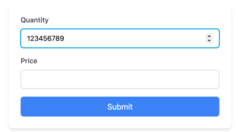
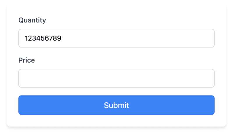
When designing forms with Tailwind CSS, you might want to remove the default arrows (also known as spinners) from number input fields. These arrows can interfere with custom designs and are challenging to style consistently across different browsers.
In this tutorial, we'll explore how to achieve this using Tailwind CSS, both with inline styles and through a global CSS approach.
The Problem
By default, browsers add increment and decrement arrows to elements. While functional, these arrows often clash with custom designs and can be difficult to style uniformly across various browsers.

The Solution
We'll use Tailwind CSS utility classes to remove these arrows and create clean, customized number inputs. We'll also look at how to apply this styling globally for larger projects.
Inline Approach
Let's start with an example that uses inline Tailwind classes:
The key classes for removing the arrows are:
- [appearance:textfield]: Removes default styling in Firefox.
- [&::-webkit-outer-spin-button]:appearance-none: Removes outer spin button in WebKit browsers.
- [&::-webkit-inner-spin-button]:appearance-none: Removes inner spin button in WebKit browsers.

Global Approach
For larger projects, you might want to apply this styling to all number inputs. You can do this by adding styles to your global CSS file:
Open your global.css file (or equivalent, like app.css or styles.css) depending on your framework and setup.
Add the following CSS:
/* In your global.css file */
@layer utilities {
  input[type="number"]::-webkit-inner-spin-button,
  input[type="number"]::-webkit-outer-spin-button {
    -webkit-appearance: none;
    margin: 0;
  }

  input[type="number"] {
    -moz-appearance: textfield;
  }
}
- Ensure this CSS file is imported in your main Tailwind CSS file or included in your HTML.
After adding these global styles, you can simplify your HTML:
Notice that we've removed the arrow-removing classes from individual inputs, as they're now handled by the global CSS.
Adding Custom Arrows
While removing default arrows improves design consistency, you may want to add custom increment/decrement buttons for better user experience. Here's how to create custom arrows that match our form's design:
Let's break down the key components of this implementation:
We wrap the input in a relative-positioned div to allow absolute positioning of our custom buttons.
The input field retains its original styling, including the classes to remove default arrows:
[appearance:textfield] [&::-webkit-outer-spin-button]:appearance-none [&::-webkit-inner-spin-button]:appearance-none
- We add a div with absolute positioning to contain our custom buttons:
This positions the buttons on the right side of the input and centers them vertically.
- Each button is styled to blend with the input:
- h-full makes the button fill the height of the input.
- border-l adds a subtle separator between buttons.
- text-gray-500 and hover:text-sky-500 provide a color change on hover that matches our form's focus state.
We use SVG icons for the up and down arrows, sized appropriately with w-4 h-4.
The onclick events use JavaScript's stepUp() and stepDown() methods to change the input value:
onclick="document.getElementById('quantity').stepUp()" onclick="document.getElementById('quantity').stepDown()"Important Considerations
There are a few things that you should consider:
Removing arrows may affect users who rely on them. Consider providing alternative increment/decrement methods if necessary.
This solution works in modern browsers. Older browsers may require additional CSS or JavaScript.
Conclusion
By implementing this, either inline or globally, you can effectively remove the default arrows from number inputs across your project.
For those looking to improve their Tailwind CSS development process further, check out the DevDojo Tails page builder, which can help you create amazing designs with ease.
Happy coding!
-
 Why Does Microsoft Visual C++ Fail to Correctly Implement Two-Phase Template Instantiation?The Mystery of "Broken" Two-Phase Template Instantiation in Microsoft Visual C Problem Statement:Users commonly express concerns that Micro...Programming Posted on 2025-02-28
 -
 Why Isn\'t My CSS Background Image Appearing?Troubleshoot: CSS Background Image Not AppearingYou've encountered an issue where your background image fails to load despite following tutorial i...Programming Posted on 2025-02-28
 -
 How to Check if an Object Has a Specific Attribute in Python?Method to Determine Object Attribute ExistenceThis inquiry seeks a method to verify the presence of a specific attribute within an object. Consider th...Programming Posted on 2025-02-28
 -
 Why Do Arrow Functions Cause Syntax Errors in IE11 and How Can I Fix Them?Why Arrow Functions Cause Syntax Errors in IE 11In the provided D3.js code, the error arises from the use of arrow functions. IE 11 does not support a...Programming Posted on 2025-02-28
 -
 How do you extract a random element from an array in PHP?Random Selection from an ArrayIn PHP, obtaining a random item from an array can be accomplished with ease. Consider the following array:$items = [523,...Programming Posted on 2025-02-28
 -
 How Can I UNION Database Tables with Different Numbers of Columns?Combined tables with different columns] Can encounter challenges when trying to merge database tables with different columns. A straightforward way i...Programming Posted on 2025-02-28
 -
 Why Am I Getting "Invalid utf8 Character String" Errors When Saving Emojis in My MySQL utf8mb4 Database?Saving Emojis in MySQL utf8mb4 Database: Troubleshooting Invalid Character ErrorsWhen attempting to store names containing emojis in a MySQL database,...Programming Posted on 2025-02-27
 -
 How Can I Remove a Div Element While Keeping Its Contents Intact?Eliminating a Div While Preserving Its ElementsTo move elements from within a div to outside of it for varying screen sizes, an alternative to repeati...Programming Posted on 2025-02-27
 -
 How Can I Sort an Associative Array by a Specific Column Value in PHP?Sorting an Associative Array by Column ValueGiven an array of associative arrays, the task is to sort the elements based on a specific column value. F...Programming Posted on 2025-02-27
 -
 How Can I Emulate Capturing Groups in Go Regular Expressions?Capturing Groups in Go Regular ExpressionsIn Go, regular expressions utilize the RE2 library, which lacks native support for capturing groups as found...Programming Posted on 2025-02-27
 -
 How to Ensure Hibernate Preserves Enum Values When Mapping to a MySQL Enum Column?Preserving Enum Values in Hibernate: Troubleshooting Wrong Column TypeIn the realm of data persistence, ensuring the compatibility between data models...Programming Posted on 2025-02-27
 -
 How can I install MySQL on Ubuntu without a password prompt?Non-Interactive Installation of MySQL on UbuntuThe standard method of installing MySQL server on Ubuntu using sudo apt-get install mysql prompts for a...Programming Posted on 2025-02-27
 -
 How to Combine Multiple Rows into a Single Comma-Separated Row in MySQL?MySQL: Converting Multiple Rows into a Single Comma-Separated RowWithin a MySQL database, you may encounter a situation where you want to condense mul...Programming Posted on 2025-02-27
 -
 How to Add Horizontal Scrolling to HTML Tables?Extending HTML Tables with Horizontal ScrollingWhen dealing with extensive data tables, it becomes necessary to enhance the user experience by providi...Programming Posted on 2025-02-27
Study Chinese
- 1 How do you say "walk" in Chinese? 走路 Chinese pronunciation, 走路 Chinese learning
- 2 How do you say "take a plane" in Chinese? 坐飞机 Chinese pronunciation, 坐飞机 Chinese learning
- 3 How do you say "take a train" in Chinese? 坐火车 Chinese pronunciation, 坐火车 Chinese learning
- 4 How do you say "take a bus" in Chinese? 坐车 Chinese pronunciation, 坐车 Chinese learning
- 5 How to say drive in Chinese? 开车 Chinese pronunciation, 开车 Chinese learning
- 6 How do you say swimming in Chinese? 游泳 Chinese pronunciation, 游泳 Chinese learning
- 7 How do you say ride a bicycle in Chinese? 骑自行车 Chinese pronunciation, 骑自行车 Chinese learning
- 8 How do you say hello in Chinese? 你好Chinese pronunciation, 你好Chinese learning
- 9 How do you say thank you in Chinese? 谢谢Chinese pronunciation, 谢谢Chinese learning
- 10 How to say goodbye in Chinese? 再见Chinese pronunciation, 再见Chinese learning


