The Periodic Table in CSS
Like the Solar System, The Periodic Table has been done in CSS a lot of times … but it has never been done as simply, as I'm about to show you.
Let's start with some basic, semantic markup:
- H
We use an ordered list,
- , as this is an ordered system of elements.
- tag for each element, and an tag.
The name of the element is an abbreviation for the word “abbreviation”, which is cute.
— Heydon Pickering.Now, instead of Googling the atomic mass of each element, we just ask ChatGPT to fill out the rest of the markup. We also ask it to add a 3-letter class to each element, indicating which type the element is, ie. a "noble gas" (class="nbl") etc. — and we get 118 elements:
- H
- He
- Li
It doesn't look great yet; it's just a numbered list with abbreviations for the elements.
1. H
2. He
3. Li
etc.
Let's turn the list into a 18x10 grid:
ol {
  all: unset;
  container-type: inline-size;
  counter-reset: element;
  display: grid;
  font-size: 2cqi;
  gap: 1px;
  grid-template-columns: repeat(18, 1fr);
  grid-template-rows: repeat(10, 1fr);
}
Now, we set each
- to be a square box and create an internal grid to place the atomic number top-left, the mass (data-mass) in the top-right, and the tag below:
li {
  aspect-ratio: 1 / 1;
  background: #EEEEEE;
  counter-increment: element;
  display: grid;
  grid-template-columns: 1fr 1fr;
  grid-template-rows: 1fr 1fr 1fr;
  padding: .25ch;
  transition: scale .125s ease-in;
  &::before {
    content: counter(element);
  }
  &::after {
    content: attr(data-mass);
    grid-area: 1 / 2 / 2 / 2;
    justify-self: end;
  }
  &::before, &::after {
    font-size: .33em;
  }
}
Before we see what we've accomplished, let's ask ChatGPT to add some colors to the "element-type"-classes it added earlier. Now we get:
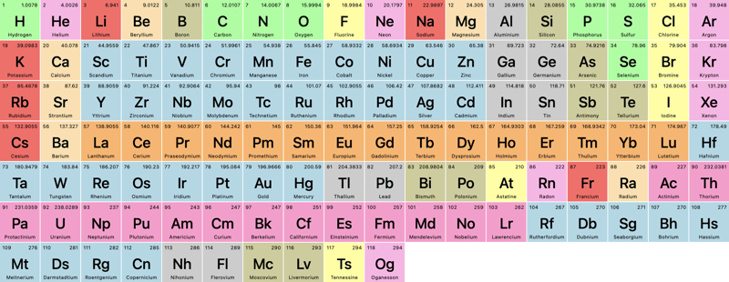
Looks great, but not exactly like the periodic table we learned in school. Let's add some grid-magic.
For Helium, we want it to be pushed to the last column. As we know the grid is 18 columns wide, we simply add:
li {
  &:nth-of-type(2) { grid-column: 18; }
}
Since this is an ordered list, the nth-of-type value will always correspond to the atomic number of each element. We want to move Boron and Aluminum to column 13:
li {
  &:nth-of-type(5), &:nth-of-type(13) { grid-column: 13; }
Let's check it out:
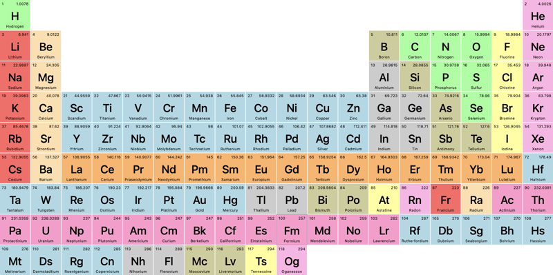
An improvement, for sure, but since grid-column just pushes the grid forward, how can we take elements 58-71 and 90-103 (the lathenides and actinides) completely out of their grid-flow and add them to those 2 rows below the main grid?
For that, we can use grid-area, where we define:
row-start / col-start / row-end / col-end
In our case, that'll be:
li {
   /* Lanthenides */
  &:nth-of-type(58) { grid-area: 9 / 4 / 9/ 4; }
  &:nth-of-type(59) { grid-area: 9 / 5 / 9/ 5; }
  &:nth-of-type(60) { grid-area: 9 / 6 / 9/ 6; }
  /* etc. */

  /* Actinides */
  &:nth-of-type(90) { grid-area: 10 / 4 / 10 / 4; }
  &:nth-of-type(91) { grid-area: 10 / 5 / 10 / 5; }
  &:nth-of-type(92) { grid-area: 10 / 6 / 10 / 6; }
  / etc. */
}
And now we get (for clarity, I've enabled Dev Tools' grid-visualizer):
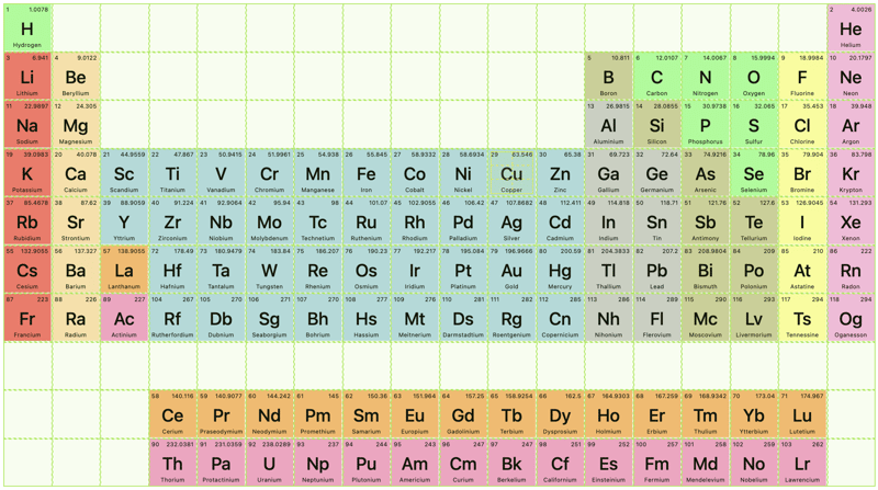
Notice how the grid-elements after the element we've moved out of the flow, continue in the main flow!
Filtering
Now, let's use these "element type"-classes, we had ChatGPT generate earlier, to filter the periodic table.
First, let's add some basic HTML:
Then, we ask chatGPT to fill out the rest, and add an "All"-option with no id:

We need a bunch of JavaScript to filter, right? No, we can do this in plain CSS:
body:has(#alk:checked) li:not(.alk) {
  opacity: 0.2;
}
The logic works like this: If the body contains a checkbox with the id="alk" and it's checked, the styles will be applied to all
- elements that don’t have the .alk class.
Repeat for all the types and classes.
Let's click on "metalloids":
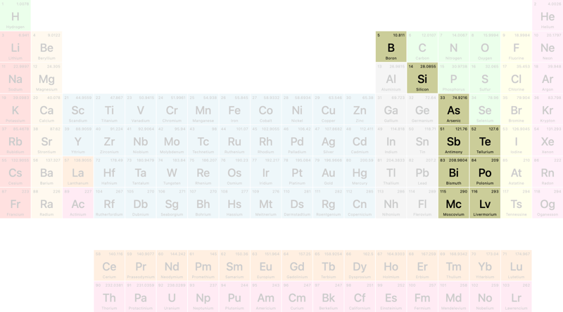
How cool is that?
That concludes this tutorial … but wait … what does that Heisenberg filter do? It wasn't in the list of filters from ChatGPT?
Let's click it:
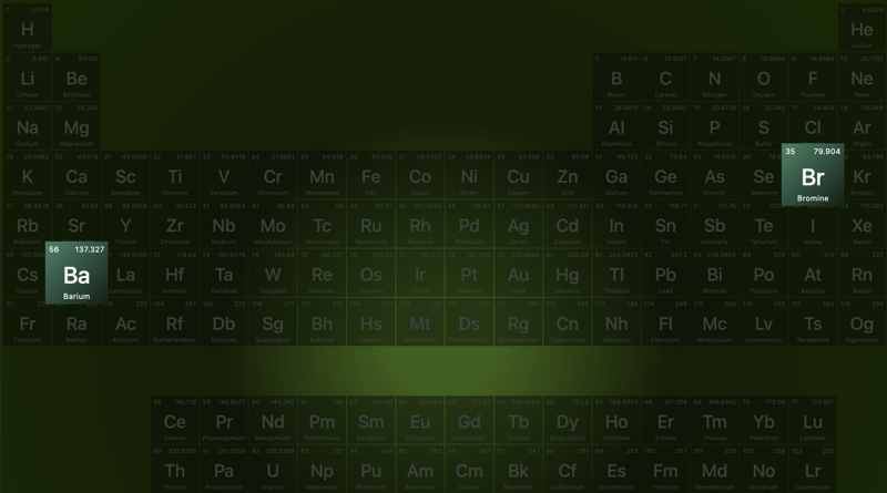
… and now you know my favorite TV-show of all time!
Demo
Here's a Codepen — even though it's fully responsive, I recommend viewing it on larger screens:
We then have a
-
 How to Convert a Pandas DataFrame Column to DateTime Format and Filter by Date?Transform Pandas DataFrame Column to DateTime FormatScenario:Data within a Pandas DataFrame often exists in various formats, including strings. When w...Programming Posted on 2025-07-06
 -
 PHP SimpleXML parsing XML method with namespace colonParsing XML with Namespace Colons in PHPSimpleXML encounters difficulties when parsing XML containing tags with colons, such as XML elements with pref...Programming Posted on 2025-07-06
 -
 How to Combine Data from Three MySQL Tables into a New Table?mySQL: Creating a New Table from Data and Columns of Three TablesQuestion:How can I create a new table that combines selected data from three existing...Programming Posted on 2025-07-06
 -
 Why Doesn't `body { margin: 0; }` Always Remove Top Margin in CSS?Addressing Body Margin Removal in CSSFor novice web developers, removing the margin of the body element can be a confusing task. Often, the code provi...Programming Posted on 2025-07-06
 -
 Why HTML cannot print page numbers and solutionsCan't Print Page Numbers on HTML Pages?Problem Description:Despite researching extensively, page numbers fail to appear when printing an HTML docu...Programming Posted on 2025-07-06
 -
 Tips for floating pictures to the right side of the bottom and wrapping around textFloating an Image to the Bottom Right with Text Wrapping AroundIn web design, it is sometimes desirable to float an image to the bottom right corner o...Programming Posted on 2025-07-06
 -
 Why do images still have borders in Chrome? `border: none;` invalid solutionRemoving the Image Border in ChromeOne frequent issue encountered when working with images in Chrome and IE9 is the appearance of a persistent thin bo...Programming Posted on 2025-07-06
 -
 FastAPI Custom 404 Page Creation GuideCustom 404 Not Found Page with FastAPITo create a custom 404 Not Found page, FastAPI offers several approaches. The appropriate method depends on your...Programming Posted on 2025-07-06
 -
 Access and management methods of Python environment variablesAccessing Environment Variables in PythonTo access environment variables in Python, utilize the os.environ object, which represents a mapping of envir...Programming Posted on 2025-07-06
 -
 Method for correct passing of C++ member function pointersHow to Pass Member Function Pointers in C When passing a class member function to a function that accepts a member function pointer, it's essenti...Programming Posted on 2025-07-06
 -
 Eval() vs. ast.literal_eval(): Which Python Function Is Safer for User Input?Weighing eval() and ast.literal_eval() in Python SecurityWhen handling user input, it's imperative to prioritize security. eval(), a powerful Pyth...Programming Posted on 2025-07-06
 -
 Solve the \\"String value error\\" exception when MySQL inserts EmojiResolving Incorrect String Value Exception When Inserting EmojiWhen attempting to insert a string containing emoji characters into a MySQL database us...Programming Posted on 2025-07-06
 -
 How to Parse Numbers in Exponential Notation Using Decimal.Parse()?Parsing a Number from Exponential NotationWhen attempting to parse a string expressed in exponential notation using Decimal.Parse("1.2345E-02&quo...Programming Posted on 2025-07-06
 -
 How to Correctly Display the Current Date and Time in "dd/MM/yyyy HH:mm:ss.SS" Format in Java?How to Display Current Date and Time in "dd/MM/yyyy HH:mm:ss.SS" FormatIn the provided Java code, the issue with displaying the date and tim...Programming Posted on 2025-07-06
 -
 How to Bypass Website Blocks with Python's Requests and Fake User Agents?How to Simulate Browser Behavior with Python's Requests and Fake User AgentsPython's Requests library is a powerful tool for making HTTP reque...Programming Posted on 2025-07-06
Study Chinese
- 1 How do you say "walk" in Chinese? 走路 Chinese pronunciation, 走路 Chinese learning
- 2 How do you say "take a plane" in Chinese? 坐飞机 Chinese pronunciation, 坐飞机 Chinese learning
- 3 How do you say "take a train" in Chinese? 坐火车 Chinese pronunciation, 坐火车 Chinese learning
- 4 How do you say "take a bus" in Chinese? 坐车 Chinese pronunciation, 坐车 Chinese learning
- 5 How to say drive in Chinese? 开车 Chinese pronunciation, 开车 Chinese learning
- 6 How do you say swimming in Chinese? 游泳 Chinese pronunciation, 游泳 Chinese learning
- 7 How do you say ride a bicycle in Chinese? 骑自行车 Chinese pronunciation, 骑自行车 Chinese learning
- 8 How do you say hello in Chinese? 你好Chinese pronunciation, 你好Chinese learning
- 9 How do you say thank you in Chinese? 谢谢Chinese pronunciation, 谢谢Chinese learning
- 10 How to say goodbye in Chinese? 再见Chinese pronunciation, 再见Chinese learning


