MUI TextField: Build Variants, Colors & Styles
The mui textfield is a fundamental component in Material-UI, designed to capture user inputs efficiently and stylishly. This guide explores its build variants, extensive customization through colors and styles, and practical use cases to elevate your application's UI/UX.

Introduction to MUI TextField
The mui textfield provides a highly adaptable interface component for user inputs in web applications, supporting a range of styles, configurations, and user interactions. Whether you are collecting simple text inputs, passwords, or more complex multiline entries, mui textfield offers the flexibility to meet these needs with robust customization options.
Basic TextField
Material-UI offers three distinct build variants for the basic mui textfield each tailored for different UI preferences and user experiences:
- Standard: Offers a minimalist approach with an underline that becomes prominent on focus. Ideal for clean, modern designs where the interface is not cluttered.
- Filled: This variant introduces a light background fill and an underline that only appears when the field is active, adding a subtle touch of depth and emphasis.
- Outlined: Features a full border around the text field, which enhances visibility on varied backgrounds and provides a clear demarcation for interactive elements.

Implementation with Code:
import * as React from 'react';
import Box from '@mui/material/Box';
import TextField from '@mui/material/TextField';
// BasicTextFields Component: Demonstrates different TextField variants.
export default function BasicTextFields() {
return (
// Container component for form elements with specified margins and width
:not(style)': { m: 1, width: '25ch' } }} // Apply margin and width to each TextField
noValidate // Disables browser validation
autoComplete="off" // Disables autocomplete feature
>
{/* Outlined TextField: Uses a border to define the input area */}
);
}
Form Props
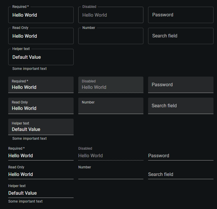
The mui textfield is equipped to handle a variety of standard form attributes that enhance functionality and user interaction. These attributes include options like required, disabled, and type, which are essential for guiding user inputs and maintaining form integrity. Additionally, the helperText prop is particularly useful for providing context about a field’s input, explaining its utility or offering guidance on the expected format.
Following are the key Form Props:
- required: Marks the field as necessary, prompting users to fill it out before submitting a form. This is crucial for ensuring that all essential information is gathered.
- disabled: Temporarily disables the input field, making it non-interactive. This is useful in scenarios where certain conditions need to be met before user input can be accepted.
- type: Defines the type of data expected in the text field, such as text, password, or number. This helps in structuring the form data correctly and ensures that the user input matches the required format.
- helperText: Provides additional details or instructions associated with the input field. This can be used to clarify the purpose of the data or to guide users on how to fill out the form correctly.
Implementation with Code:
import * as React from 'react';
import Box from '@mui/material/Box';
import TextField from '@mui/material/TextField';
// FormPropsTextFields Component: Showcases TextField with various props and states.
export default function FormPropsTextFields() {
return (
// Container for the form elements with specified margins and width
{/* Section for Outlined TextFields with various configurations */}
);
}
Multiline Text Fields
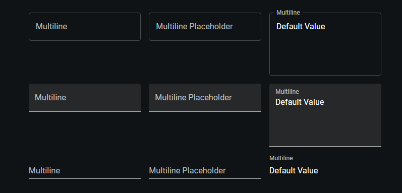
The multiline prop in the mui textfield is a powerful feature that transforms the standard text field into a TextareaAutosize element, making it ideal for inputs that require longer text entries such as comments, descriptions, or feedback forms. This feature is especially useful in forms where users need to provide detailed information that exceeds a single line of text.
For scenarios where you need more control over the size of the text field, you can use the minRows and maxRows props to set minimum and maximum boundaries for its height. This is particularly useful when you want to maintain a certain layout aesthetic or when dealing with form inputs that are expected to be within specific length constraints.
Implementation with Code:
import * as React from 'react';
import Box from '@mui/material/Box';
import TextField from '@mui/material/TextField';
// MULTILINE TEXT FIELDS COMPONENT: Demonstrates various multiline TextField configurations.
export default function MultilineTextFields() {
return (
// Container for the multiline TextField elements with specified margins and width
{/* OUTLINED TEXTFIELDS GROUP */}
);
}
Select
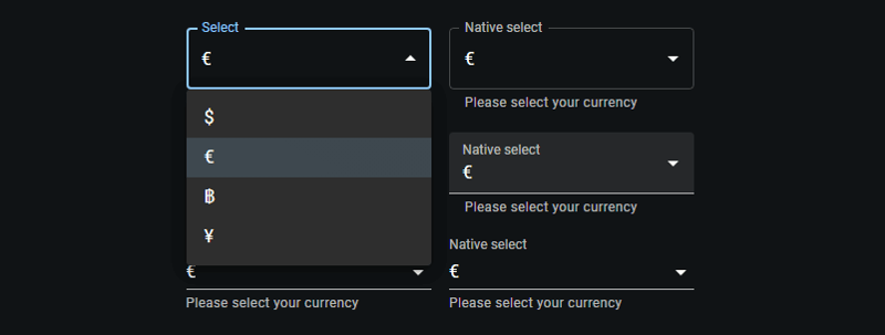
The select prop in mui textfield transforms the standard text field into a dropdown menu by integrating the Select component internally. This modification allows for seamless selection among predefined options, making it particularly useful in forms where users must choose from a set list.
Implementation with Code:
import * as React from 'react';
import Box from '@mui/material/Box';
import TextField from '@mui/material/TextField';
import MenuItem from '@mui/material/MenuItem';
// Currency options for the select dropdown.
const currencies = [
{ value: 'USD', label: '$' },
{ value: 'EUR', label: '€' },
{ value: 'BTC', label: '฿' },
{ value: 'JPY', label: '¥' },
];
// SELECT TEXT FIELDS COMPONENT: Demonstrates TextField with select dropdowns.
export default function SelectTextFields() {
return (
// Container for the select TextField elements with specified margins and width
{/* OUTLINED SELECT TEXTFIELDS GROUP */}
{currencies.map((option) => (
))}
{currencies.map((option) => (
))}
{/* FILLED SELECT TEXTFIELDS GROUP */}
{currencies.map((option) => (
))}
{currencies.map((option) => (
))}
{/* STANDARD SELECT TEXTFIELDS GROUP */}
{currencies.map((option) => (
))}
{currencies.map((option) => (
))}
);
}
Input Adornments
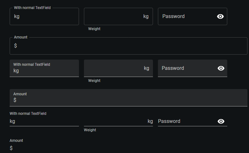
Input Adornments in Material-UI's mui textfield offer a flexible way to incorporate additional elements like prefixes, suffixes, or interactive icons directly within the text field.
Implementation with Code:
import * as React from 'react';
import Box from '@mui/material/Box';
import IconButton from '@mui/material/IconButton';
import Input from '@mui/material/Input';
import FilledInput from '@mui/material/FilledInput';
import OutlinedInput from '@mui/material/OutlinedInput';
import InputLabel from '@mui/material/InputLabel';
import InputAdornment from '@mui/material/InputAdornment';
import FormHelperText from '@mui/material/FormHelperText';
import FormControl from '@mui/material/FormControl';
import TextField from '@mui/material/TextField';
import Visibility from '@mui/icons-material/Visibility';
import VisibilityOff from '@mui/icons-material/VisibilityOff';
// INPUT ADORNMENTS COMPONENT: Demonstrates various ways to use Input Adornments with TextField and FormControl.
export default function InputAdornments() {
const [showPassword, setShowPassword] = React.useState(false);
const handleClickShowPassword = () => setShowPassword((show) => !show);
const handleMouseDownPassword = (event) => event.preventDefault();
const handleMouseUpPassword = (event) => event.preventDefault();
return (
{/* OUTLINED VARIANT GROUP */}
kg,
}}
/>
kg}
aria-describedby="outlined-weight-helper-text"
/>
Weight
Password
{showPassword ?
}
label="Password"
/>
Amount
$}
label="Amount"
/>
{/* FILLED VARIANT GROUP */}
kg,
}}
variant="filled"
/>
kg}
aria-describedby="filled-weight-helper-text"
/>
Weight
Password
{showPassword ?
}
/>
Amount
$}
/>
{/* STANDARD VARIANT GROUP */}
kg,
}}
variant="standard"
/>
kg}
aria-describedby="standard-weight-helper-text"
/>
Weight
{showPassword ?
}
/>
Amount
$}
/>
)
};
Margin
The margin prop in the mui textfield component is a practical attribute that allows you to control the vertical spacing of the text field within a form. This can be crucial for achieving the desired layout and ensuring that the form is visually appealing.
The margin prop accepts three values: none, dense, and normal. Each of these settings adjusts the amount of space around the text field, affecting how compact or spread out the form elements appear.
- none (default): Applies no additional margin to the TextField. This setting is useful when you want to handle spacing through other means, such as using grid systems or custom CSS.
- dense: Reduces the amount of vertical space around the text field. This is ideal for forms where space is limited or when many elements need to be displayed without overwhelming the user.
- normal: Increases the vertical spacing for better readability and separation between fields. This setting is often used in forms where clarity and ease of use are prioritized.
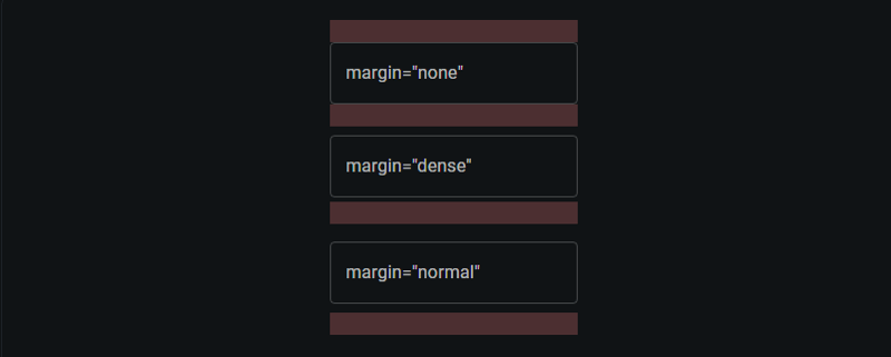
Implementation with Code:
import * as React from 'react';
import Box from '@mui/material/Box';
import TextField from '@mui/material/TextField';
// RedBar Component: Displays a red horizontal bar to visually separate elements.
function RedBar() {
return (
// Styling applied using a function to access the theme for conditional styles
({
height: 20, // Fixed height for the bar
backgroundColor: 'rgba(255, 0, 0, 0.1)', // Light red background color
...theme.applyStyles('dark', { // Conditional style application for dark themes
backgroundColor: 'rgb(255 132 132 / 25%)',
}),
})}
/>
);
}
// LayoutTextFields Component: Demonstrates TextField components with different margin settings.
export default function LayoutTextFields() {
return (
);
}
Controlled vs. Uncontrolled Components
In React, components like mui textfield can be either controlled or uncontrolled, which refers to how their state is managed.
- A controlled TextField is managed by state and props within a parent component, offering precise value handling and updates.
- Conversely, an uncontrolled TextField maintains its own internal state, initialized with defaultValue, simplifying setup but offering less direct control over its state.

Implementation with Code:
import * as React from 'react';
import Box from '@mui/material/Box';
import TextField from '@mui/material/TextField';


// StateTextFields Component: Demonstrates the use of controlled and uncontrolled TextField components.
export default function StateTextFields() {
  // State hook for controlling the TextField value
  const [name, setName] = React.useState('Cat in the Hat');


  return (
    // Container for the form elements with specific margin and width styles
     :not(style)': { m: 1, width: '25ch' } }} // Apply margin and width to each TextField
      noValidate // Disables browser validation
      autoComplete="off" // Turns off auto-completion
    >
      {/* CONTROLLED TEXTFIELD */}
       {
          setName(event.target.value); // Update state based on input
        }}
      />
      {/* UNCONTROLLED TEXTFIELD */}


  );
}
Inputs
Material-UI's Input component provides a streamlined way to handle user inputs in forms. It supports various states such as default values, placeholders, disabled inputs, and error handling.

Implementation with Code:
import * as React from 'react';
import Box from '@mui/material/Box';
import Input from '@mui/material/Input';
// Accessibility label configuration for inputs.
const ariaLabel = { 'aria-label': 'description' };
// Inputs Component: Demonstrates various configurations of MUI Input components.
export default function Inputs() {
return (
// Form container that applies margin to each input and disables browser validation and autocomplete.
:not(style)': { m: 1 } }} // Margin applied to all direct children except
);
}
Color
The color prop changes the highlight color of the text field when focused.

Implementation with Code:
import * as React from 'react';
import Box from '@mui/material/Box';
import TextField from '@mui/material/TextField';
// ColorTextFields Component: Demonstrates TextField components styled with various color schemes.
export default function ColorTextFields() {
return (
// Form container applying margin and width to each TextField component
:not(style)': { m: 1, width: '25ch' } }} // Specifies margin and width for direct children
noValidate // Disables HTML5 validation
autoComplete="off" // Disables browser auto-completion
>
{/* OUTLINED TEXTFIELD WITH SECONDARY COLOR */}
);
}
Conclusion
Throughout this guide, we've explored the diverse capabilities of the MUI TextField component, covering its variants, styles, colors, and additional functionalities like select options and input adornments.
- Variants and Styles: We discussed how different TextField variants like standard, filled, and outlined can be utilized to meet specific design needs, enhancing the form's usability and appearance.
- Functionality Enhancements: By leveraging props such as select and input adornments, TextField can be transformed to accommodate more complex user interactions, such as selecting from dropdowns or adding icons for improved functionality.
- Form Management: The distinction between controlled and uncontrolled components was highlighted, emphasizing their roles in managing form state and interactions in React applications.
- Basic Inputs: The simplicity and flexibility of the MUI Input component were showcased, demonstrating how it can handle various input states to streamline user form interactions.
The versatility of MUI components allows developers to build comprehensive, responsive, and accessible user interfaces. For further customization and deeper understanding, refer to the official Material-UI documentation.
-
 Why Does Microsoft Visual C++ Fail to Correctly Implement Two-Phase Template Instantiation?The Mystery of "Broken" Two-Phase Template Instantiation in Microsoft Visual C Problem Statement:Users commonly express concerns that Micro...Programming Posted on 2025-07-04
 -
 FastAPI Custom 404 Page Creation GuideCustom 404 Not Found Page with FastAPITo create a custom 404 Not Found page, FastAPI offers several approaches. The appropriate method depends on your...Programming Posted on 2025-07-04
 -
 PHP Future: Adaptation and InnovationThe future of PHP will be achieved by adapting to new technology trends and introducing innovative features: 1) Adapting to cloud computing, container...Programming Posted on 2025-07-04
 -
 Solve the \\"String value error\\" exception when MySQL inserts EmojiResolving Incorrect String Value Exception When Inserting EmojiWhen attempting to insert a string containing emoji characters into a MySQL database us...Programming Posted on 2025-07-04
 -
 The compiler error "usr/bin/ld: cannot find -l" solutionError Encountered: "usr/bin/ld: cannot find -l"When attempting to compile a program, you may encounter the following error message:usr/bin/l...Programming Posted on 2025-07-04
 -
 CSS strongly typed language analysisOne of the ways you can classify a programming language is by how strongly or weakly typed it is. Here, “typed” means if variables are known at compil...Programming Posted on 2025-07-04
 -
 How to pass exclusive pointers as function or constructor parameters in C++?Managing Unique Pointers as Parameters in Constructors and FunctionsUnique pointers (unique_ptr) uphold the principle of unique ownership in C 11. Wh...Programming Posted on 2025-07-04
 -
 Will fake wakeup really happen in Java?Spurious Wakeups in Java: Reality or Myth?The concept of spurious wakeups in Java synchronization has been a subject of discussion for quite some time...Programming Posted on 2025-07-04
 -
 Reasons for CodeIgniter to connect to MySQL database after switching to MySQLiUnable to Connect to MySQL Database: Troubleshooting Error MessageWhen attempting to switch from the MySQL driver to the MySQLi driver in CodeIgniter,...Programming Posted on 2025-07-04
 -
 How to prevent duplicate submissions after form refresh?Preventing Duplicate Submissions with Refresh HandlingIn web development, it's common to encounter the issue of duplicate submissions when a page ...Programming Posted on 2025-07-04
 -
 Causes and solutions for Face Detection Failure: Error -215Error Handling: Resolving "error: (-215) !empty() in function detectMultiScale" in OpenCVWhen attempting to utilize the detectMultiScale() m...Programming Posted on 2025-07-04
 -
 How to Convert a Pandas DataFrame Column to DateTime Format and Filter by Date?Transform Pandas DataFrame Column to DateTime FormatScenario:Data within a Pandas DataFrame often exists in various formats, including strings. When w...Programming Posted on 2025-07-04
 -
 How to Handle User Input in Java's Full-Screen Exclusive Mode?Handling User Input in Full Screen Exclusive Mode in JavaIntroductionWhen running a Java application in full screen exclusive mode, the usual event ha...Programming Posted on 2025-07-04
 -
 How to Resolve the \"Invalid Use of Group Function\" Error in MySQL When Finding Max Count?How to Retrieve the Maximum Count Using MySQLIn MySQL, you may encounter an issue while attempting to find the maximum count of values grouped by a sp...Programming Posted on 2025-07-04
 -
 How Can I Customize Compilation Optimizations in the Go Compiler?Customizing Compilation Optimizations in Go CompilerThe default compilation process in Go follows a specific optimization strategy. However, users may...Programming Posted on 2025-07-04
Study Chinese
- 1 How do you say "walk" in Chinese? 走路 Chinese pronunciation, 走路 Chinese learning
- 2 How do you say "take a plane" in Chinese? 坐飞机 Chinese pronunciation, 坐飞机 Chinese learning
- 3 How do you say "take a train" in Chinese? 坐火车 Chinese pronunciation, 坐火车 Chinese learning
- 4 How do you say "take a bus" in Chinese? 坐车 Chinese pronunciation, 坐车 Chinese learning
- 5 How to say drive in Chinese? 开车 Chinese pronunciation, 开车 Chinese learning
- 6 How do you say swimming in Chinese? 游泳 Chinese pronunciation, 游泳 Chinese learning
- 7 How do you say ride a bicycle in Chinese? 骑自行车 Chinese pronunciation, 骑自行车 Chinese learning
- 8 How do you say hello in Chinese? 你好Chinese pronunciation, 你好Chinese learning
- 9 How do you say thank you in Chinese? 谢谢Chinese pronunciation, 谢谢Chinese learning
- 10 How to say goodbye in Chinese? 再见Chinese pronunciation, 再见Chinese learning


