I Like to Move It, Move It (Part 2)
Welcome back! If you've been following week to week, you may have noticed that this series took a short break! If you've been following along, I'm very sorry!
Some of my work on a personal project took up a significant portion of my attention, plus I just got married, so I'm going to use that as an excuse. If you want to see what I've been working on check out the Build In Public: Roast, series that documents my process from concept to deployment for an app that tracks your home roasts.
Alright, alright. Stop self-promoting, let's get back to moving our boxes around the screen!
Get Your CodePen!
Just like in part one, you'll be able to follow along with your CodePen template! If you haven't read Part 1, check it out here. And if you need a new template, click here.
What is the Display Property?
With display and position properties, it may seem like they're affecting the same thing: where something appears on the web page. But, they do have a subtle difference. Positioning properties control how an element is positioned within the document that contains it. Either in normal flow, relative to other elements, or ignoring everything!
Display is different in that it is affecting the way that layout is interpreted: the display type. The display property for CSS is a bit of a bear at first, because it not only sets the display type for the element it's applied to (an outer display type), but it also sets the display behaviors for elements contained within the element the property is applied to (an inner display type).
Inline vs. Block
Most elements that we have used so far have a default outer display type of block. This means that no other elements will occupy the same vertical space as that element, effectively, any new element added will create a "new line".
Not all elements are this way. For example,
Well, regardless of the defaults for the element, you can change this property by setting:
display: block
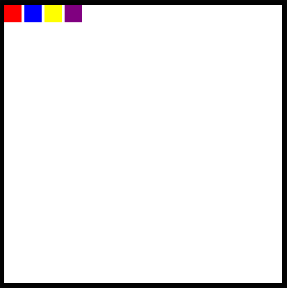
display: inline-block
Now in your code pen, change the .box ruleset to make all of the boxes appear side by side.
Flexbox and Grid
As for the inner display types, we have a couple more options about how to position things. We can turn our element into a flexbox or a grid, which will affect how its children are laid out.
Display: Flex
Each of these concepts deserves an entire post for its own, but basically, a flex box will "flexibly" position elements contained within a parent element inline. The flexbox is more adaptive to different screen sizes since it places items relative to one another and the containing element rather than relative to the window.
To see this in action, take a look at the .frame ruleset in the Codepen.
Uncomment the following line of code:
display: flex;

It looks very similar to having four inline-blocks right? By default, a flex container justifies its items to the start of the flexbox, or the left, but, this can be changed too!
Below the declaration of the flexbox, add this:
justify-content: center;
And now we should see all of the boxes appear at the middle of the screen!

But, what if we don't want them to be stuck at the top like that? Let's also add:
align-items: center;

Great!
Display: Grid
Note: Before moving on in the CodePen, make sure that you comment out or remove the lines containing display: flex and the justify-content or align-items properties that you added.
In addition to the flexbox, we also have the option to turn our entire element into a grid, where we can place items!
I wont get much into the details of this code here, but know that it is possible by declaring the element to be a grid, providing a grid template and then placing items within the grid!
Uncomment the following lines in the .frame ruleset!
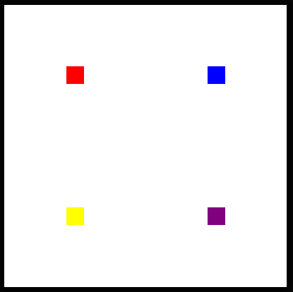
display: grid;
  grid-template: 1fr 1fr / 1fr 1fr;
  align-items: center;
  justify-items: center;
Now, you should see each of the boxes positioned each in the center of a quadrant of the frame!
Use Your Newfound Skills!
As with last article, here are a series of challenges. You will want to delete or re-comment the lines of code creating the grid layout before attempting!
Challenge #1: Search MDN for the correct justify-content property to display each of the blocks evenly on the horizontal plane without touching the sides and in the center vertically as pictured below.

Challenge #2: Still in a flex container, see if you can group all of the boxes together and place them in the bottom right-hand corner! (What properties will you have to adjust for this?)

Challenge #3: Can you find a flex property that will reverse the display order of the elements?

Congratulations on completing these challenges! See you next week for more HTML and CSS!
-
 How Can I UNION Database Tables with Different Numbers of Columns?Combined tables with different columns] Can encounter challenges when trying to merge database tables with different columns. A straightforward way i...Programming Posted on 2025-04-20
 -
 How to deal with sliced memory in Go language garbage collection?Garbage Collection in Go Slices: A Detailed AnalysisIn Go, a slice is a dynamic array that references an underlying array. When working with slices, i...Programming Posted on 2025-04-20
 -
 How do you extract a random element from an array in PHP?Random Selection from an ArrayIn PHP, obtaining a random item from an array can be accomplished with ease. Consider the following array:$items = [523,...Programming Posted on 2025-04-20
 -
 Implementing a slash method of left-aligning text in all browsers]]Text alignment on slanted lines Background Achieving Left-Aligned Text on a slanted line can pose a challenge, particully when secreta. compatibilit...Programming Posted on 2025-04-20
 -
 Method to correctly convert Latin1 characters to UTF8 in UTF8 MySQL tableConvert Latin1 Characters in a UTF8 Table to UTF8You've encountered an issue where characters with diacritics (e.g., "Jáuò Iñe") were in...Programming Posted on 2025-04-20
 -
 How Can You Define Variables in Laravel Blade Templates Elegantly?Defining Variables in Laravel Blade Templates with EleganceUnderstanding how to assign variables in Blade templates is crucial for storing data for la...Programming Posted on 2025-04-20
 -
 Is There a Performance Difference Between Using a For-Each Loop and an Iterator for Collection Traversal in Java?For Each Loop vs. Iterator: Efficiency in Collection TraversalIntroductionWhen traversing a collection in Java, the choice arises between using a for-...Programming Posted on 2025-04-20
 -
 How Can I Maintain Custom JTable Cell Rendering After Cell Editing?Maintaining JTable Cell Rendering After Cell EditIn a JTable, implementing custom cell rendering and editing capabilities can enhance the user experie...Programming Posted on 2025-04-20
 -
 Why do images still have borders in Chrome? `border: none;` invalid solutionRemoving the Image Border in ChromeOne frequent issue encountered when working with images in Chrome and IE9 is the appearance of a persistent thin bo...Programming Posted on 2025-04-20
 -
 Why Doesn't `body { margin: 0; }` Always Remove Top Margin in CSS?Addressing Body Margin Removal in CSSFor novice web developers, removing the margin of the body element can be a confusing task. Often, the code provi...Programming Posted on 2025-04-20
 -
 Why doesn't Java have unsigned integers?Understanding Java's Absence of Unsigned IntegersDespite the potential benefits of unsigned integers, such as reduced risk of overflow, self-docum...Programming Posted on 2025-04-20
 -
 Why does the session data lose after PHP refresh?Troubleshooting PHP Session Data LossPHP sessions are a valuable tool for storing and retrieving data across multiple pages. However, issues can arise...Programming Posted on 2025-04-20
 -
 Can I use NOLOCK in SQL Server to improve performance?NOLOCK in SQL Server: Performance improvement and risk coexist SQL Server's transaction isolation level ensures that data modifications for conc...Programming Posted on 2025-04-20
 -
 How to Convert a Pandas DataFrame Column to DateTime Format and Filter by Date?Transform Pandas DataFrame Column to DateTime FormatScenario:Data within a Pandas DataFrame often exists in various formats, including strings. When w...Programming Posted on 2025-04-20
 -
 Detect click object in sprite group and resolve "AttributeError: Group has no attribute rect" errorDetecting Clicked Objects within a Sprite GroupWhen working with sprites in a Pygame application, it becomes necessary to detect when the user clicks ...Programming Posted on 2025-04-20
Study Chinese
- 1 How do you say "walk" in Chinese? 走路 Chinese pronunciation, 走路 Chinese learning
- 2 How do you say "take a plane" in Chinese? 坐飞机 Chinese pronunciation, 坐飞机 Chinese learning
- 3 How do you say "take a train" in Chinese? 坐火车 Chinese pronunciation, 坐火车 Chinese learning
- 4 How do you say "take a bus" in Chinese? 坐车 Chinese pronunciation, 坐车 Chinese learning
- 5 How to say drive in Chinese? 开车 Chinese pronunciation, 开车 Chinese learning
- 6 How do you say swimming in Chinese? 游泳 Chinese pronunciation, 游泳 Chinese learning
- 7 How do you say ride a bicycle in Chinese? 骑自行车 Chinese pronunciation, 骑自行车 Chinese learning
- 8 How do you say hello in Chinese? 你好Chinese pronunciation, 你好Chinese learning
- 9 How do you say thank you in Chinese? 谢谢Chinese pronunciation, 谢谢Chinese learning
- 10 How to say goodbye in Chinese? 再见Chinese pronunciation, 再见Chinese learning


