The Two Lines of CSS That Tanked Performance (fps to ps)
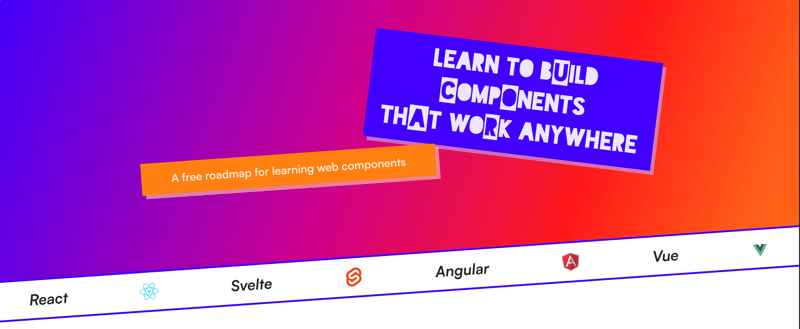
I recently released Learn WCs and If you’ve seen it, you’ve likely noticed the animation in the background, where the coloured circles move diagonally across the screen. It looks like this:
It works nicely on Chrome and Safari, but I noticed a severe drop in performance on Firefox.
The performance was so bad, that I straight up disabled this animation in Firefox.
How does the animation work?
The animation is built using two nested divs. The outer div is the first child of the site’s body tag.
The .background-gradient element is responsible for creating a gradient that spans the entire width and height of its parent container. Like so:

The outer .background-mask is responsible for two things:
- It sets the position to fixed, and makes the container fill the entire dimensions of the viewport.
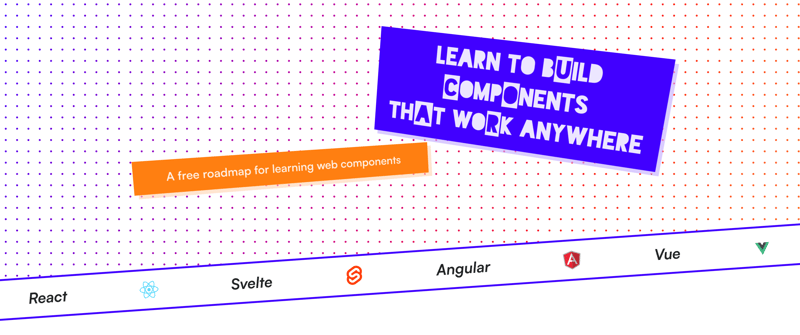
- Creates a dotted mask over the gradient
This ensures that the colour of the dots is the colour of the gradient directly underneath it:

Here’s the CSS for everything I described above:
.background-mask {
    --mask-size: 24px;

    /* Position Styles */
    position: fixed;
    width: 100%;
    height: 100%;
    z-index: -1;

    /* Mask Styles */
    mask-image: radial-gradient(black 2px, transparent 2px);
    mask-size: var(--mask-size) var(--mask-size);
    mask-position: 0px 0px;
    animation: mask-move 3s infinite linear;
}

.background-gradient {
    background: var(--red);
    background-image: var(--gradient);
    width: 100%;
    height: 100%;
}

@keyframes mask-move {
    0% {
        mask-position: 0px 0px;
    }

    100% {
        mask-position: var(--mask-size) var(--mask-size);
    }
}

@media (prefers-reduced-motion: reduce) {
    .hero-background-mask {
        animation: none;
    }
}
If you’re interested in learning more about masks in CSS, then I can recommend this comprehensive post by Ahmad Shadeed
What’s causing this drop in performance?
Not all CSS properties animate equally. Without going too much into how the browser renders HTML to the page (though I’ve outlined it here), there are a handful of stages it goes through. The three stages that we’re interested in are:
- Layout - When the browser calculates the size and positions of the elements on the page
- Paint - Draws all the visual aspects of the page, like images, colors, shadows, etc
- Composite - Layering the elements on top of one another in the correct order
The order of the pipeline looks like this:
Layout → Paint → Composite
The layout and paint processes can be CPU-intensive, so it’s important to try and reduce the amount of times your CSS triggers the stages in the pipeline*.* The browser helps in some part by optimising performance for certain properties, some skip entire stages of the rendering pipeline and others can leverage hardware acceleration to move computation from the CPU to the GPU.
Animating certain properties, like translate and opacity , both avoids triggering a layout and uses hardware acceleration.
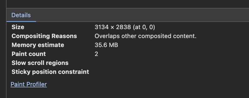
Sadly, this is not the case when animating mask-position. I took a look at Chrome and saw that the paint count for the background div was increasing on every frame. After a few seconds it had already triggered a paint over 1,000 times.

Even with this high paint count, the animation on Chrome feels smooth. However, it feels super janky on Firefox. Annoyingly, I couldn‘t find a way to measure the paint count on Firefox, so any assumptions I make about Firefox’s poor performance is purely conjecture.
What I did notice is that the animation is fine for small devices, but gets worse as the size of the screen increases. My working theory is that Firefox doesn’t batch the layout triggers for each the 24x24 masks, which causes the FPS to tank when more 24x24 masks are present. Again, I might be completely wrong here.
How did I fix this?
Instead of animating badly optimised CSS properties like mask-position , I needed to lean on the more performant properties, like translate.
The solution wasn’t to move the masks by 24px, but to instead move the entire background element using the translate property.
From an abstract standpoint, this is how the animation looks:
Here’s the two line change in the CSS:
/* --mask-size = 24px */

@keyframes mask-move {
    0% {
        transform: translate(calc(var(--mask-size) * -1), calc(var(--mask-size) * -1));
    }

    100% {
        transform: translate(0px, 0px);
    }
}
The browser no longer animates the mask-position, which triggered a layout on each frame. Even though the background moves on each frame, through translate it doesn’t trigger a layout or a paint. You can see that the only paints twice, down from 1,000 every minute.

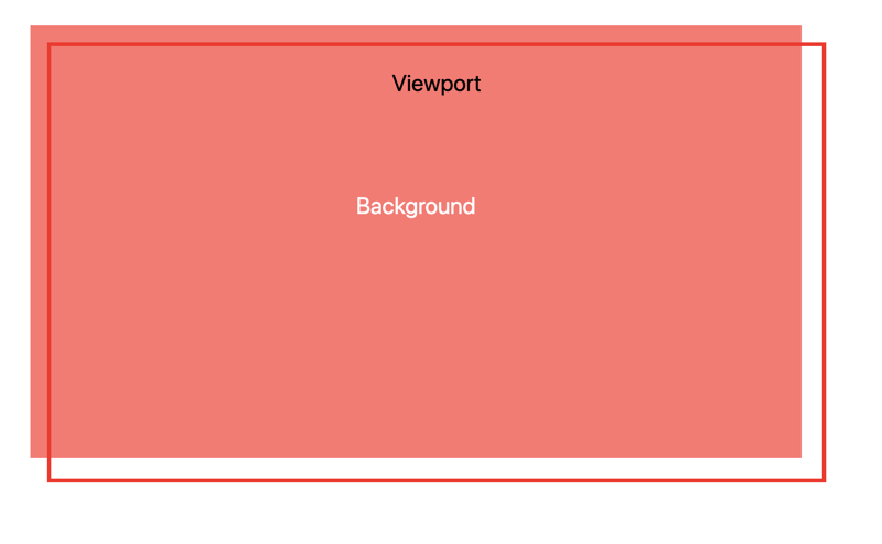
Eagle-eyed viewers will have spotted a problem. If you remember, the height and width of the background fills the viewport. Shifting the background left and up by 24px leaves us with this empty space in the viewport.

Solving it is as simple as adding the mask size to the width and height of the container:
.background-mask {
    --mask-size: 24px;

    width: calc(100%   var(--mask-size));
    height: calc(100%   var(--mask-size));
}
Let’s take a look again in Firefox:
It may not be a perfect solution, but it’s always a little satisfying pulling off a fun smoke and mirrors CSS trick.
-
 CSS strongly typed language analysisOne of the ways you can classify a programming language is by how strongly or weakly typed it is. Here, “typed” means if variables are known at compil...Programming Posted on 2025-04-30
 -
 How to efficiently insert data into multiple MySQL tables in one transaction?MySQL Insert into Multiple TablesAttempting to insert data into multiple tables with a single MySQL query may yield unexpected results. While it may s...Programming Posted on 2025-04-30
 -
 How to avoid memory leaks when slicing Go language?Memory Leak in Go SlicesUnderstanding memory leaks in Go slices can be a challenge. This article aims to provide clarification by examining two approa...Programming Posted on 2025-04-30
 -
 Why do left joins look like intra-connections when filtering in the WHERE clause in the right table?Left Join Conundrum: Witching Hours When It Turns Into an Inner JoinIn a database wizard's realm, performing complex data retrievals using left jo...Programming Posted on 2025-04-30
 -
 How do you extract a random element from an array in PHP?Random Selection from an ArrayIn PHP, obtaining a random item from an array can be accomplished with ease. Consider the following array:$items = [523,...Programming Posted on 2025-04-30
 -
 How Can I Maintain Custom JTable Cell Rendering After Cell Editing?Maintaining JTable Cell Rendering After Cell EditIn a JTable, implementing custom cell rendering and editing capabilities can enhance the user experie...Programming Posted on 2025-04-30
 -
 Reasons for CodeIgniter to connect to MySQL database after switching to MySQLiUnable to Connect to MySQL Database: Troubleshooting Error MessageWhen attempting to switch from the MySQL driver to the MySQLi driver in CodeIgniter,...Programming Posted on 2025-04-30
 -
 How to Fix \"mysql_config not found\" Error When Installing MySQL-python on Ubuntu/Linux?MySQL-python Installation Error: "mysql_config not found"Attempting to install MySQL-python on Ubuntu/Linux Box may encounter an error messa...Programming Posted on 2025-04-30
 -
 `console.log` shows the reason for the modified object value exceptionObjects and Console.log: An Oddity UnraveledWhen working with objects and console.log, you may encounter peculiar behavior. Let's unravel this mys...Programming Posted on 2025-04-30
 -
 How to efficiently INSERT or UPDATE rows based on two conditions in MySQL?INSERT INTO or UPDATE with Two ConditionsProblem Description:The user encounters a time-consuming challenge: inserting a new row into a table if there...Programming Posted on 2025-04-30
 -
 How to Redirect Multiple User Types (Students, Teachers, and Admins) to Their Respective Activities in a Firebase App?Red: How to Redirect Multiple User Types to Respective ActivitiesUnderstanding the ProblemIn a Firebase-based voting app with three distinct user type...Programming Posted on 2025-04-30
 -
 Why HTML cannot print page numbers and solutionsCan't Print Page Numbers on HTML Pages?Problem Description:Despite researching extensively, page numbers fail to appear when printing an HTML docu...Programming Posted on 2025-04-30
 -
 Effective checking method for Java strings that are non-empty and non-nullChecking if a String is Not Null and Not EmptyTo determine if a string is not null and not empty, Java provides various methods.Option 1: isEmpty()For...Programming Posted on 2025-04-30
 -
 How Do I Efficiently Select Columns in Pandas DataFrames?Selecting Columns in Pandas DataframesWhen dealing with data manipulation tasks, selecting specific columns becomes necessary. In Pandas, there are va...Programming Posted on 2025-04-30
 -
 Why Am I Getting a "Could Not Find an Implementation of the Query Pattern" Error in My Silverlight LINQ Query?Query Pattern Implementation Absence: Resolving "Could Not Find" ErrorsIn a Silverlight application, an attempt to establish a database conn...Programming Posted on 2025-04-30
Study Chinese
- 1 How do you say "walk" in Chinese? 走路 Chinese pronunciation, 走路 Chinese learning
- 2 How do you say "take a plane" in Chinese? 坐飞机 Chinese pronunciation, 坐飞机 Chinese learning
- 3 How do you say "take a train" in Chinese? 坐火车 Chinese pronunciation, 坐火车 Chinese learning
- 4 How do you say "take a bus" in Chinese? 坐车 Chinese pronunciation, 坐车 Chinese learning
- 5 How to say drive in Chinese? 开车 Chinese pronunciation, 开车 Chinese learning
- 6 How do you say swimming in Chinese? 游泳 Chinese pronunciation, 游泳 Chinese learning
- 7 How do you say ride a bicycle in Chinese? 骑自行车 Chinese pronunciation, 骑自行车 Chinese learning
- 8 How do you say hello in Chinese? 你好Chinese pronunciation, 你好Chinese learning
- 9 How do you say thank you in Chinese? 谢谢Chinese pronunciation, 谢谢Chinese learning
- 10 How to say goodbye in Chinese? 再见Chinese pronunciation, 再见Chinese learning


