
Flexbox button with tyles and variations
Published on 2024-11-08
 Browse:150
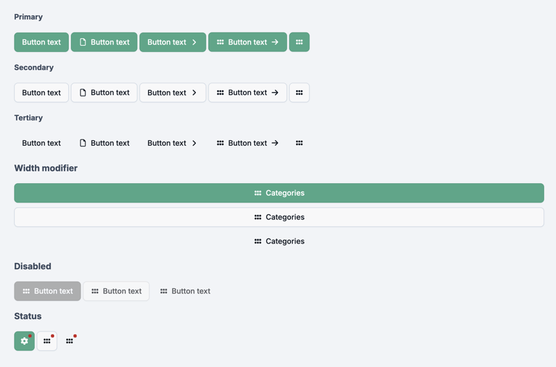
The button, styled using CSS Flexbox, includes primary, secondary, and tertiary styles, all structured within nested CSS for clarity and maintainability, with variations such as:
- with text
- with text and icon (left / right / left & right)
- with only icon
- with status
- for full-width
- for disabled type
HTML code:
LinkPrimary
Button text Button text Button text Button textSecondary
Button text Button text Button text Button textTertiary
Button text Button text Button text Button textWidth modifier
Categories Categories CategoriesDisabled
Button text Button text Button textStatus
CSS code:
/* ---------------------------------------------------------- */
/*                     Snippflow Button                       */
/* ---------------------------------------------------------- */

.sf-button {
    --sf-button-gap: 8px;
    --sf-button-padding-top: 12px;
    --sf-button-padding-bottom: 12px;
    --sf-button-padding-left: 16px;
    --sf-button-padding-right: 16px;
    --sf-button-border-radius: 8px;
    --sf-button-box-shadow: 0px 1px 2px 0px rgba(16, 24, 40, 0.05);

    --sf-button-primary-color: #fff;
    --sf-button-primary-bg: #46a787;
    --sf-button-primary-border: #3f9b7d;
    --sf-button-primary-hover-color: #fff;
    --sf-button-primary-hover-bg: #3c9376;
    --sf-button-primary-hover-border: #378c70;

    --sf-button-secondary-color: #121924;
    --sf-button-secondary-bg: #F8F8F9;
    --sf-button-secondary-border: #cbd5e1;
    --sf-button-secondary-hover-color: #121924;
    --sf-button-secondary-hover-bg: #fff;
    --sf-button-secondary-hover-border: #cbd5e1;

    --sf-button-tertiary-color: #121924;
    --sf-button-tertiary-bg: transparent;
    --sf-button-tertiary-border: transparent;
    --sf-button-tertiary-hover-color: #121924;
    --sf-button-tertiary-hover-bg: #e0e5ea;
    --sf-button-tertiary-hover-border: transparent;

    --sf-button-tertiary-status: #c82020;
}

a.sf-button,
input[type="submit"].sf-button,
input[type="reset"].sf-button,
input[type="button"].sf-button,
button.sf-button {
    display: inline-flex;
    align-items: center;
    justify-content: center;
    gap: var(--sf-button-gap);
    position: relative;
    box-sizing: border-box;
    font-size: inherit;
    font-weight: 500;
    line-height: 1;
    padding: var(--sf-button-padding-top) var(--sf-button-padding-right) var(--sf-button-padding-bottom) var(--sf-button-padding-left);
    border: 1px solid;
    border-radius: var(--sf-button-border-radius);
    white-space: nowrap;
    outline: unset;
    text-decoration: none;
    cursor: pointer;
    transition: all 0.3s ease-in-out;

    &[aria-expanded="true"],
    &:hover {
        text-decoration: none;
    }

    /* Is fit  (100%)*/
    &.is-fit {
        width: 100%;
    }

    /*   Is fit margin */
    &   .is-fit {
        margin-top: 10px; /* btn under other is-fit btm */
    }

    /* Has status */
    &.has-status {
        :after {
            content: "";
            display: block;
            width: 8px;
            height: 8px;
            border-radius: 100%;
            background-color: var(--sf-button-tertiary-status);
            position: absolute;
            right: 5px;
            top: 5px;
            animation: sp-status-pulse 1s infinite ease-in-out alternate;
        }
    }

    /* Is disabled */
    &.disabled,
    &:disabled,
    &[aria-disabled="true"] {
        cursor: default;
        filter: saturate(0%);
        opacity: .7;
        background: transparent;
        transform: none;
        box-shadow: none;
        outline: none;

        &:hover {
            color: initial;
            pointer-events: none;
        }
    }

    /*  Icon */
     & > i {
        min-width: 18px;
        font-style: normal;
        text-align: center;
    }

    /* Has only icon */
    &.has-only-icon {
        padding: var(--sf-button-padding-top);
    }

    /* Primary button */
    &.is-primary {
        color: var(--sf-button-primary-color);
        background-color: var(--sf-button-primary-bg);
        border-color: var(--sf-button-primary-border);
        box-shadow: var(--sf-button-box-shadow);

        &:hover:not(:disabled) {
            color: var(--sf-button-primary-color);
            background-color: var(--sf-button-primary-hover-bg);
            border-color: var(--sf-button-primary-hover-border);
        }
    }

    /* Secondary button */
    &.is-secondary {
        color: var(--sf-button-secondary-color);
        background-color: var(--sf-button-secondary-bg);
        border-color: var(--sf-button-secondary-border);
        box-shadow: var(--sf-button-box-shadow);

        &:hover:not(:disabled) {
            color: var(--sf-button-secondary-color);
            background-color: var(--sf-button-secondary-hover-bg);
            border-color: var(--sf-button-secondary-hover-border);
        }
    }

    /* Tertiary button */
    &.is-tertiary {
        color: var(--sf-button-tertiary-color);
        background-color: var(--sf-button-tertiary-bg);
        border-color: var(--sf-button-tertiary-border);

        &:hover:not(:disabled) {
            color: var(--sf-button-tertiary-color);
            background-color: var(--sf-button-tertiary-hover-bg);
            border-color: var(--sf-button-tertiary-hover-border);
        }
    }

}

@keyframes sp-status-pulse {
    from { transform: scale(0.8); }
    to { transform: scale(1.1); }
}
See the following Codepen for a demo:
PS. I hope it will be useful ;)
Full article: https://snippflow.com/snippet/flexbox-button-with-3-styles-and-variations/
CSS Snippets
Release Statement
This article is reproduced at: https://dev.to/snippflow/flexbox-button-with-3-styles-and-variations-5al?1 If there is any infringement, please contact [email protected] to delete it
Latest tutorial
More>
-
 How to pass exclusive pointers as function or constructor parameters in C++?Managing Unique Pointers as Parameters in Constructors and FunctionsUnique pointers (unique_ptr) uphold the principle of unique ownership in C 11. Wh...Programming Posted on 2025-07-03
 -
How to solve the error "Cannot guess file type, use application/octet-stream..." in AppEngine?AppEngine Static File MIME Type OverrideIn AppEngine, static file handlers can occasionally override the correct MIME type, resulting in the error mes...Programming Posted on 2025-07-03
-
Why Does Microsoft Visual C++ Fail to Correctly Implement Two-Phase Template Instantiation?The Mystery of "Broken" Two-Phase Template Instantiation in Microsoft Visual C Problem Statement:Users commonly express concerns that Micro...Programming Posted on 2025-07-03
-
How does Android send POST data to PHP server?Sending POST Data in AndroidIntroductionThis article addresses the need to send POST data to a PHP script and display the result in an Android applica...Programming Posted on 2025-07-03
-
Tips for finding element position in Java arrayRetrieving Element Position in Java ArraysWithin Java's Arrays class, there is no direct "indexOf" method to determine the position of a...Programming Posted on 2025-07-03
-
How to Efficiently Convert Timezones in PHP?Efficient Timezone Conversion in PHPIn PHP, handling timezones can be a straightforward task. This guide will provide an easy-to-implement method for ...Programming Posted on 2025-07-03
-
Why HTML cannot print page numbers and solutionsCan't Print Page Numbers on HTML Pages?Problem Description:Despite researching extensively, page numbers fail to appear when printing an HTML docu...Programming Posted on 2025-07-03
-
Can CSS locate HTML elements based on any attribute value?Targeting HTML Elements with Any Attribute Value in CSSIn CSS, it is possible to target elements based on specific attributes, as illustrated in the e...Programming Posted on 2025-07-03
-
How to efficiently insert data into multiple MySQL tables in one transaction?MySQL Insert into Multiple TablesAttempting to insert data into multiple tables with a single MySQL query may yield unexpected results. While it may s...Programming Posted on 2025-07-03
-
What is the difference between nested functions and closures in PythonNested Functions vs. Closures in PythonWhile nested functions in Python superficially resemble closures, they are fundamentally distinct due to a key ...Programming Posted on 2025-07-03
-
How to Resolve the \"Invalid Use of Group Function\" Error in MySQL When Finding Max Count?How to Retrieve the Maximum Count Using MySQLIn MySQL, you may encounter an issue while attempting to find the maximum count of values grouped by a sp...Programming Posted on 2025-07-03
-
Effective checking method for Java strings that are non-empty and non-nullChecking if a String is Not Null and Not EmptyTo determine if a string is not null and not empty, Java provides various methods.Option 1: isEmpty()For...Programming Posted on 2025-07-03
-
How to Convert a Pandas DataFrame Column to DateTime Format and Filter by Date?Transform Pandas DataFrame Column to DateTime FormatScenario:Data within a Pandas DataFrame often exists in various formats, including strings. When w...Programming Posted on 2025-07-03
-
Why Am I Getting a "Could Not Find an Implementation of the Query Pattern" Error in My Silverlight LINQ Query?Query Pattern Implementation Absence: Resolving "Could Not Find" ErrorsIn a Silverlight application, an attempt to establish a database conn...Programming Posted on 2025-07-03
-
Python metaclass working principle and class creation and customizationWhat are Metaclasses in Python?Metaclasses are responsible for creating class objects in Python. Just as classes create instances, metaclasses create ...Programming Posted on 2025-07-03


Study Chinese
- 1 How do you say "walk" in Chinese? 走路 Chinese pronunciation, 走路 Chinese learning
- 2 How do you say "take a plane" in Chinese? 坐飞机 Chinese pronunciation, 坐飞机 Chinese learning
- 3 How do you say "take a train" in Chinese? 坐火车 Chinese pronunciation, 坐火车 Chinese learning
- 4 How do you say "take a bus" in Chinese? 坐车 Chinese pronunciation, 坐车 Chinese learning
- 5 How to say drive in Chinese? 开车 Chinese pronunciation, 开车 Chinese learning
- 6 How do you say swimming in Chinese? 游泳 Chinese pronunciation, 游泳 Chinese learning
- 7 How do you say ride a bicycle in Chinese? 骑自行车 Chinese pronunciation, 骑自行车 Chinese learning
- 8 How do you say hello in Chinese? 你好Chinese pronunciation, 你好Chinese learning
- 9 How do you say thank you in Chinese? 谢谢Chinese pronunciation, 谢谢Chinese learning
- 10 How to say goodbye in Chinese? 再见Chinese pronunciation, 再见Chinese learning


