 Front page > Programming > Mastering Compound Components: Building Flexible and Reusable React Components
Mastering Compound Components: Building Flexible and Reusable React Components
Introduction
Something that is very useful and comprehensive in the world of React are its design patterns, as they help keep the code scalable and add meaning to the components we create.
There are several patterns, and in this article we will talk about Compound Components, an advanced pattern that is especially useful for creating flexible, composite interfaces.
What is Compound Components?
Compound Components is an advanced pattern in React. It aims to create a more flexible design, allowing the sharing of state and logic between a group of components, where communication between the parent component and child components must be done in a flexible way.
Components must work together to perform some behavior without creating embarrassing prop trees or logic that is too complex to be refactored or understood in the future.
This pattern helps us eliminate prop flaming, where we have to pass a prop tree between components. This prop injection is a problem as it can cause multiple unnecessary re-renders with each state that is updated, as each state will update all child components.
We have an example of Compound Components in the structure of select and option tags in HTML:
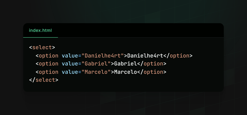
The select works as an interface state manager, while the options are configured in how the select should work.
Example using Compound Components
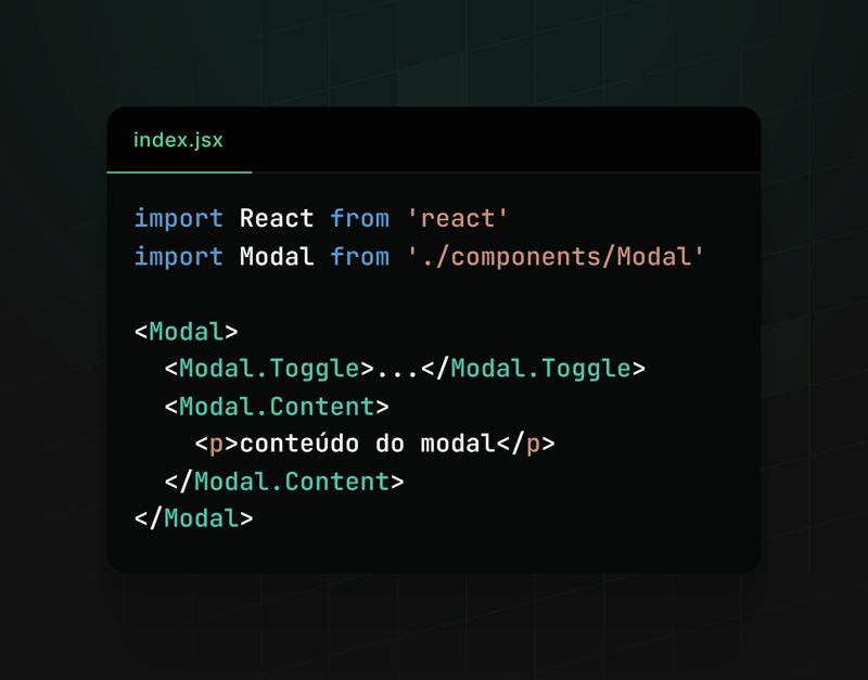
In this example, we will create a Modal, which is divided into two composite components: Toggle and Content. Where they will share the state of opening and closing the modal between them.
Let's see what it would be like to create this component step by step:
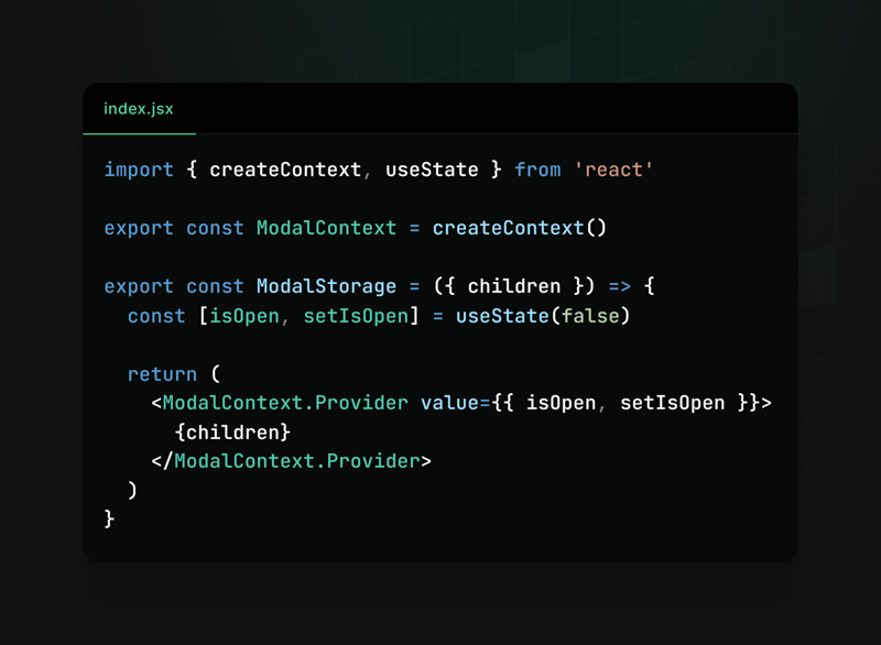
We can start by creating the context responsible for managing the state of opening and closing the modal

Creating the base of the Modal component
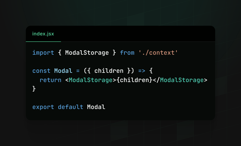
Note that we are using children, to get the components that will be inserted into the Modal, we will want to use it like this:
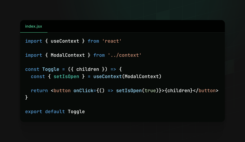
Now we need to create the toggle component, which will be responsible for opening the Modal
We also need the content component that will be responsible for displaying the content of the Modal
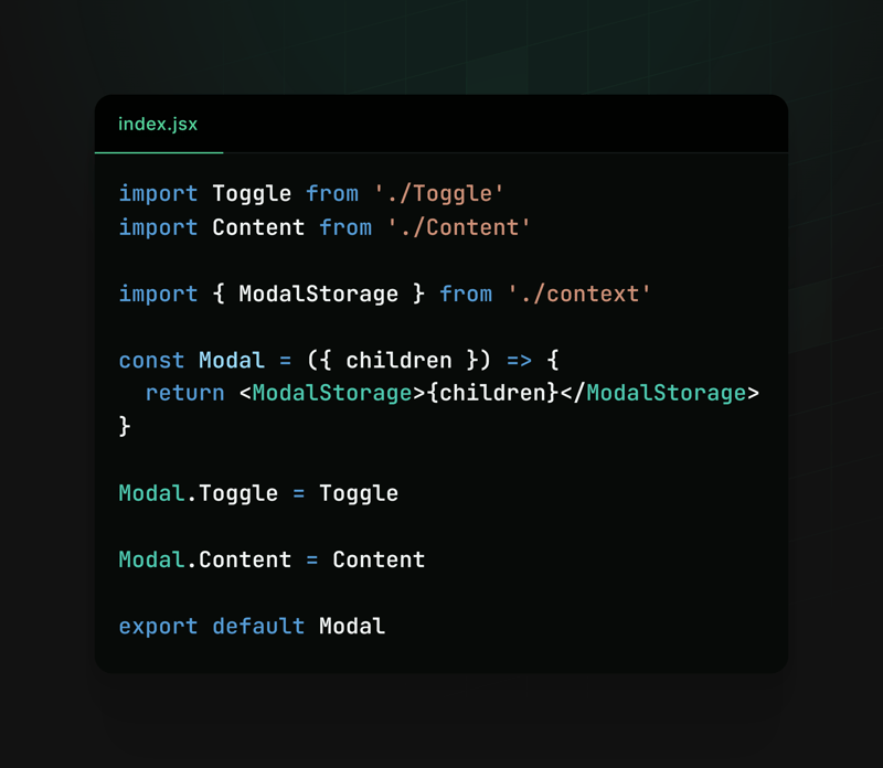
Finally, we can assign both to our Modal component and that's it (:
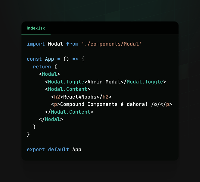
Using
Result

This way, we make the creation and use of modals extremely flexible and reusable. Modal.Toggle is responsible for activating the modal display, while Modal.Content must display the content of our modal.
This framework allows developers to easily customize the behavior and content of modals according to the specific needs of their applications, making the code cleaner and more organized.
Other examples
We can also use Compound Components in other contexts, for example:
Accordion Components:
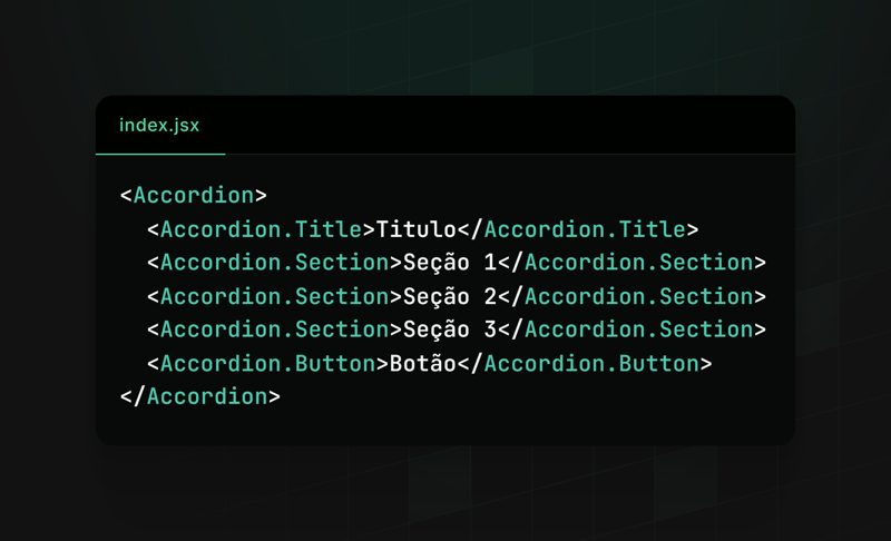
Menu Components:
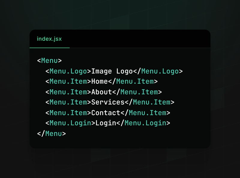
All are flexible and adaptable, facilitating the development, scalability and use of the component.
Conclusion
We saw how writing components in the Compound Components pattern can be useful in our applications, we also saw how to use it and some examples where this pattern can fit.
Feel free to explore and play around creating components with Compoud Components, use it wisely and see if it really makes sense to apply it in your context, sometimes, if it is not applied well, it can be more of a hindrance than a help.
NOTE: I posted this same content on react4noobs, a repository designed to group articles created by developers in the react universe. It's worth checking out =).
-
 How to Correctly Transfer Files Over Sockets in Java?Java File Transfer over Sockets: Sending and Receiving Byte ArraysIn Java, transferring files over sockets involves converting the file into byte arra...Programming Published on 2024-11-17
 -
 Why Use `enableReaderMode` API for Writing NDEF Records to NFC Tags?How to Write NDEF Records to NFC TagWriting NDEF records to an NFC tag requires utilizing the enableReaderMode API, which offers superior performance ...Programming Published on 2024-11-17
 -
 Beyond `if` Statements: Where Else Can a Type with an Explicit `bool` Conversion Be Used Without Casting?Contextual Conversion to bool Allowed Without a CastYour class defines an explicit conversion to bool, enabling you to use its instance 't' di...Programming Published on 2024-11-17
 -
 Here are some question-style titles that fit the content of your article: * MySQLdb on Mac OS X: Why am I getting \"Library not loaded: libmysqlclient.16.dylib\"? * How to Fix \"Library not loaded: lPython: MySQLdb and "Library not loaded: libmysqlclient.16.dylib"In an attempt to develop Python/Django applications, you've encountered...Programming Published on 2024-11-17
 -
 How to Fix \"ImproperlyConfigured: Error loading MySQLdb module\" in Django on macOS?MySQL Improperly Configured: The Problem with Relative PathsWhen running python manage.py runserver in Django, you may encounter the following error:I...Programming Published on 2024-11-17
 -
 Discover the Top Advantages of Progressive Web Apps for Your Next ProjectProgressive online Apps, or PWAs, are quickly changing the online development landscape. PWAs are becoming the ideal way to connect mobile application...Programming Published on 2024-11-17
 -
 Is `std::list::size()` Truly O(1) in Modern C++ Implementations?Is std::list::size() Truly O(n) in Modern Implementations?Recently, some developers have suggested that std::list::size() has a linear time complexity...Programming Published on 2024-11-17
 -
 What Happened to Column Offsetting in Bootstrap 4 Beta?Bootstrap 4 Beta: The Removal and Restoration of Column OffsettingBootstrap 4, in its Beta 1 release, introduced significant changes to the way column...Programming Published on 2024-11-17
 -
 How to Establish Remote Access to a ClearDB MySQL Database on Heroku?Remote Access to ClearDB MySQL Database on HerokuQuerying a ClearDB MySQL database remotely can be achieved through tools like MySQL Query Browser. To...Programming Published on 2024-11-17
 -
 When to Choose IFNULL Over COALESCE for Optimal Performance?Comparing Performance: IFNULL vs. COALESCEWhen a database column can only have two candidate values, both IFNULL and COALESCE can be used to retrieve ...Programming Published on 2024-11-17
 -
 How to Use Inner Joins in Access-SQL to Retrieve Data from Multiple Tables?Access-SQL: Inner Join with Multiple TablesWhen dealing with multiple interconnected tables in an Access database, the need arises to retrieve data fr...Programming Published on 2024-11-17
 -
 Why Is My Less.js Not Working in Chrome?Less.js Not Responding in ChromeLess.js functionality in Firefox while remaining unresponsive in Chrome has raised concerns. To determine the cause, l...Programming Published on 2024-11-17
 -
 How to Correctly Encode Special Characters in JSON with PHP\'s json_encode() Function?JSON Encoding and Special CharactersWhile encoding arrays using the json_encode() function, it may happen that elements containing special characters ...Programming Published on 2024-11-17
 -
 ## Why are my Go-GORM struct fields returning default values despite a successful query?Accessing Query Results in Go-GORM StructuresYou're facing an issue where the result of a query into a 'res' structure remains default val...Programming Published on 2024-11-17
 -
 How to Select Distinct Value Combinations from Multiple Columns in MySQL?Selecting Distinct Values from Multiple Columns in MySQLWhen working with databases, it's often necessary to retrieve unique combinations of value...Programming Published on 2024-11-17
Study Chinese
- 1 How do you say "walk" in Chinese? 走路 Chinese pronunciation, 走路 Chinese learning
- 2 How do you say "take a plane" in Chinese? 坐飞机 Chinese pronunciation, 坐飞机 Chinese learning
- 3 How do you say "take a train" in Chinese? 坐火车 Chinese pronunciation, 坐火车 Chinese learning
- 4 How do you say "take a bus" in Chinese? 坐车 Chinese pronunciation, 坐车 Chinese learning
- 5 How to say drive in Chinese? 开车 Chinese pronunciation, 开车 Chinese learning
- 6 How do you say swimming in Chinese? 游泳 Chinese pronunciation, 游泳 Chinese learning
- 7 How do you say ride a bicycle in Chinese? 骑自行车 Chinese pronunciation, 骑自行车 Chinese learning
- 8 How do you say hello in Chinese? 你好Chinese pronunciation, 你好Chinese learning
- 9 How do you say thank you in Chinese? 谢谢Chinese pronunciation, 谢谢Chinese learning
- 10 How to say goodbye in Chinese? 再见Chinese pronunciation, 再见Chinese learning


