CSS Grid: keywords de dimensionamento
Note: I just translated the text below and posted it here. References are at the end of this article.
Hello. Today I want to talk about some special CSS Grid keywords that are useful for defining the sizing of grid tracks. The ability to use these keywords will allow you to precisely determine the desired grid track sizes. So, let's go.
This article is part of my introduction to CSS Grid series. If you want to check out my previous posts, here you can find the full table of contents.
Introducing sizing keywords
When it comes to CSS Grid, there are only three keywords you can use to determine the size of tracks. These keywords are auto, min-content and max-content. All of them can be used in the CSS properties grid-template-colums and grid-template-rows.
Min-content and max-content
If you want to make the size of the grid track dependent on its content, you must use one of two keywords: min-content or max-content. Min-content grid track will attempt to maintain the minimum size without overflowing its content. Max-content grid track, however, assumes that the free space to expand is infinite and assumes the ideal width for your content.
Let me show you some examples showing the difference between the keywords mentioned. Keep in mind that each image contains two containers: the container with a min-content grid column on the left and the container with a max-content grid column on the right.

As you can see here, there is no difference in sizes between the min-content and max-content columns. The reason is that the image has its "default fixed size" which will not change unless you explicitly tell it to change. The content of a text, on the other hand, has the ability to "compress" its size depending on the situation. This compression is done using text wrapping (text wrapping), that is, single words do not wrap. Knowing this, let's replace the image in the example above with some text.
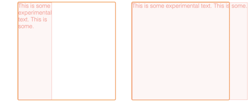
This time, the column widths are different. The column min-content forces its text content to "wrap" while the column max-content expands so much that no text wrapping is necessary. Note that the column min-content has the same width as the longest word and the column max-content is now wider than the container itself.
What will happen when a column contains more than one content type? Below is an example of columns containing image and text.

In both cases, the widest element determines the size of the column. In the case of min-content, this element is the image or the longest word. In the case of column max-width, this is an image or the entire text. Notice how both content types are separated vertically within the column. I want to discuss this behavior in one of my future articles.
Keyword Auto
The keyword auto is related to the unit fr that I described in the two previous articles. It similarly determines that the grid track must "fill" all the available space on a given axis.
.container {
    /** ... **/
    grid-template-columns: auto auto;
}
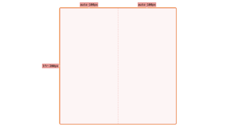
However, there are two main differences between the auto keyword and the fr unit. First, the keyword auto is not a unit, so you cannot use it with a numeric value (e.g. 2auto) like you can with fr. Second, the keyword auto always "loses" with the unit fr, when both are used together. See the example below.
.container {
    /** ... **/
    grid-template-columns: auto 1fr;
}
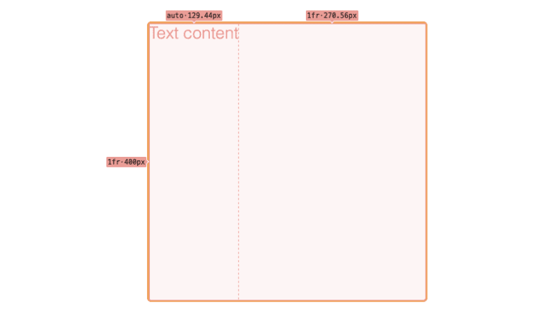
You can expect column auto to "fill" an equal amount of space to column fr in the horizontal dimension. However, the presence of the column fr causes the column to auto "shrink" its size to the size of the content present.
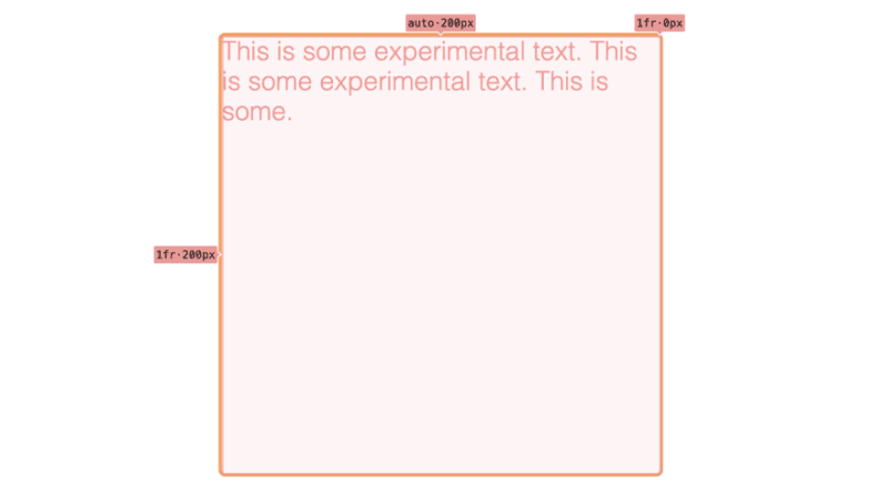
Note that in the case of text content, auto grid track behaves differently than min-content/max-content grid track. When auto is mixed with fr, auto-track never forces the text content to "wrap" unless auto-track "fills" all available space.
.container {
    /** ... **/
    width: 200px;
    grid-template-columns: auto 1fr;
}
Thank you for reading this short article. If you want to read more content like this, follow my dev.to or twitter account. Also, feel free to give me any kind of feedback. I would love to read your comments. See you soon in my next article!
PS. If you want to support my work, I would be grateful for a cup of coffee. Thanks. ❤️

Source
Article written by Mateusz Kirmuć.
-
 How do Java's Map.Entry and SimpleEntry simplify key-value pair management?A Comprehensive Collection for Value Pairs: Introducing Java's Map.Entry and SimpleEntryIn Java, when defining a collection where each element com...Programming Posted on 2025-04-17
 -
 Python Read CSV File UnicodeDecodeError Ultimate SolutionUnicode Decode Error in CSV File ReadingWhen attempting to read a CSV file into Python using the built-in csv module, you may encounter an error stati...Programming Posted on 2025-04-17
 -
 Why can't Java create generic arrays?Generic Array Creation ErrorQuestion:When attempting to create an array of generic classes using an expression like:public static ArrayList<myObjec...Programming Posted on 2025-04-17
 -
 When does a Go web application close the database connection?Managing Database Connections in Go Web ApplicationsIn simple Go web applications that utilize databases like PostgreSQL, the timing of database conne...Programming Posted on 2025-04-17
 -
 Why do stacked translucent boxes change in order?Color Perception of Stacked Semi-Translucent BoxesWhen two semi-translucent boxes are stacked atop one another, the perceived color of the combined la...Programming Posted on 2025-04-17
 -
 How to Capture and Stream stdout in Real Time for Chatbot Command Execution?Capturing stdout in Real Time from Command ExecutionIn the realm of developing chatbots capable of executing commands, a common requirement is the abi...Programming Posted on 2025-04-17
 -
 How to Handle User Input in Java's Full-Screen Exclusive Mode?Handling User Input in Full Screen Exclusive Mode in JavaIntroductionWhen running a Java application in full screen exclusive mode, the usual event ha...Programming Posted on 2025-04-17
 -
 PHP SimpleXML parsing XML method with namespace colonParsing XML with Namespace Colons in PHPSimpleXML encounters difficulties when parsing XML containing tags with colons, such as XML elements with pref...Programming Posted on 2025-04-17
 -
 Reasons why Python does not report errors to the slicing of the hyperscope substringSubstring Slicing with Index Out of Range: Duality and Empty SequencesIn Python, accessing elements of a sequence using the slicing operator, such as ...Programming Posted on 2025-04-17
 -
 How to Check if an Object Has a Specific Attribute in Python?Method to Determine Object Attribute ExistenceThis inquiry seeks a method to verify the presence of a specific attribute within an object. Consider th...Programming Posted on 2025-04-17
 -
 How to create dynamic variables in Python?Dynamic Variable Creation in PythonThe ability to create variables dynamically can be a powerful tool, especially when working with complex data struc...Programming Posted on 2025-04-17
 -
 The difference between PHP and C++ function overload processingPHP Function Overloading: Unraveling the Enigma from a C PerspectiveAs a seasoned C developer venturing into the realm of PHP, you may encounter t...Programming Posted on 2025-04-17
 -
 How Can I Handle UTF-8 Filenames in PHP's Filesystem Functions?Handling UTF-8 Filenames in PHP's Filesystem FunctionsWhen creating folders containing UTF-8 characters using PHP's mkdir function, you may en...Programming Posted on 2025-04-17
 -
 How to efficiently detect empty arrays in PHP?Checking Array Emptiness in PHPAn empty array can be determined in PHP through various approaches. If the need is to verify the presence of any array ...Programming Posted on 2025-04-17
 -
 How Can I UNION Database Tables with Different Numbers of Columns?Combined tables with different columns] Can encounter challenges when trying to merge database tables with different columns. A straightforward way i...Programming Posted on 2025-04-17
Study Chinese
- 1 How do you say "walk" in Chinese? 走路 Chinese pronunciation, 走路 Chinese learning
- 2 How do you say "take a plane" in Chinese? 坐飞机 Chinese pronunciation, 坐飞机 Chinese learning
- 3 How do you say "take a train" in Chinese? 坐火车 Chinese pronunciation, 坐火车 Chinese learning
- 4 How do you say "take a bus" in Chinese? 坐车 Chinese pronunciation, 坐车 Chinese learning
- 5 How to say drive in Chinese? 开车 Chinese pronunciation, 开车 Chinese learning
- 6 How do you say swimming in Chinese? 游泳 Chinese pronunciation, 游泳 Chinese learning
- 7 How do you say ride a bicycle in Chinese? 骑自行车 Chinese pronunciation, 骑自行车 Chinese learning
- 8 How do you say hello in Chinese? 你好Chinese pronunciation, 你好Chinese learning
- 9 How do you say thank you in Chinese? 谢谢Chinese pronunciation, 谢谢Chinese learning
- 10 How to say goodbye in Chinese? 再见Chinese pronunciation, 再见Chinese learning


