 Front page > Programming > Comprehensive Weather Data Analysis Using Python: Temperature, Rainfall Trends, and Visualizations
Comprehensive Weather Data Analysis Using Python: Temperature, Rainfall Trends, and Visualizations
-
Weather Data Analysis and Forecasting for Different Cities in Kenya
- Introduction
- Dataset overview
- Exploratory Data Analysis
- Visualising Key Weather Features
- Weather Condition Analysis
- City-wise Rainfall
- Average Monthly Temperature
- Average Monthly Rainfall
- Correlation Between Weather Variables
- Case Study: City Specific Trends
- Conclusion
Weather Data Analysis and Forecasting for Different Cities in Kenya
Introduction
In this article, I’ll walk you through analyzing weather patterns using Python. From identifying temperature trends to visualizing rainfall, this step-by-step guide is perfect for anyone interested in using data science techniques for weather analysis. I’ll explore code, data manipulation, and visualizations for practical insights.
In Kenya, Weather plays a critical role in many sectors, particularly agriculture, tourism, and outdoor activities. Farmers, businesses, and event planners need accurate weather information in order to make decisions. However, weather patterns can vary significantly across different regions, and current forecasting systems may not always provide localised insights.
The objective of this project is to collect real-time weather data from from OpenWeatherMap API and Weather API for different regions across Kenya. This data will be stored in a database and analysed using Python to uncover insights into:-
- Temperature trends
- Rainfall patterns - Humidity and wind conditions
In this project, I analyze a dataset containing weather information for various cities in Kenya. The dataset includes over 3,000 rows of weather observations, including temperature, humidity, pressure, wind speed, visibility, and rainfall, among other factors. Using these insights, we aim to provide accurate, region specific weather forecast that can aid decision-making in weather sensitive sectors like agriculture, tourism, and even management.
Dataset overview
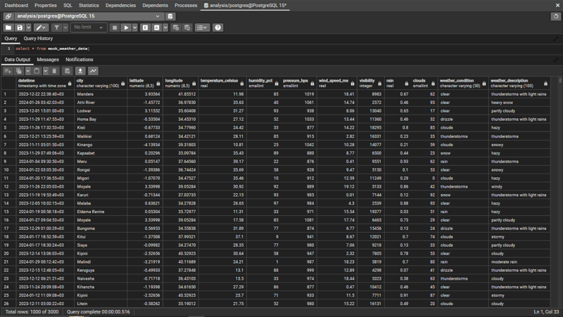
The dataset was structured using several columns:
- Datetime - Timestamp indicating when the weather was recorded.
- City and Country - Location of the weather observation.
- Latitude and Longitude - Geographical coordinates of the location.
- Temperature (Celsius) - The temperature recorded.
- Humidity (%) - The percentage of humidity in the air.
- Pressure (hPa) - The atmospheric pressure in hectopascals.
- Wind Speed (m/s) - The speed of the wind at the time.
- Rain (mm) - The amount of rainfall measured in millimeters.
- Clouds (%) - The percentage of cloud coverage.
- Weather Condition and Weather Description - General and detailed descriptions of the weather (e.g., 'Clouds', 'Scattered Clouds').
This is how the data is structured in the database.
Exploratory Data Analysis
The first step in the analysis involved basic exploration of the data.
_ Data dimensions - The dataset contains 3,000 rows and 14 columns.
_ Null Values - Minimal missing data, ensuring that the dataset was reliable for further analysis.
print(df1[['temperature_celsius', 'humidity_pct', 'pressure_hpa', 'wind_speed_ms', 'rain', 'clouds']].describe())
Using the code above, we computed summary statistics for the numerical columns, that provided insights into the range, mean, and spread of temperature, humidity, pressure, rainfall and clouds.
Visualising Key Weather Features
To gain a clearer understanding of the weather features, we plotted various distributions:
Temperature Distribution
sns.displot(df1['temperature_celsius'], bins=50, kde=True)
plt.title('Temperature Distribution')
plt.xlabel('Temperature (Celsius)')
This distibution reveals the general spread of temperatures across the cities. The KDE line plot gives a smooth estimate of the probability distribution of temperature.
Rainfall Distribution
sns.displot(df1['rain'], bins=50, kde=True)
plt.title('Rainfall Distribution')
plt.xlabel('Rainfall (mm/h)')
This code analyzes rainfall distribution across kenyan cities.
Humidity, Pressure and Wind Speed
Similar distribution plots for Humidity (%), Pressure (hPa), and Wind Speed (m/s), each providing useful insights into the variations of these parameters across the dataset.
Weather Condition Analysis
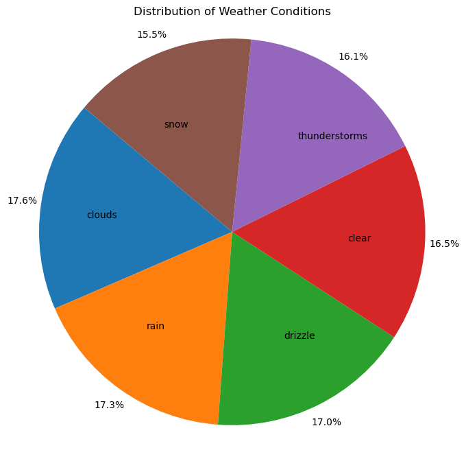
Weather conditions (e.g., 'Clouds', 'Rain') were counted and visualized using a pie chart to show their proportional distribution:
condition_counts = df1['weather_condition'].value_counts()

plt.figure(figsize=(8,8))
plt.pie(condition_counts, labels=condition_counts.index, autopct='%1.1f%%', pctdistance=1.1, labeldistance=0.6, startangle=140)
plt.title('Distribution of Weather Conditions')
plt.axis('equal')
plt.show()
City-wise Rainfall
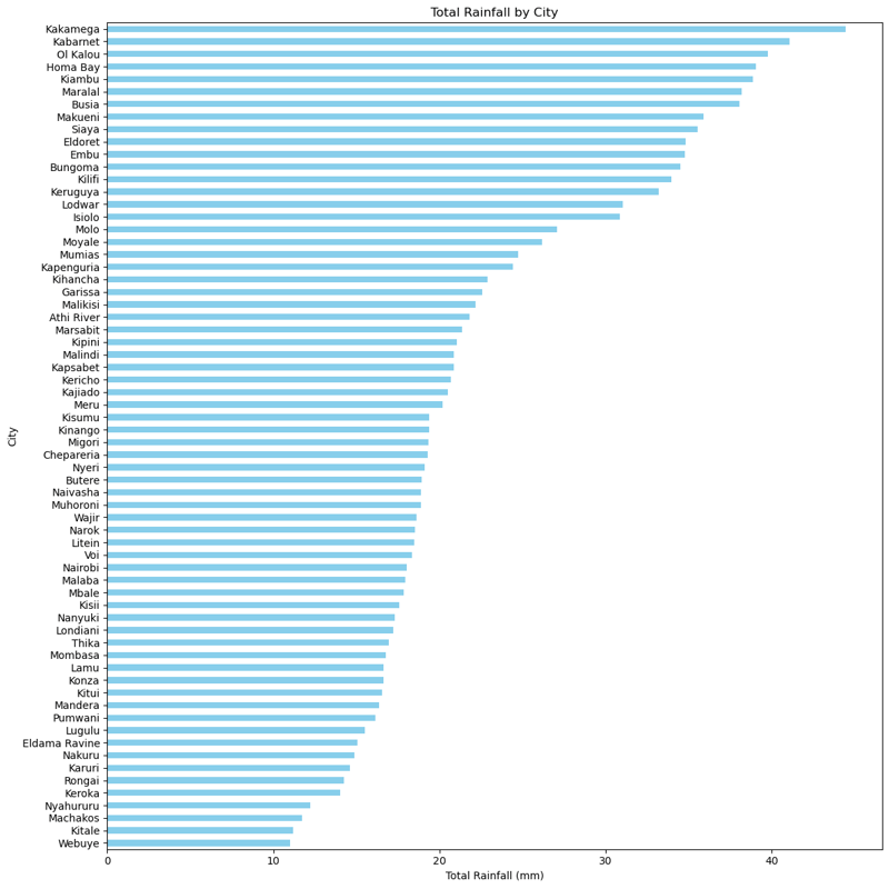
One of the key analysis was the total rainfall by city:
rainfall_by_city = df1.groupby('city')['rain'].sum().sort_values()

plt.figure(figsize=(12,12))
rainfall_by_city.plot(kind='barh', color='skyblue')
plt.title('Total Rainfall by City')
plt.xlabel('Total Rainfall (mm)')
plt.ylabel('City')
plt.tight_layout()
plt.show()
This bar plot highlighted which cities received the most rain over the observed period, with a few outliers showing significant rainfall compared to others.
Average Monthly Temperature
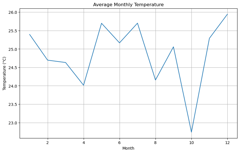
avg_temp_by_month.plot(kind='line')
plt.title('Average Monthly Temperature')
The line chart revealed temperature fluctuations across different months, showing seasonal changes.
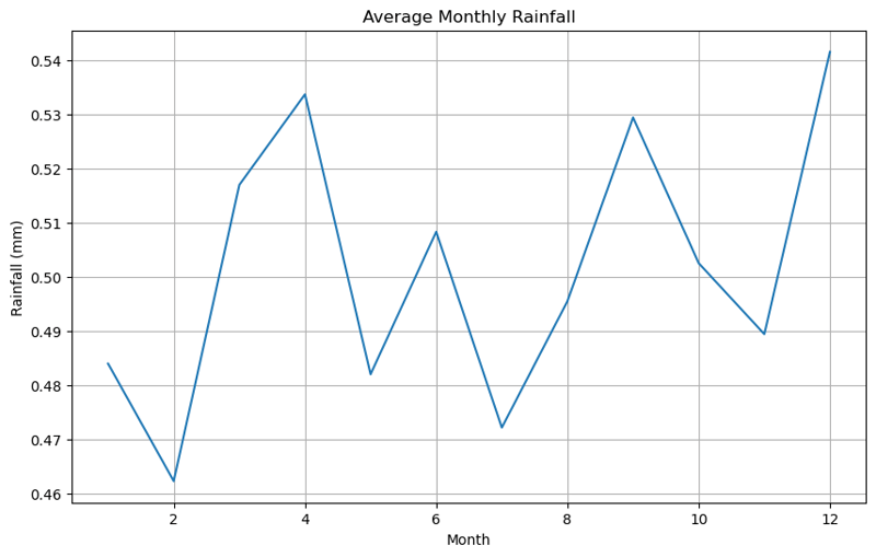
Average Monthly Rainfall
monthly_rain.plot(kind='line')
plt.title('Average Monthly Rainfall')
Similarly, rainfall was analyzed to observe how it varied month-to-month.
We also visualized the data using heatmaps for a more intuitive understanding of monthly temperature and rainfall.
Here are the heatmaps for the average monthly temperature and rainfall


Correlation Between Weather Variables
Next, I calculated the correlation matrix between key weather variables:
correlation_matrix = df1[['temperature_celsius', 'humidity_pct', 'pressure_hpa', 'wind_speed_ms', 'rain', 'clouds']].corr()
correlation_matrix
sns.heatmap(correlation_matrix, annot=True, cmap='coolwarm')
plt.title('Correlation Between Weather Variables')
This heatmap allowed us to identify relationships between variables. For example, we observed a negative correlation between temperature and humidity, as expected.
Case Study: City Specific Trends
I have focused on individual cities such as Mombasa and Nyeri, to explore their unique weather patterns:
Mombasa Temperature Trends
plt.plot(monthly_avg_temp_msa)
plt.title('Temperature Trends in Mombasa Over Time')
This city showed significant variation in temperature across the year.
Nyeri Rainfall Trends
plt.plot(monthly_avg_rain_nyr)
plt.title('Rainfall Trends in Nyeri Over Time')
The rainfall data for Nyeri displayed a clear seasonal pattern, with rainfall peaking during certain months.
Conclusion
This analysis provides a comprehensive overview of the weather conditions in major cities, highlighting the temperature, rainfall, and other key weather variables. By using visualizations like histograms, line charts, pie charts, and heatmaps, we were able to extract meaningful insights into the data. Further analysis could involve comparing these trends with historical weather patterns or exploring predictive modeling to forecast future weather trends.
You can find the Jupyter Notebook with the full code for this analysis in my GitHub repository).
-
 Why Does Microsoft Visual C++ Fail to Correctly Implement Two-Phase Template Instantiation?The Mystery of "Broken" Two-Phase Template Instantiation in Microsoft Visual C Problem Statement:Users commonly express concerns that Micro...Programming Posted on 2025-07-04
 -
 FastAPI Custom 404 Page Creation GuideCustom 404 Not Found Page with FastAPITo create a custom 404 Not Found page, FastAPI offers several approaches. The appropriate method depends on your...Programming Posted on 2025-07-04
 -
 PHP Future: Adaptation and InnovationThe future of PHP will be achieved by adapting to new technology trends and introducing innovative features: 1) Adapting to cloud computing, container...Programming Posted on 2025-07-04
 -
 Solve the \\"String value error\\" exception when MySQL inserts EmojiResolving Incorrect String Value Exception When Inserting EmojiWhen attempting to insert a string containing emoji characters into a MySQL database us...Programming Posted on 2025-07-04
 -
 The compiler error "usr/bin/ld: cannot find -l" solutionError Encountered: "usr/bin/ld: cannot find -l"When attempting to compile a program, you may encounter the following error message:usr/bin/l...Programming Posted on 2025-07-04
 -
 CSS strongly typed language analysisOne of the ways you can classify a programming language is by how strongly or weakly typed it is. Here, “typed” means if variables are known at compil...Programming Posted on 2025-07-04
 -
 How to pass exclusive pointers as function or constructor parameters in C++?Managing Unique Pointers as Parameters in Constructors and FunctionsUnique pointers (unique_ptr) uphold the principle of unique ownership in C 11. Wh...Programming Posted on 2025-07-04
 -
 Will fake wakeup really happen in Java?Spurious Wakeups in Java: Reality or Myth?The concept of spurious wakeups in Java synchronization has been a subject of discussion for quite some time...Programming Posted on 2025-07-04
 -
 Reasons for CodeIgniter to connect to MySQL database after switching to MySQLiUnable to Connect to MySQL Database: Troubleshooting Error MessageWhen attempting to switch from the MySQL driver to the MySQLi driver in CodeIgniter,...Programming Posted on 2025-07-04
 -
 How to prevent duplicate submissions after form refresh?Preventing Duplicate Submissions with Refresh HandlingIn web development, it's common to encounter the issue of duplicate submissions when a page ...Programming Posted on 2025-07-04
 -
 Causes and solutions for Face Detection Failure: Error -215Error Handling: Resolving "error: (-215) !empty() in function detectMultiScale" in OpenCVWhen attempting to utilize the detectMultiScale() m...Programming Posted on 2025-07-04
 -
 How to Convert a Pandas DataFrame Column to DateTime Format and Filter by Date?Transform Pandas DataFrame Column to DateTime FormatScenario:Data within a Pandas DataFrame often exists in various formats, including strings. When w...Programming Posted on 2025-07-04
 -
 How to Handle User Input in Java's Full-Screen Exclusive Mode?Handling User Input in Full Screen Exclusive Mode in JavaIntroductionWhen running a Java application in full screen exclusive mode, the usual event ha...Programming Posted on 2025-07-04
 -
 How to Resolve the \"Invalid Use of Group Function\" Error in MySQL When Finding Max Count?How to Retrieve the Maximum Count Using MySQLIn MySQL, you may encounter an issue while attempting to find the maximum count of values grouped by a sp...Programming Posted on 2025-07-04
 -
 How Can I Customize Compilation Optimizations in the Go Compiler?Customizing Compilation Optimizations in Go CompilerThe default compilation process in Go follows a specific optimization strategy. However, users may...Programming Posted on 2025-07-04
Study Chinese
- 1 How do you say "walk" in Chinese? 走路 Chinese pronunciation, 走路 Chinese learning
- 2 How do you say "take a plane" in Chinese? 坐飞机 Chinese pronunciation, 坐飞机 Chinese learning
- 3 How do you say "take a train" in Chinese? 坐火车 Chinese pronunciation, 坐火车 Chinese learning
- 4 How do you say "take a bus" in Chinese? 坐车 Chinese pronunciation, 坐车 Chinese learning
- 5 How to say drive in Chinese? 开车 Chinese pronunciation, 开车 Chinese learning
- 6 How do you say swimming in Chinese? 游泳 Chinese pronunciation, 游泳 Chinese learning
- 7 How do you say ride a bicycle in Chinese? 骑自行车 Chinese pronunciation, 骑自行车 Chinese learning
- 8 How do you say hello in Chinese? 你好Chinese pronunciation, 你好Chinese learning
- 9 How do you say thank you in Chinese? 谢谢Chinese pronunciation, 谢谢Chinese learning
- 10 How to say goodbye in Chinese? 再见Chinese pronunciation, 再见Chinese learning


