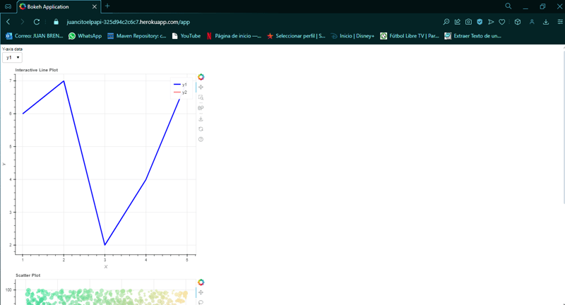
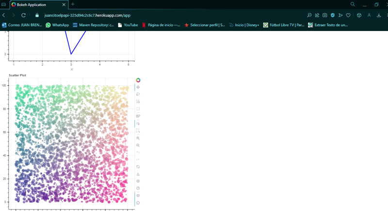
Bokeh an interesting data tool in python for data visualization
Data visualization plays a critical role in interpreting large volumes of information. Tools like Bokeh have emerged as popular solutions for building interactive dashboards and reports. Each tool brings unique advantages depending on the complexity of your project and your preferred programming language. In this article, we will delve into each tool and then focus on Bokeh, including a hands-on example and deployment in the cloud.
So that...
What is bokeh?
Bokeh is an interactive visualization library that targets modern web browsers for presentation. It offers elegant and concise graphics, enabling developers to build dashboards with advanced interactivity. Bokeh is particularly suitable for data scientists and developers using Python, offering both high-level interfaces and granular control over your plots.
How can you use this tool?
- Install dependencies:
pip install bokeh
pip install gunicorn
- Create the plot: In this case i developed two plots in the main page then i called "app.py"

from bokeh.layouts import column
from bokeh.models import ColumnDataSource, Select
from bokeh.plotting import figure, curdoc
import numpy as np

# Sample data for line plot
line_data = {
    'x': [1, 2, 3, 4, 5],
    'y1': [6, 7, 2, 4, 7],
    'y2': [1, 4, 8, 6, 9]
}

# Data for scatter plot
N = 4000
x_scatter = np.random.random(size=N) * 100
y_scatter = np.random.random(size=N) * 100
radii = np.random.random(size=N) * 1.5
colors = np.array([(r, g, 150) for r, g in zip(50   2 * x_scatter, 30   2 * y_scatter)], dtype="uint8")

# Create ColumnDataSource for line plot
source = ColumnDataSource(data={'x': line_data['x'], 'y': line_data['y1']})

# Create a figure for line plot
plot_line = figure(title="Interactive Line Plot", x_axis_label='X', y_axis_label='Y')
line1 = plot_line.line('x', 'y', source=source, line_width=3, color='blue', legend_label='y1')
line2 = plot_line.line('x', 'y2', source=source, line_width=3, color='red', legend_label='y2', line_alpha=0.5)

# Create a figure for scatter plot
plot_scatter = figure(title="Scatter Plot", tools="hover,crosshair,pan,wheel_zoom,zoom_in,zoom_out,box_zoom,undo,redo,reset,tap,save,box_select,poly_select,lasso_select,examine,help")
plot_scatter.circle(x_scatter, y_scatter, radius=radii,
                    fill_color=colors, fill_alpha=0.6,
                    line_color=None)

# Dropdown widget to select data for line plot
select = Select(title="Y-axis data", value='y1', options=['y1', 'y2'])

# Update function to change data based on selection
def update(attr, old, new):
    selected_y = select.value
    source.data = {'x': line_data['x'], 'y': line_data[selected_y]}
    # Update line colors based on selection
    line1.visible = (selected_y == 'y1')
    line2.visible = (selected_y == 'y2')
    plot_line.title.text = f"Interactive Line Plot - Showing {selected_y}"

select.on_change('value', update)

# Arrange plots and widgets in a layout
layout = column(select, plot_line, plot_scatter)

# Add layout to current document
curdoc().add_root(layout)
`
Create your page in heroku and make the next to steps.
- Create a Procfile:

In this file declare for example in my case.
web: bokeh serve --port=$PORT --address=0.0.0.0 --allow-websocket-origin=juancitoelpapi-325d94c2c6c7.herokuapp.com app.py
- Create requeriments: In the project create requirements.txt and write and save

bokeh
- Push your project:
It's similar when you push a project in git but in this case the final master push is in heroku
git init
git add .
git commit -m "Deploy Bokeh app with Gunicorn"
git push heroku master
- And Finally ...
You can see your page with the plots bokeh.


- Conclusion
The real power of Bokeh lies in its ability to deliver interactive dashboards in web environments, making it ideal for real-time data monitoring and large datasets. By using Gunicorn to deploy Bokeh applications on cloud services like Heroku, you can build scalable, production-ready dashboards that are easy to maintain and update.
-
 How Can I Reliably Check for Column Existence in a MySQL Table?Determining Column Existence in a MySQL TableIn MySQL, verifying the presence of a column in a table can be a bit perplexing compared to other databas...Programming Posted on 2025-02-19
 -
 Why Does Microsoft Visual C++ Fail to Correctly Implement Two-Phase Template Instantiation?The Mystery of "Broken" Two-Phase Template Instantiation in Microsoft Visual C Problem Statement:Users commonly express concerns that Micro...Programming Posted on 2025-02-19
 -
 How can I install MySQL on Ubuntu without a password prompt?Non-Interactive Installation of MySQL on UbuntuThe standard method of installing MySQL server on Ubuntu using sudo apt-get install mysql prompts for a...Programming Posted on 2025-02-19
 -
 Why Do Arrow Functions Cause Syntax Errors in IE11 and How Can I Fix Them?Why Arrow Functions Cause Syntax Errors in IE 11In the provided D3.js code, the error arises from the use of arrow functions. IE 11 does not support a...Programming Posted on 2025-02-19
 -
 Does `exec()` Update Local Variables in Python 3, and If Not, How Can It Be Made To?exec's Impact on Local Variables: A Dive InThe exec function, a Python staple for dynamic code execution, poses an intriguing query: can it update...Programming Posted on 2025-02-19
 -
 How to Check if an Object Has a Specific Attribute in Python?Method to Determine Object Attribute ExistenceThis inquiry seeks a method to verify the presence of a specific attribute within an object. Consider th...Programming Posted on 2025-02-19
 -
 How to Sort Data by String Length in MySQL Using CHAR_LENGTH()?Selecting Data by String Length in MySQLTo sort data based on string length in MySQL, instead of using string_length(column), consider using the built...Programming Posted on 2025-02-19
 -
 How to Ensure Hibernate Preserves Enum Values When Mapping to a MySQL Enum Column?Preserving Enum Values in Hibernate: Troubleshooting Wrong Column TypeIn the realm of data persistence, ensuring the compatibility between data models...Programming Posted on 2025-02-19
 -
 How Can I Control Android Device Vibrations with Varying Frequencies?Controlling Android Device Vibrations with Frequency VariationsWant to add a tactile element to your Android app? Understanding how to trigger the dev...Programming Posted on 2025-02-19
 -
 How Can I Remove a Div Element While Keeping Its Contents Intact?Eliminating a Div While Preserving Its ElementsTo move elements from within a div to outside of it for varying screen sizes, an alternative to repeati...Programming Posted on 2025-02-19
 -
 How Can I Efficiently Count Element Occurrences in a Java List?Counting Element Occurrences in a ListWithin the realm of Java programming, the task of enumerating element occurrences within a list comes to the for...Programming Posted on 2025-02-19
 -
 How to Implement Custom Exception Handling with Python\'s Logging Module?Custom Error Handling with Python's Logging ModuleEnsuring that uncaught exceptions are properly handled and logged can be crucial for troubleshoo...Programming Posted on 2025-02-19
 -
 How Can I UNION Database Tables with Different Numbers of Columns?Combined tables with different columns] Can encounter challenges when trying to merge database tables with different columns. A straightforward way i...Programming Posted on 2025-02-19
 -
 Why is my exec() function failing, even after disabling safe mode and checking permissions?Debugging exec() Function IssuesProblem StatementDespite efforts to disable safe mode, ensure proper console command functionality, and test with expl...Programming Posted on 2025-02-18
 -
![How to Resolve "Unrecognized name: employees at [9:8]" Error in BigQuery?](/style/images/moren/moren.png) How to Resolve "Unrecognized name: employees at [9:8]" Error in BigQuery?Error: "Unrecognized name: employees at [9:8]"] When using table alias, you may encounter the "Unrecognized name: employees at [9:8]&q...Programming Posted on 2025-02-18
How to Resolve "Unrecognized name: employees at [9:8]" Error in BigQuery?Error: "Unrecognized name: employees at [9:8]"] When using table alias, you may encounter the "Unrecognized name: employees at [9:8]&q...Programming Posted on 2025-02-18
Study Chinese
- 1 How do you say "walk" in Chinese? 走路 Chinese pronunciation, 走路 Chinese learning
- 2 How do you say "take a plane" in Chinese? 坐飞机 Chinese pronunciation, 坐飞机 Chinese learning
- 3 How do you say "take a train" in Chinese? 坐火车 Chinese pronunciation, 坐火车 Chinese learning
- 4 How do you say "take a bus" in Chinese? 坐车 Chinese pronunciation, 坐车 Chinese learning
- 5 How to say drive in Chinese? 开车 Chinese pronunciation, 开车 Chinese learning
- 6 How do you say swimming in Chinese? 游泳 Chinese pronunciation, 游泳 Chinese learning
- 7 How do you say ride a bicycle in Chinese? 骑自行车 Chinese pronunciation, 骑自行车 Chinese learning
- 8 How do you say hello in Chinese? 你好Chinese pronunciation, 你好Chinese learning
- 9 How do you say thank you in Chinese? 谢谢Chinese pronunciation, 谢谢Chinese learning
- 10 How to say goodbye in Chinese? 再见Chinese pronunciation, 再见Chinese learning


![How to Resolve "Unrecognized name: employees at [9:8]" Error in BigQuery?](http://www.luping.net/uploads/20250218/173987605067b466d280e71.jpg173987605067b466d280e79.jpg)


