7 Features Windows 12 Should Steal From Linux
Windows 12 is still in development, giving us time to make some demands. For inspiration, let's look at Linux, the underdog of desktop computing. Here are 7 surprisingly advanced, quality-of-life features that Linux offers, and Windows 12 should definitely steal them.
No Ads in the User Interface
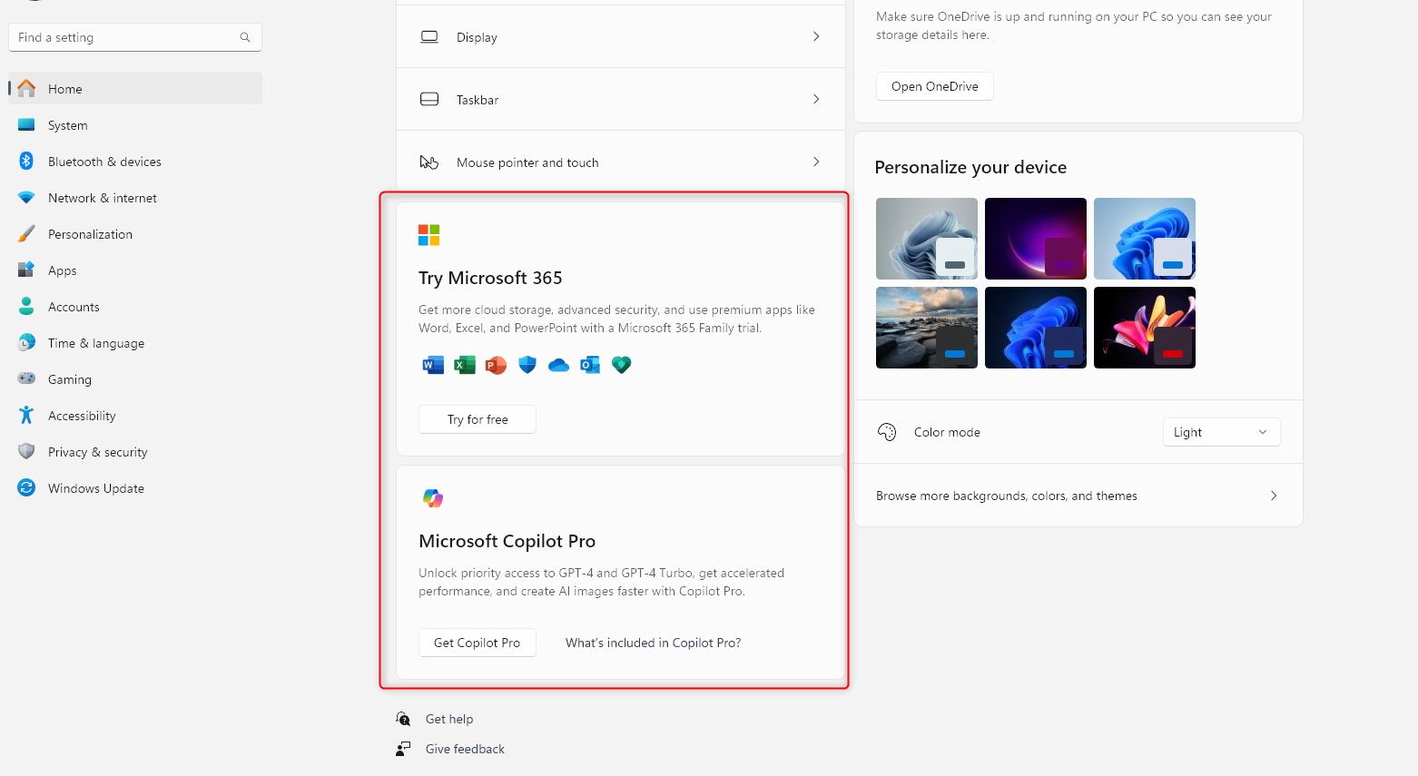
Recently, Microsoft started testing ads in the Windows 11 Start Menu, with the idea that ads and recommendations help users find good apps and products. While I can't objectively claim if that's true or not for all users, I personally find ads in the UI distracting and disruptive to my workflow. It's actually one of the main reasons why I switched to Linux as my work system and only use Windows for gaming and entertainment. For instance, sometimes I have to share my screen, and I'd like it if my Start Menu didn't show Candy Crush as a suggested app during an important meeting about productivity.
In contrast, Linux offers a much more professional workspace. The UI is extremely customizable, so you can fine tune it to best suit your workflow. It won't ever bother you with app recommendations or nudge you to buy different services while navigating the UI. But if you want recommendations, which is expected if you visit the app store, you will get a curated list of Featured Apps or Editor's Choices. But again, it's not intrusive and the focus is on allowing you to find the app you came to download.
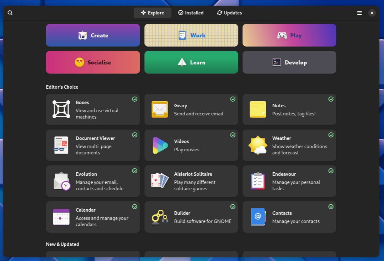
So the first thing Windows 12 should steal from Linux is a nonintrusive user experience. It'd be best if ads were completely removed, but opt-in ads would provide a better user experience than enabled by default, as it is now.
On Windows 11, ads are enabled by default, but they can be disabled. Follow this guide to know where all the options are.
Multiple Start Menu Variations
Now, coming to the good stuff, what is most certain about a new Windows release? A new Start Menu design! And with Windows 12, let’s just allow people to choose or customize their own Start Menu.
The Windows 7 Start Menu was universally beloved. Windows 8’s Start Menu was a phase that we and Microsoft would like to forget. Windows 10’s Start Menu had critiques, but I actually liked it. The Windows 11 Start Menu has more admirers, but I’m not a huge fan. So, instead of making these divisive UI changes, why not allow users to customize the Start Menu as they like?
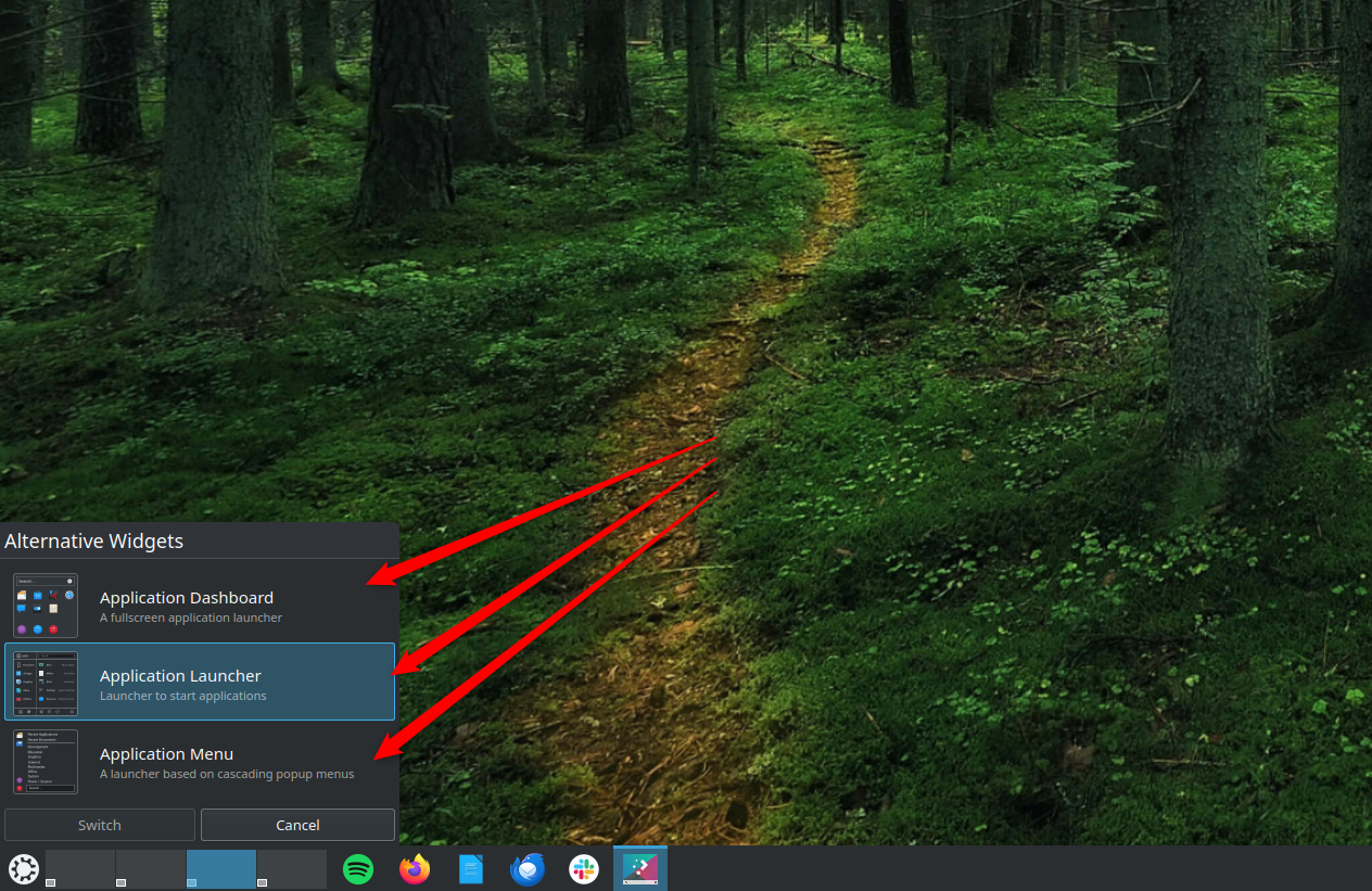
Take Kubuntu running KDE Plasma. It gives you different types of launcher variations for the Application Menu (the equivalent to Windows’ Start Menu).
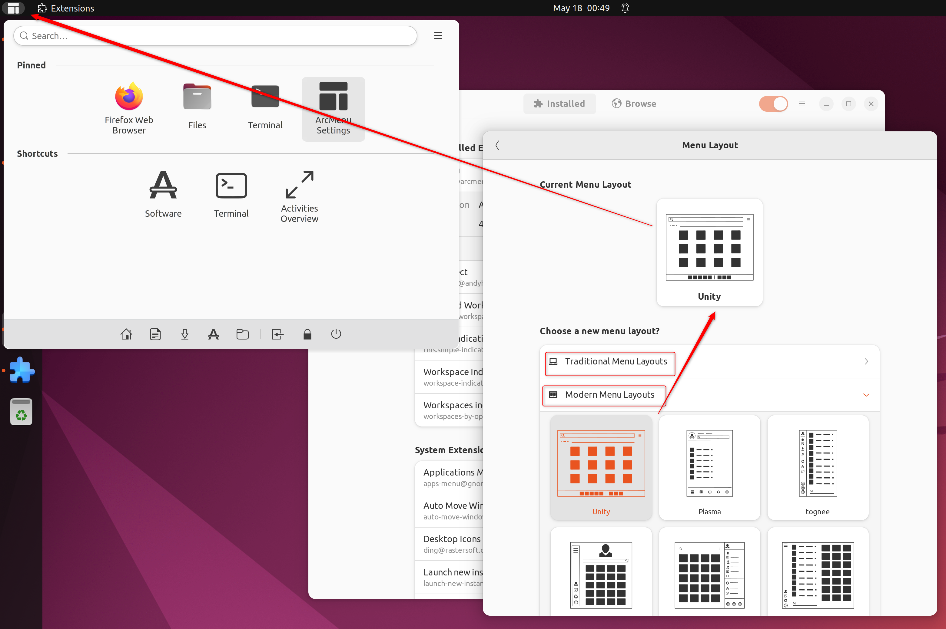
Whereas, on Ubuntu, you can install an extension called Arc Menu, which provides dozens of application menu variations with extensive customization options.
Widgets on the Desktop
Windows 7 had widgets and it was wonderful. Sadly, Microsoft removed them because of security concerns, but they made a comeback (sort of) with Windows 11. The problem is that Windows 11 widgets are tucked away inside a separate panel and not embedded directly on the desktop. It would be very nice to see Windows 12 will properly implement desktop widgets, like you can see here on Kubuntu:
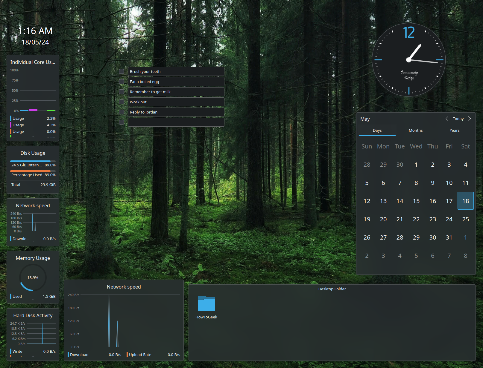
Having desktop widgets means you have direct access to useful information like reminders, to-do lists, weather updates, a world clock, and more, without having to open multiple apps. It’d be awesome if I turned on the computer every morning and got a snapshot of my entire day right there on the desktop.
If you can’t wait for Windows 12 and whether it will or will not introduce desktop widgets, you can use Rainmeter to display helpful information straight on your desktop.
Automatic Window Tiling
Window Tiling is a technical term for organizing all open windows on your screen to prevent overlapping. This can make your desktop cleaner and more productive.
Now, credit where credit’s due, Microsoft has made significant strides in this department. With features like Snap Assist and PowerToys Fancy Zones, you can manually tile all your open windows. Also, with Windows 11, you have Window Snap, letting you hover over the maximize button to tile or snap windows to specific regions of the screen.
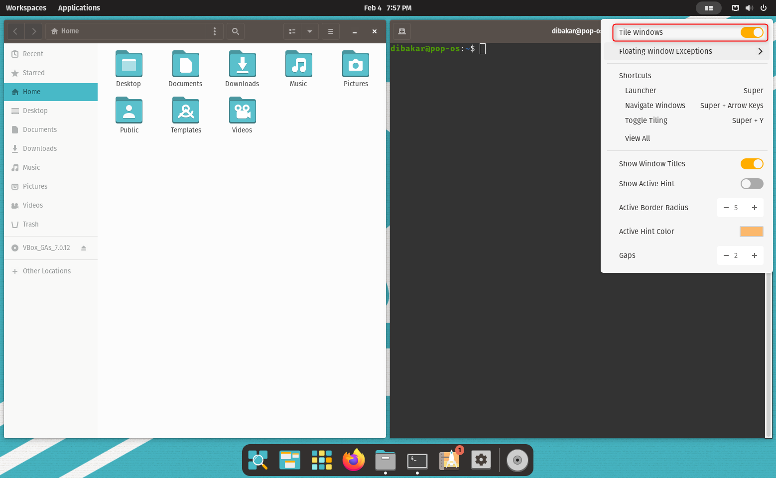
So let’s make this perfect with Windows 12 with support for automatic window tiling or auto-tiling. Of course, it will be an optional feature that you can enable/disable. If enabled, every time you open a new window, it'll automatically arrange itself in a non-overlapping grid-like pattern. So, one app opens full screen, two apps split the screen 50/50, and more apps divide the screen proportionally (in a predefined manner) without overlap. Linux has had this feature for ages. Here’s how auto-tiling looks on Pop_OS!
Options to Customize the Taskbar
Windows 10 offered a decent amount of customization options for the Taskbar. Unfortunately, Windows 11 severely reduced them to the point where the Taskbar is now fixed at the bottom; you can’t move it to the left, right, or top. Also, the right-click menu is overly simplified to just two options—Taskbar Setting or the Task Manager.
Hopefully, with Windows 12, we'll see Microsoft make the Taskbar more flexible. For reference, this is the level of freedom we get with the Linux taskbar (a.k.a. panel) as demonstrated with Garuda Linux.
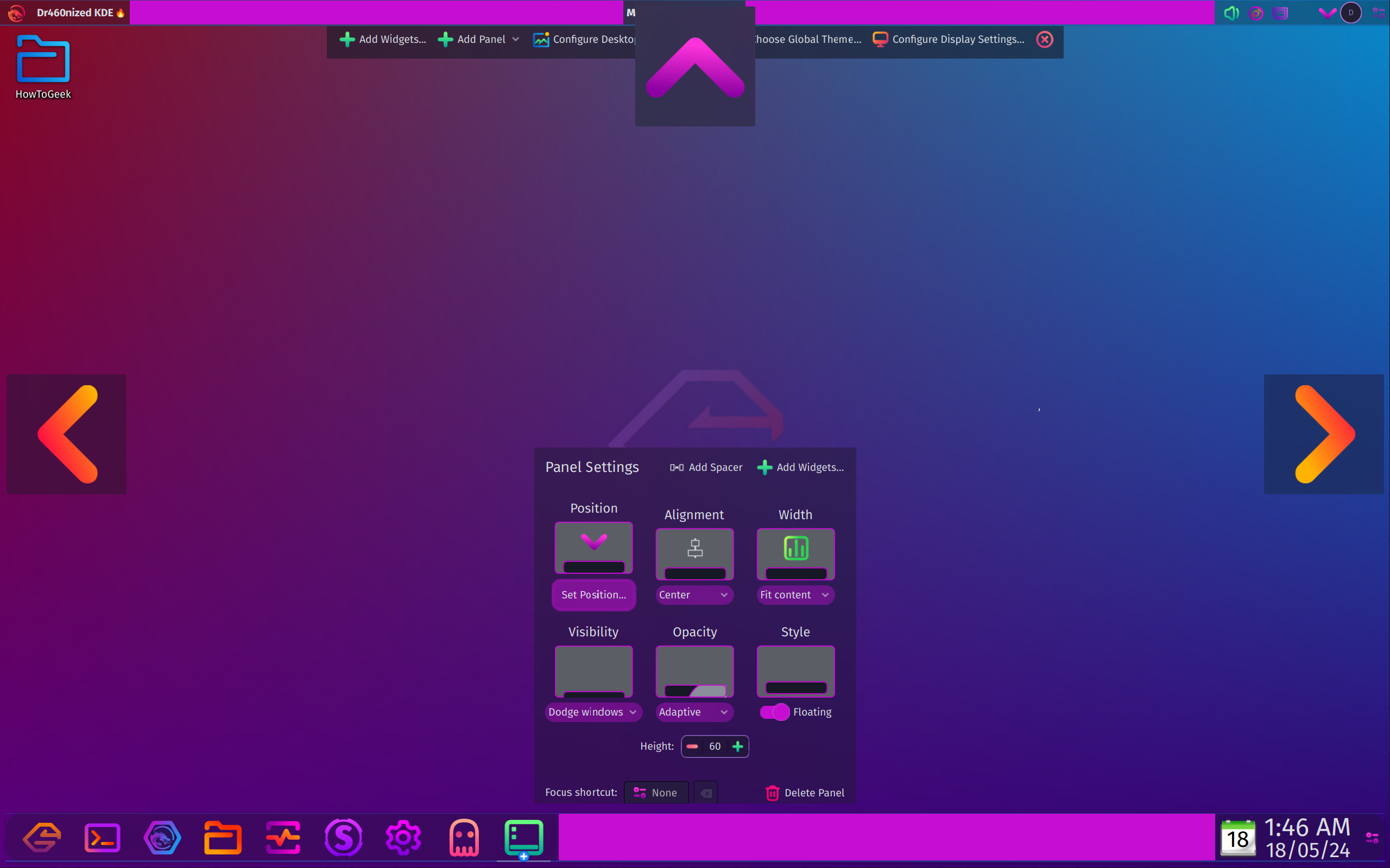
The ability to move the taskbar again would be a great start. On top of that, different Taskbar variations, like a floating one or a minimized one similar to the Mac Dock, would really help users to personalize their personal computers.
A More Integrated Virtual Desktop Experience
Virtual desktops are a great way to organize open apps and boost productivity. Microsoft introduced them to Windows 10 and improved their overall experience with Windows 11.
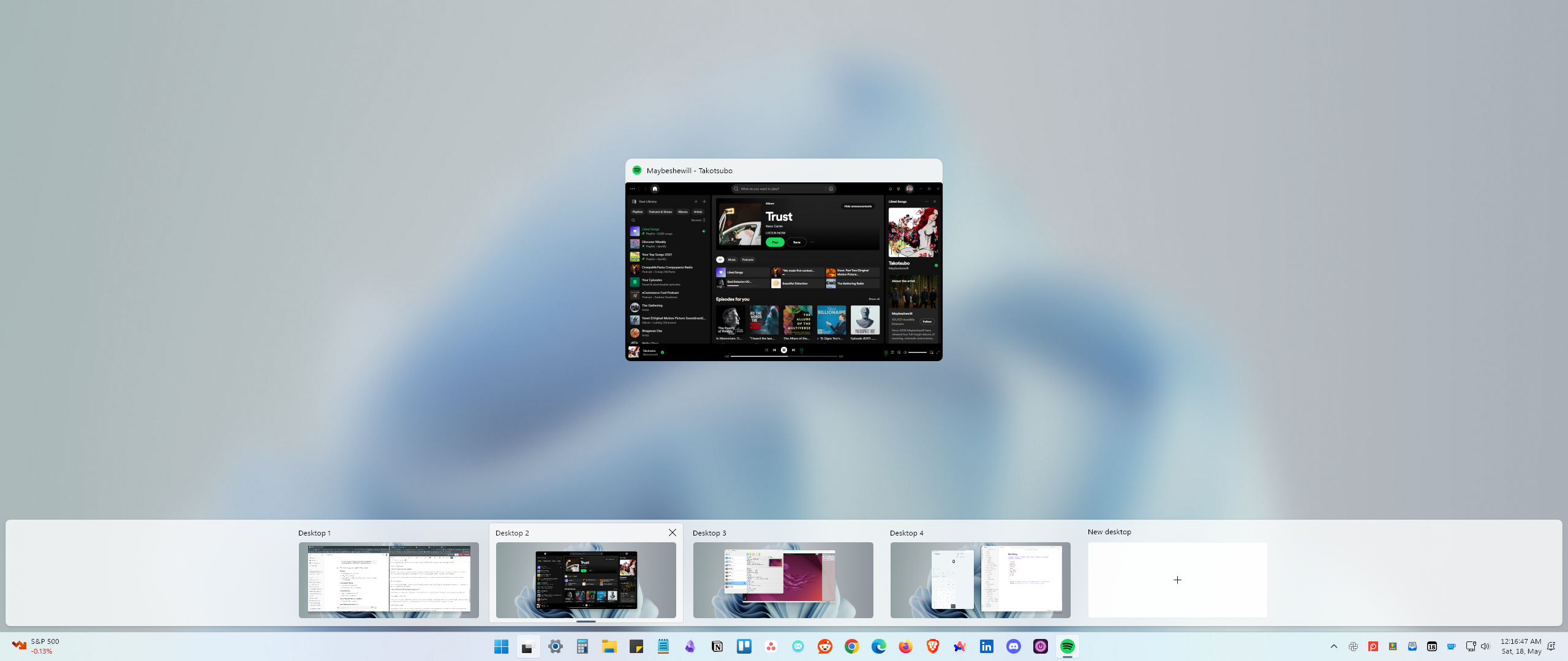
To enhance this in Windows 12, it would be awesome to have the option to visualize and manage all virtual desktops directly from the Taskbar. Also, the option to launch apps to different desktops from the Task View would be a game-changer. Look at Ubuntu’s Activities Overview (equivalent to Windows 11’s Task View) to see what I’m talking about.
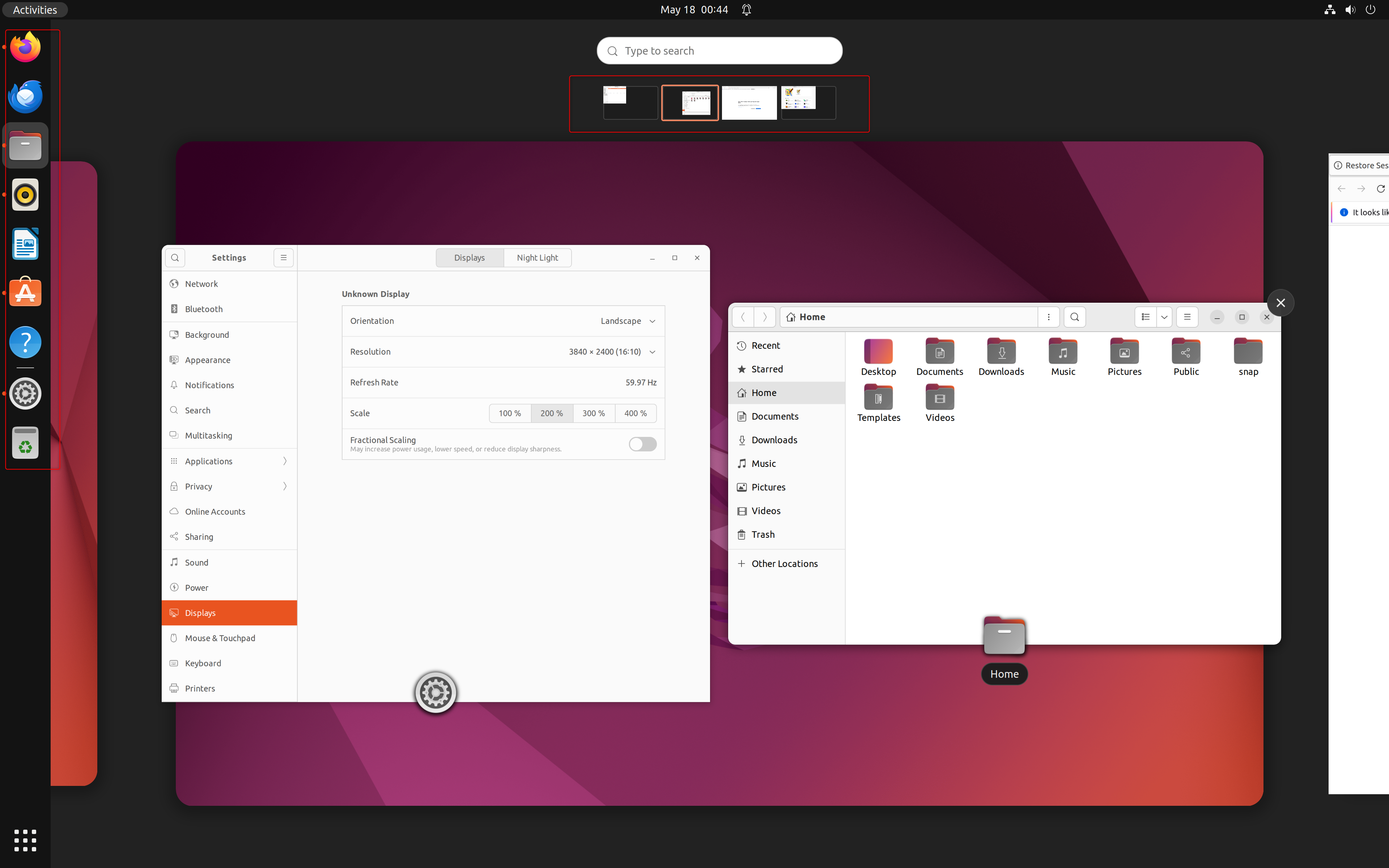
At the top, there’s a row of mini windows for all open virtual desktops (Workspaces). You can click to switch between them. The center shows your current desktop with all open apps. On the left, the Ubuntu Dash (similar to Windows' Taskbar) lets you drag and drop apps to any virtual desktop.
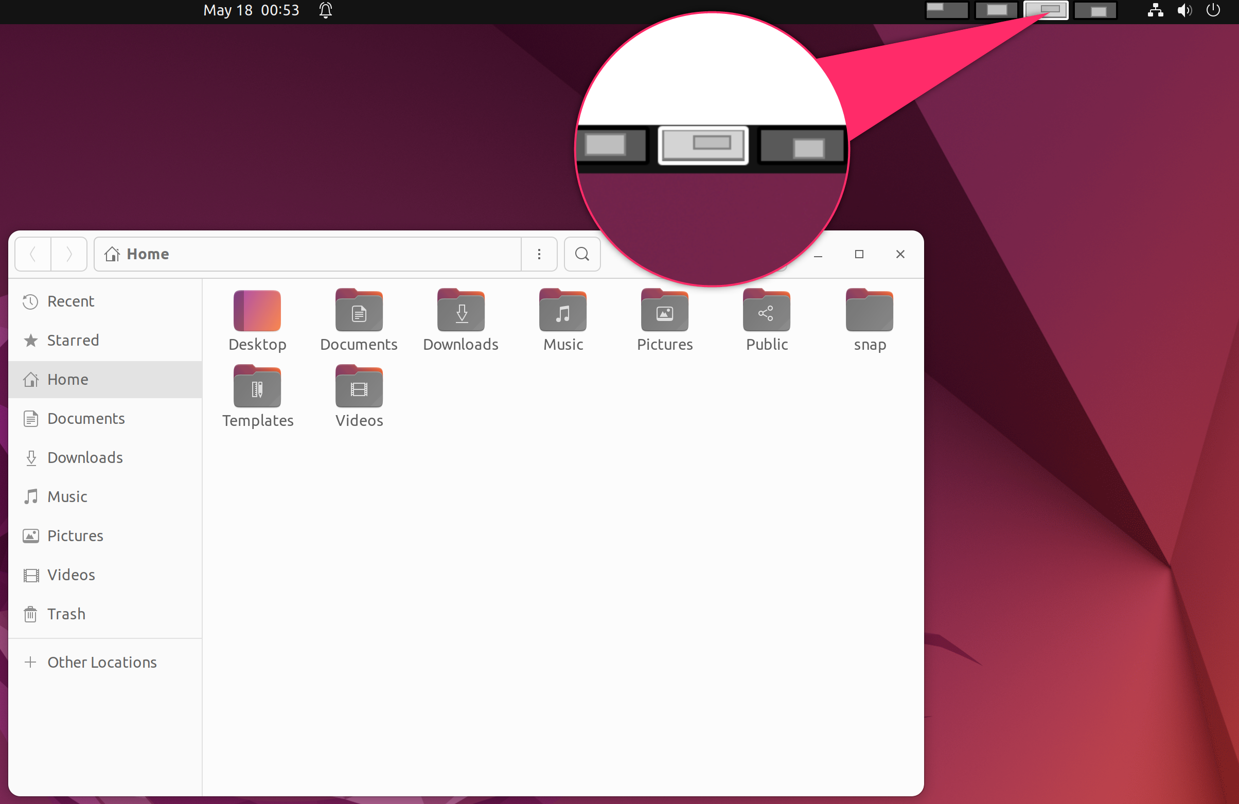
Additionally, the Workspace Indicator extension adds a virtual desktop switcher to the panel, allowing you to switch and move apps between desktops directly from the panel without opening the Activities Overview.
KDE Activities
Most people use a single Windows PC for various tasks like work, gaming, recreation, and learning. Unfortunately, Windows doesn’t provide a meaningful way to segregate these different use cases. But you could do it if Windows 12 comes with a feature like KDE Activities. Here’s a quick look at how KDE Activities work:
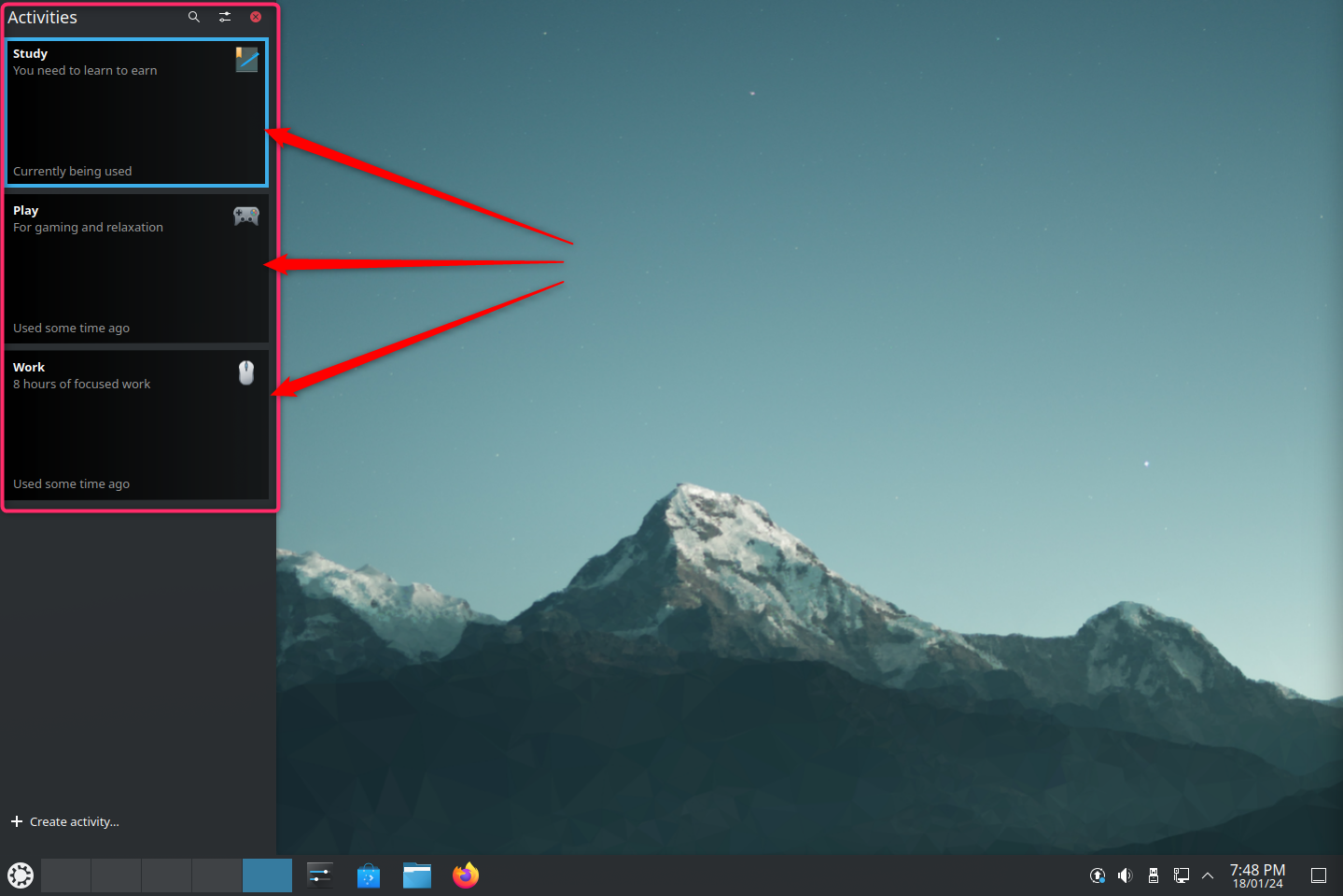
KDE Activities are like virtual desktops on steroids. You can create multiple activities, each with its own unique wallpaper, keyboard shortcuts, desktop icons/shortcuts, and pinned apps on the taskbar and Start Menu.
I personally use KDE Activities and have three optimized Activities with apps and tools dedicated to research, writing, and team communication. This allows me to effortlessly switch between different workflow states without being distracted by notifications or alluring app icons. With this feature, Windows 12 would definitely become a productivity powerhouse.
This is just a short list of Linux features that we believe Microsoft should learn from and implement. There are plenty of other features to take inspiration from that would be great to see.
-
 5 Ways to Retrieve Deleted Text Messages on AndroidMethod 1: Check the Archive and Spam Folder It’s easy to archive a text message on the Google Messages app accidentally. If that’s what you’ve done in...Software tutorial Published on 2024-11-07
 -
 Here\'s How I Properly Back Up My Windows 11 PCAlthough Windows Backup is a decent backup solution for Windows 11, it has its limitations. That's why I rely on a three-step process to properly ...Software tutorial Published on 2024-11-07
 -
 How to Transfer Text Messages (SMS) From Android to AndroidBoasting an easy-to-use interface, Android devices are the choice of more than half of smartphone users worldwide. When setting up a new device or res...Software tutorial Published on 2024-11-07
 -
 An Administrator Has Restricted Sign in? Fix It Now!Why do you receive an administrator has restricted sign in after entering the correct information? How to unlock your system again? If you are looking...Software tutorial Published on 2024-11-07
 -
 How to Stop Getting Calls From Blocked NumbersMethod 1: Review the Blocked Numbers List Before you delve deeper, double-checking the list of blocked numbers on your phone should fix calls from blo...Software tutorial Published on 2024-11-07
 -
 3 Ways to Fix Vertical or Horizontal Lines on Android ScreenBasic Fixes Restart your device: Restart your device to remove any bugs or glitches causing the problem. Let your device cool down: Unplug your devic...Software tutorial Published on 2024-11-07
 -
 3 Ways to Make a Picture Fit Wallpaper on iPhoneMethod 1: By Using the Wallpaper Resizer App You can use third-party wallpaper resizing apps to do the job. Here’s how. Step 1: Download and open the ...Software tutorial Published on 2024-11-07
 -
 WiFi Keeps Disconnecting on Windows 11 – 5 Quick FixesExpand the Network adapters category, right-click on your WiFi adapter, and choose Update driver. Select Search automatically for drivers. For a more...Software tutorial Published on 2024-11-07
 -
 3 Fixes for Right Click Not Working on Windows 11Basic Fixes: Unplug peripheral devices: This will work because it isolates possible software interference and hardware conflicts that may trigger the ...Software tutorial Published on 2024-11-07
 -
 How to Can You Fix Satisfactory Executable Missing Error?It could be exciting news for players who have waiting for Satisfactory for a long time that Satisfactory is available on Steam now. However, plenty o...Software tutorial Published on 2024-11-07
 -
 What to Do If Your Outlook Mailbox is FullFix 1: Use the Mailbox Cleanup Tool Microsoft Outlook includes a Mailbox Cleanup tool that can help reduce your mailbox size by deleting old emails qu...Software tutorial Published on 2024-11-07
 -
 How to Rename or Delete SoftwareDistribution and Catroot2 FoldersWhat Happens When You Reset SoftwareDistribution and Catroot2 Folders Catroot2 folder contains catalog files (.cat) that are cryptographic hashes an...Software tutorial Published on 2024-11-07
 -
 4 Fixes for “Excel Couldn’t Start Last Time” Error on WindowsFix 1: Open Excel in Safe Mode Opening Microsoft Excel in safe mode can help you troubleshoot all kinds of errors and issues. Hence, try that first. W...Software tutorial Published on 2024-11-07
 -
 4 Ways to Fix Error Code 0x80070570 in WindowsFix 1: Re-Download Windows ISO Finding the correct Windows ISO for your PC is crucial for proper installation. Windows 11 is not available for 32-bit ...Software tutorial Published on 2024-11-07
 -
 Fix: Background Intelligent Transfer Service (BITS) Keeps StoppingFix 1: Set Background Intelligent Transfer Service to Automatic (Delayed Start) If the Background Intelligent Transfer Service or its related services...Software tutorial Published on 2024-11-07
Study Chinese
- 1 How do you say "walk" in Chinese? 走路 Chinese pronunciation, 走路 Chinese learning
- 2 How do you say "take a plane" in Chinese? 坐飞机 Chinese pronunciation, 坐飞机 Chinese learning
- 3 How do you say "take a train" in Chinese? 坐火车 Chinese pronunciation, 坐火车 Chinese learning
- 4 How do you say "take a bus" in Chinese? 坐车 Chinese pronunciation, 坐车 Chinese learning
- 5 How to say drive in Chinese? 开车 Chinese pronunciation, 开车 Chinese learning
- 6 How do you say swimming in Chinese? 游泳 Chinese pronunciation, 游泳 Chinese learning
- 7 How do you say ride a bicycle in Chinese? 骑自行车 Chinese pronunciation, 骑自行车 Chinese learning
- 8 How do you say hello in Chinese? 你好Chinese pronunciation, 你好Chinese learning
- 9 How do you say thank you in Chinese? 谢谢Chinese pronunciation, 谢谢Chinese learning
- 10 How to say goodbye in Chinese? 再见Chinese pronunciation, 再见Chinese learning


